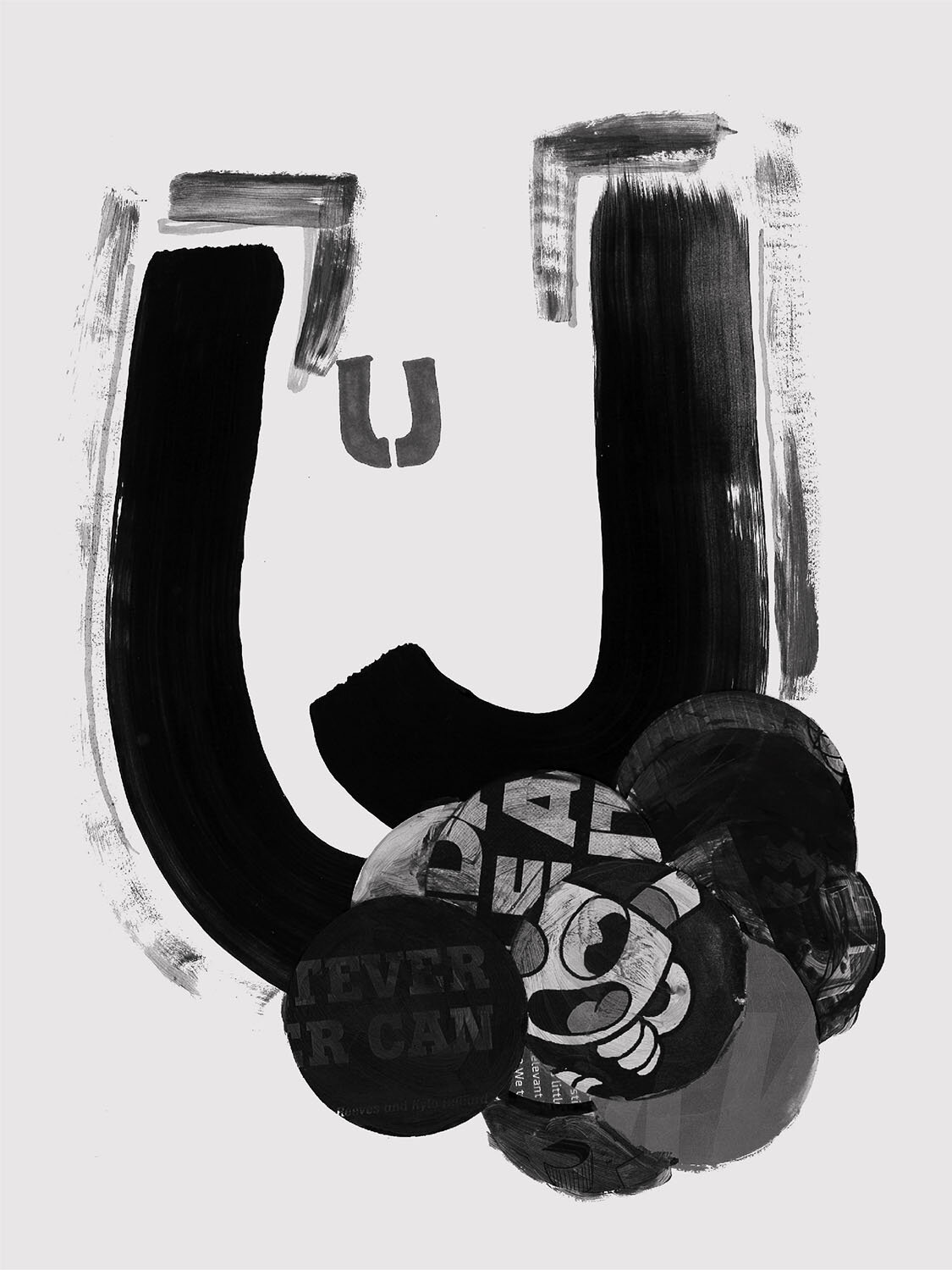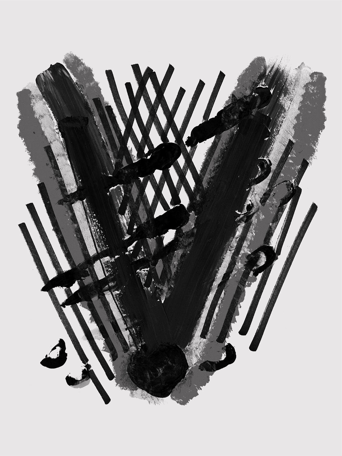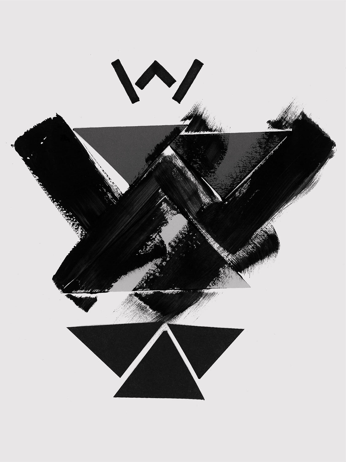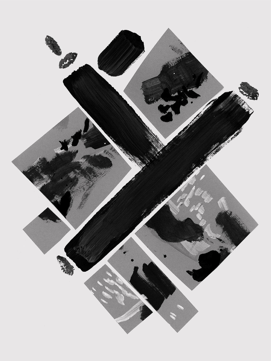
Gestalt Part Two - Quarantine Edition
After four extremely fun and productive typography workshops spanning from July 2018 to February 2019, some big plans were in motion to grow the Gestalt Typography Project bigger and better in 2020. More sessions, more participants, new rules and variations. Big plans. We know what happened next. After spending a few months stuck indoors due to a global pandemic, my housemates and I decided to bring Gestalt back in a smaller, more intimate way, while still keeping the experimental nature of project.
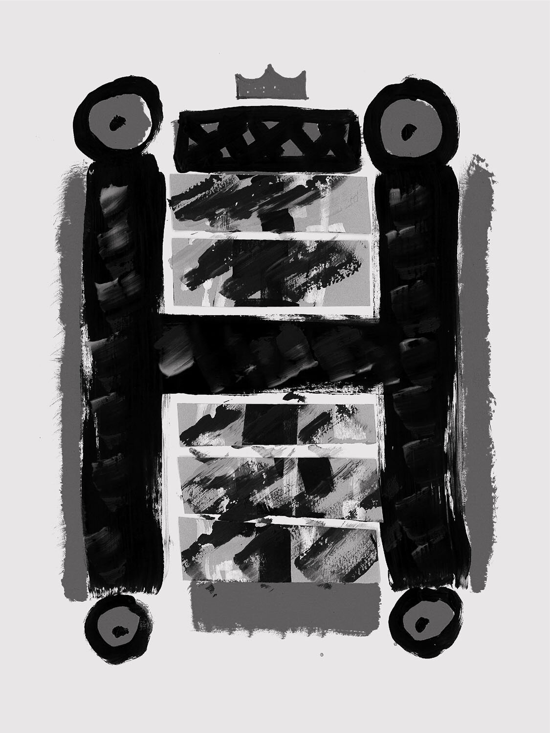
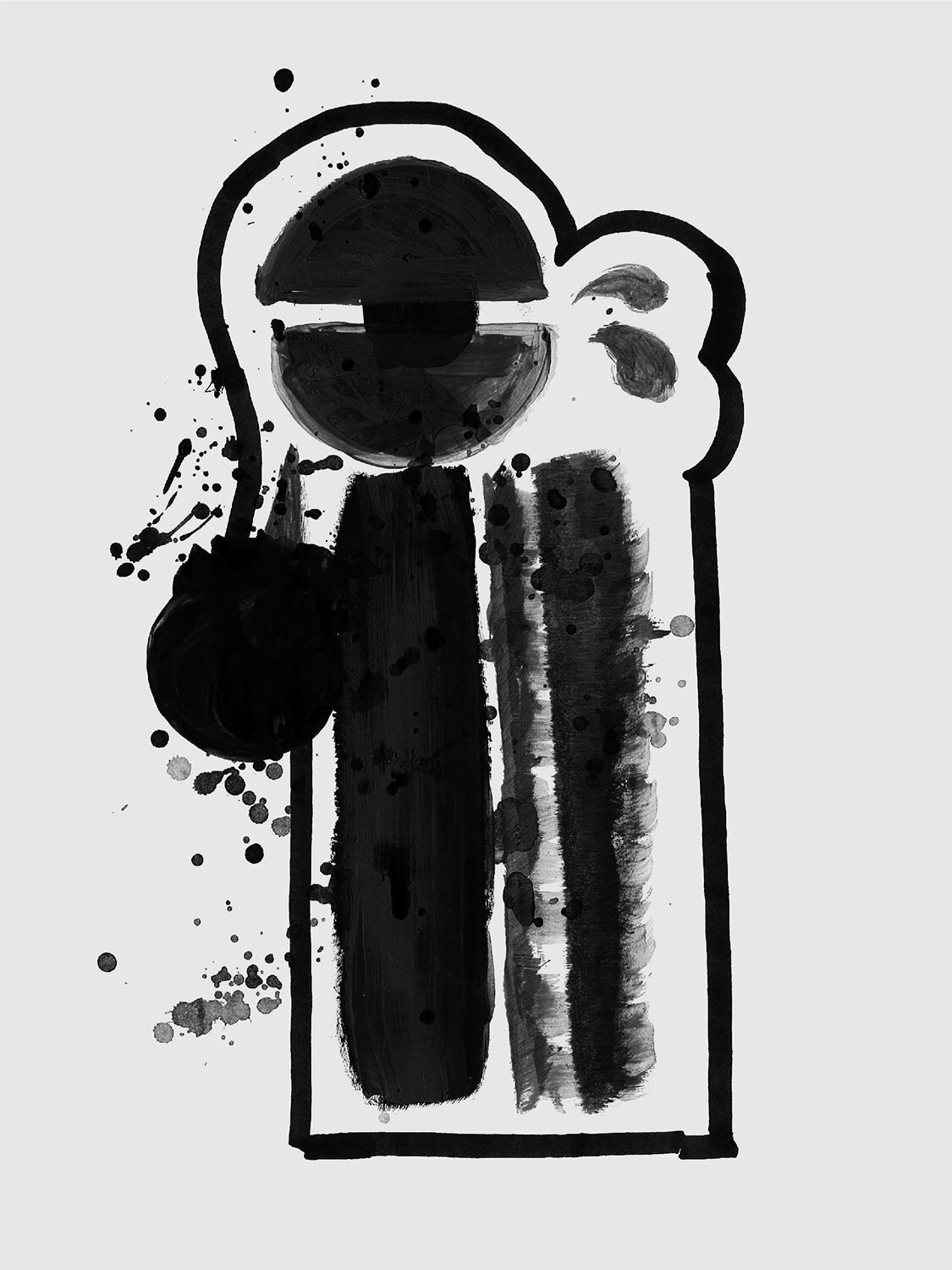
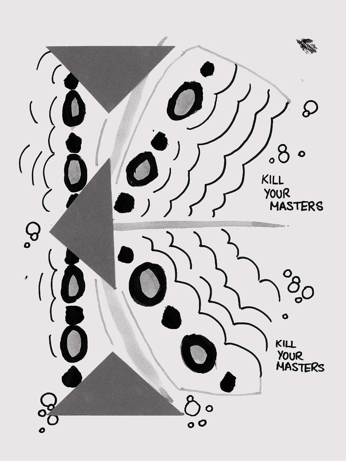
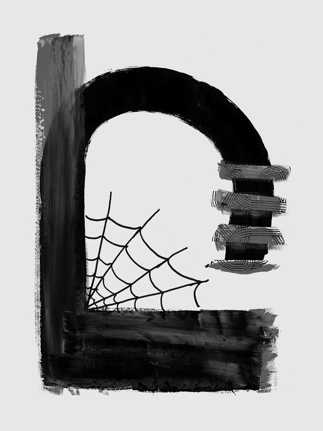
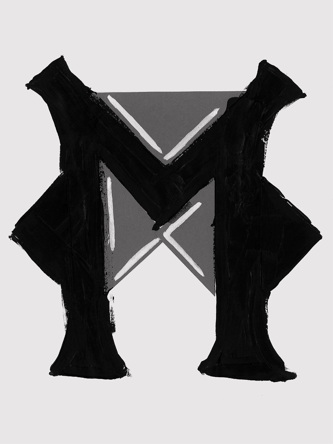
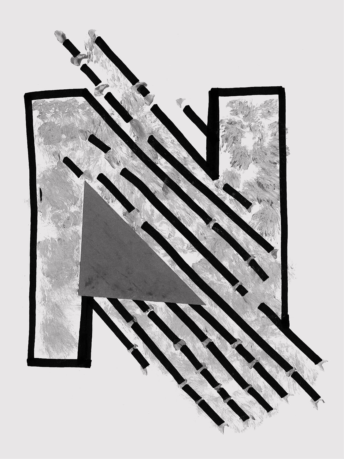
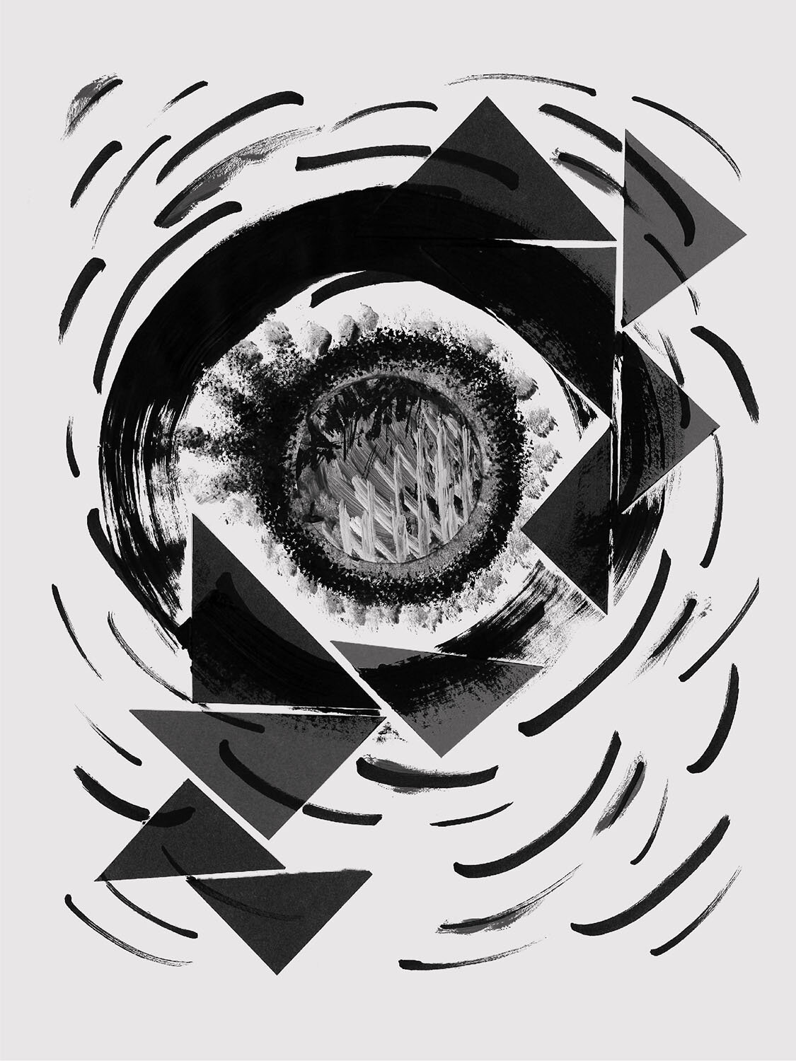
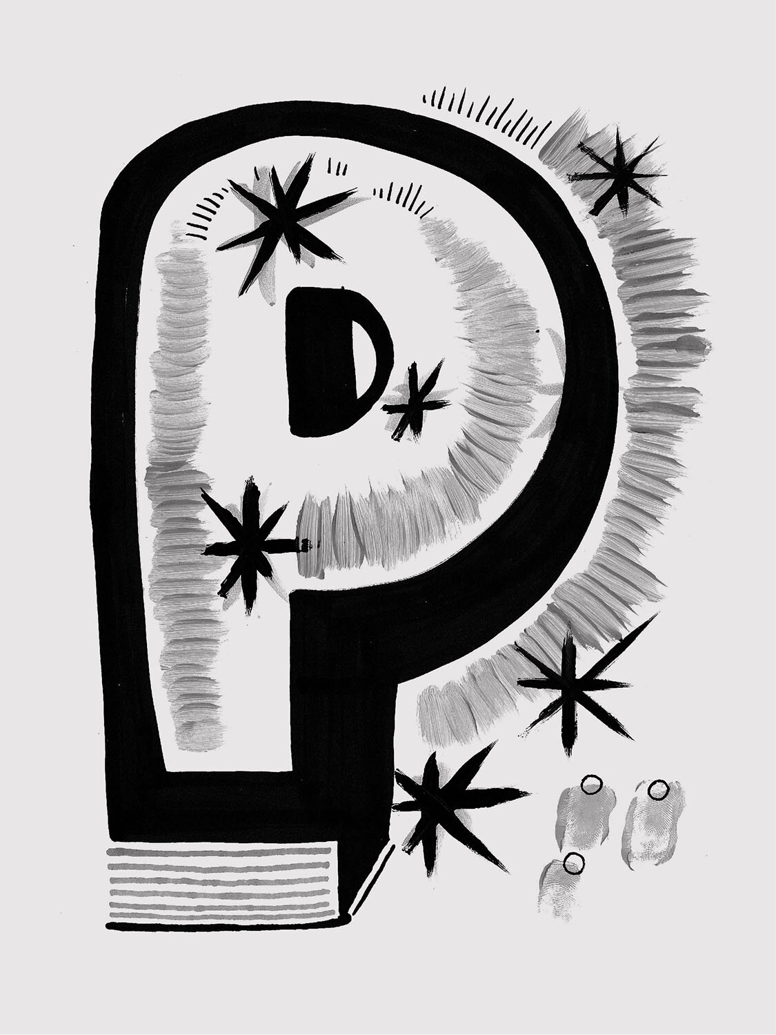
One warm June night amidst plague and elongated quarantine, we blasted the new Run The Jewels album and broke out all the leftover supplies being hoarded from the previous workshops. The rules for this “Quarantine Edition” were simple: use what’s in front of you to construct and collage a letterform within 3 minutes before swapping worksheets around the table. Four participants entered with about a dozen materials to play with, and two hours later the session, dubbed “The Kitchen Sink,” was complete.
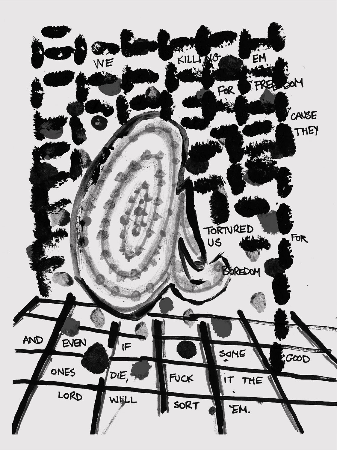
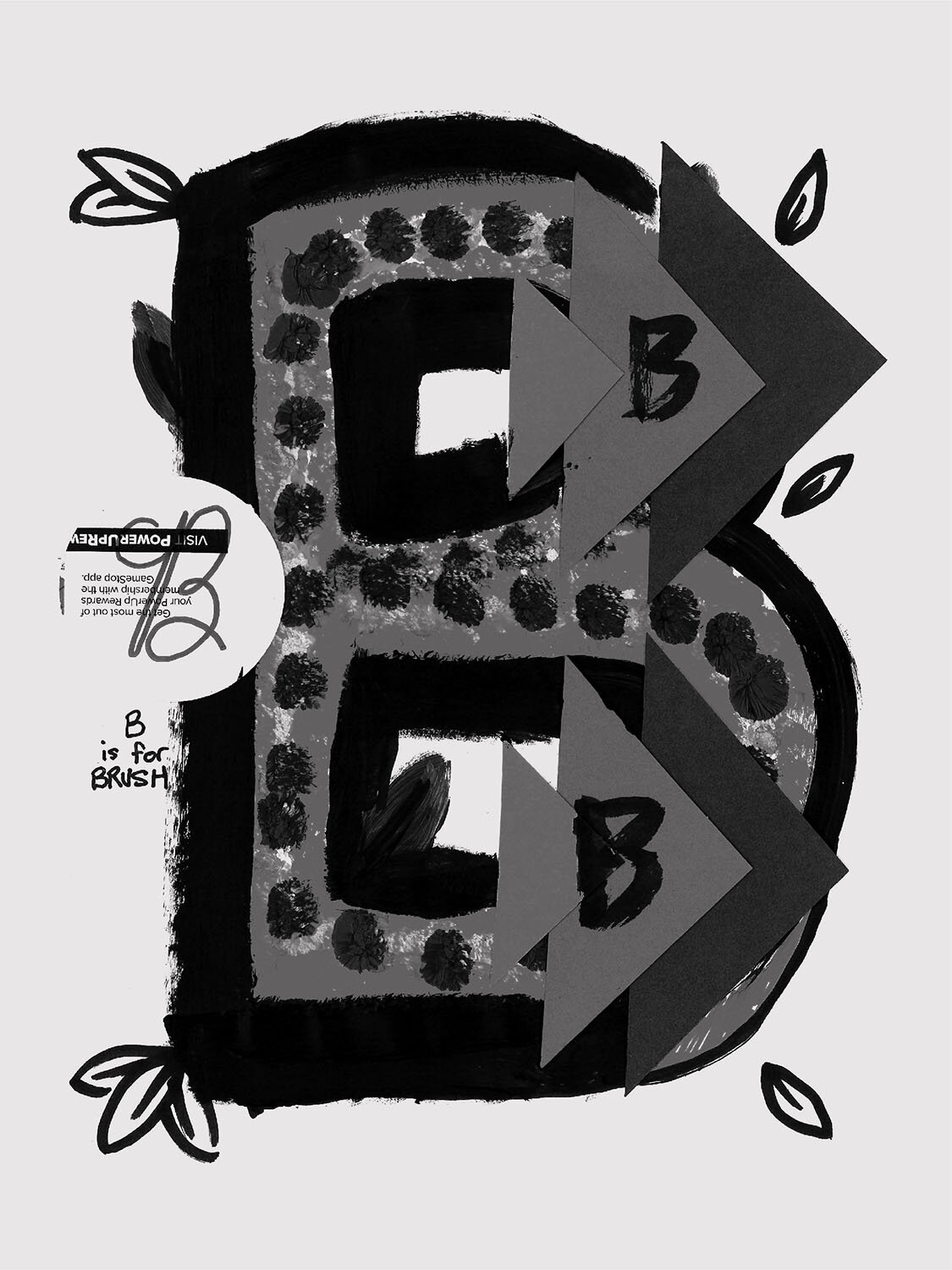
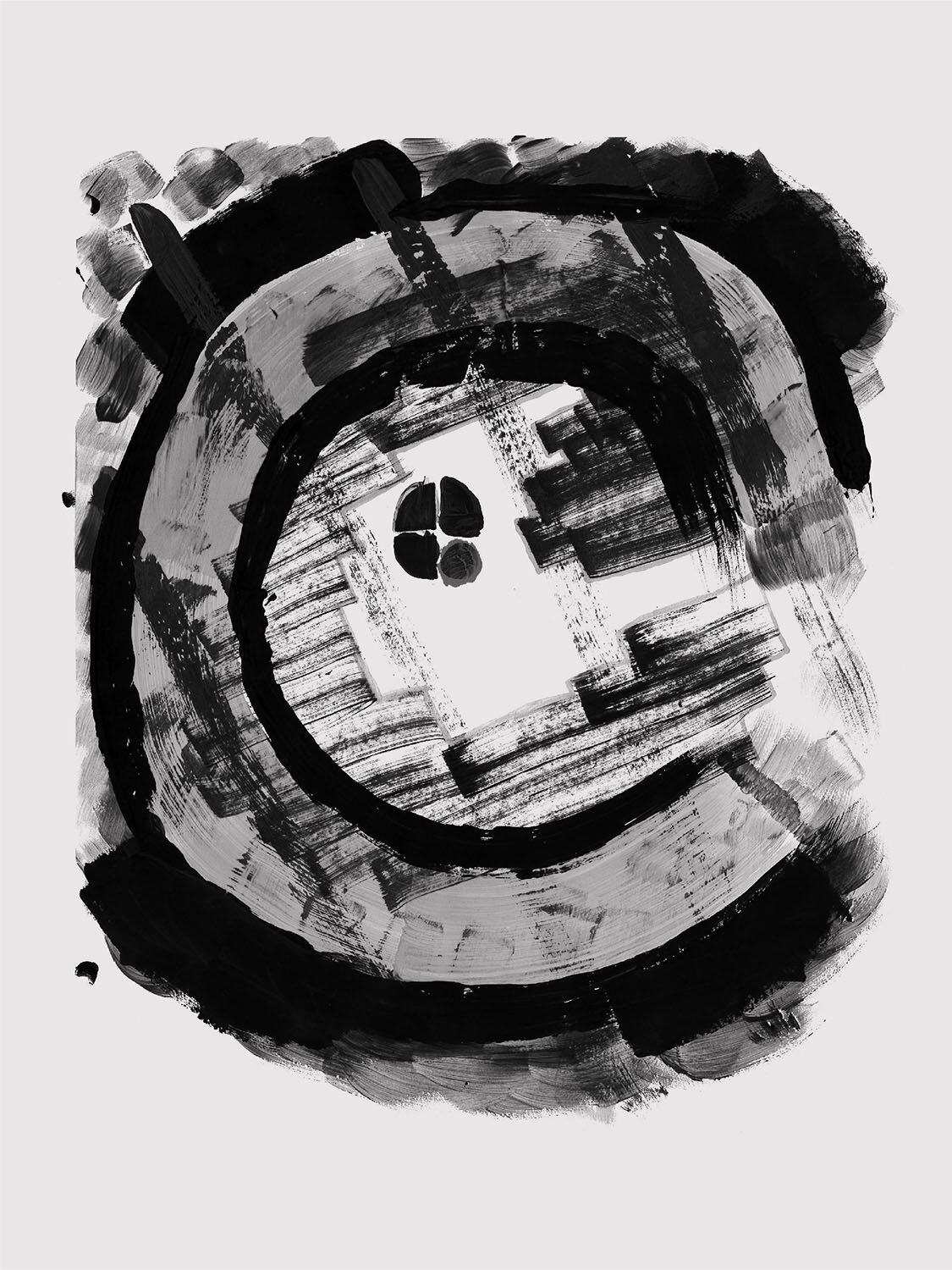
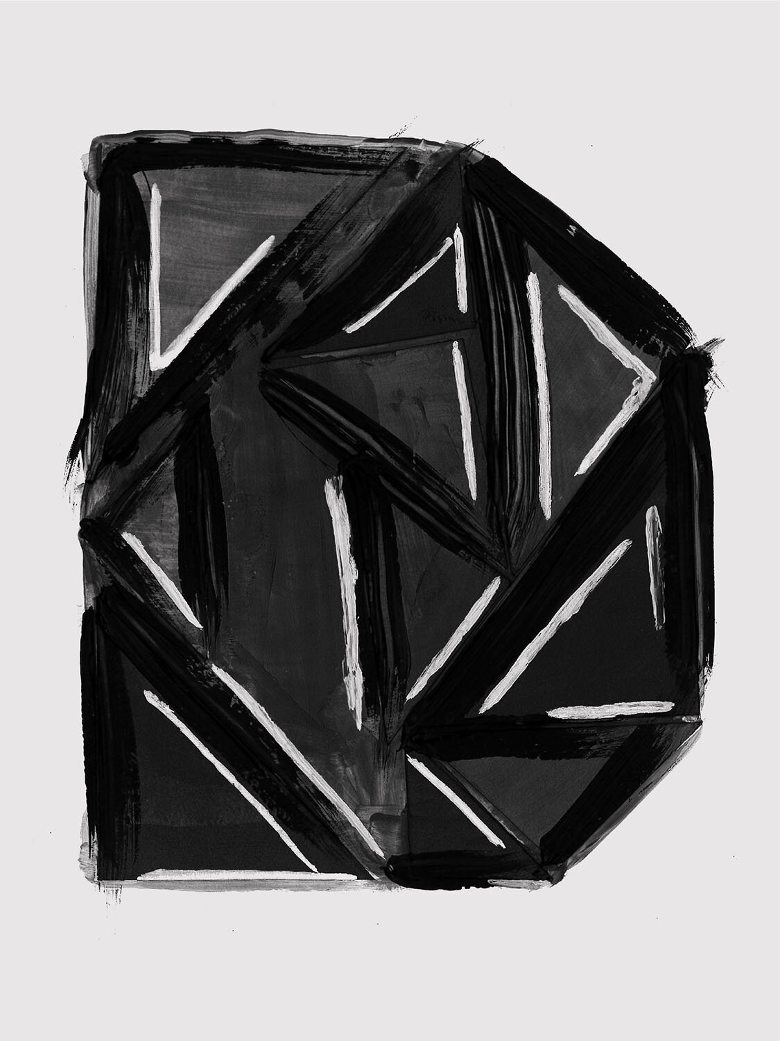
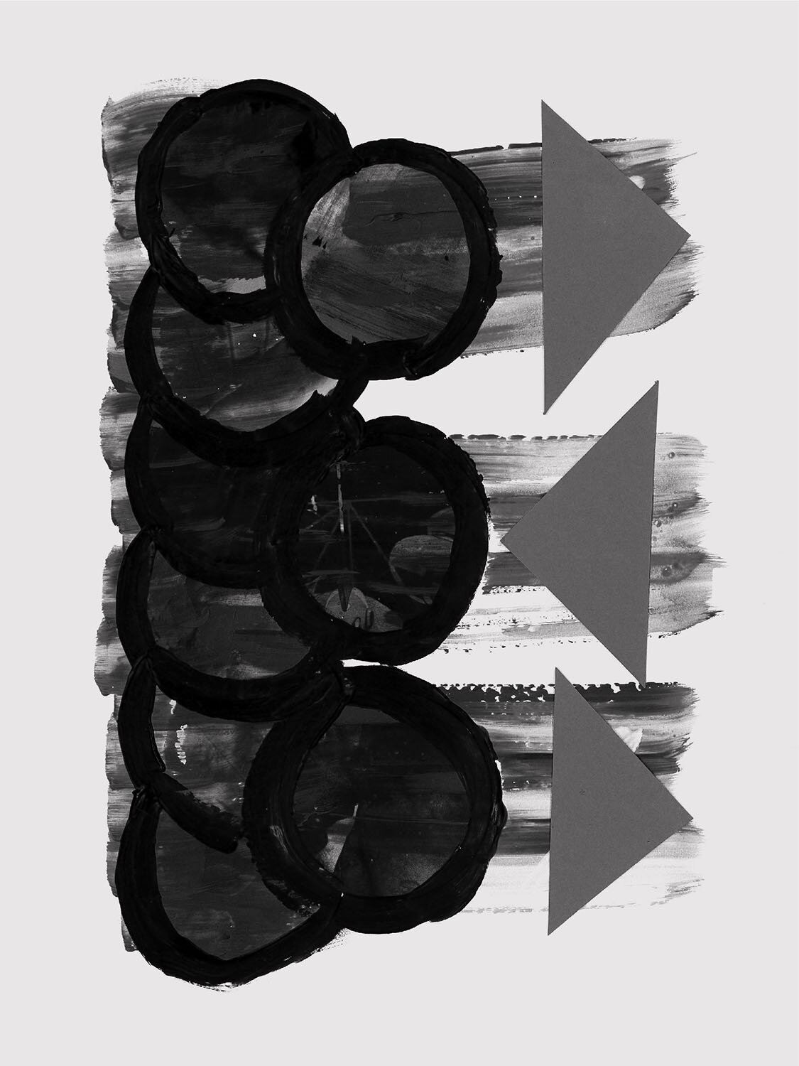
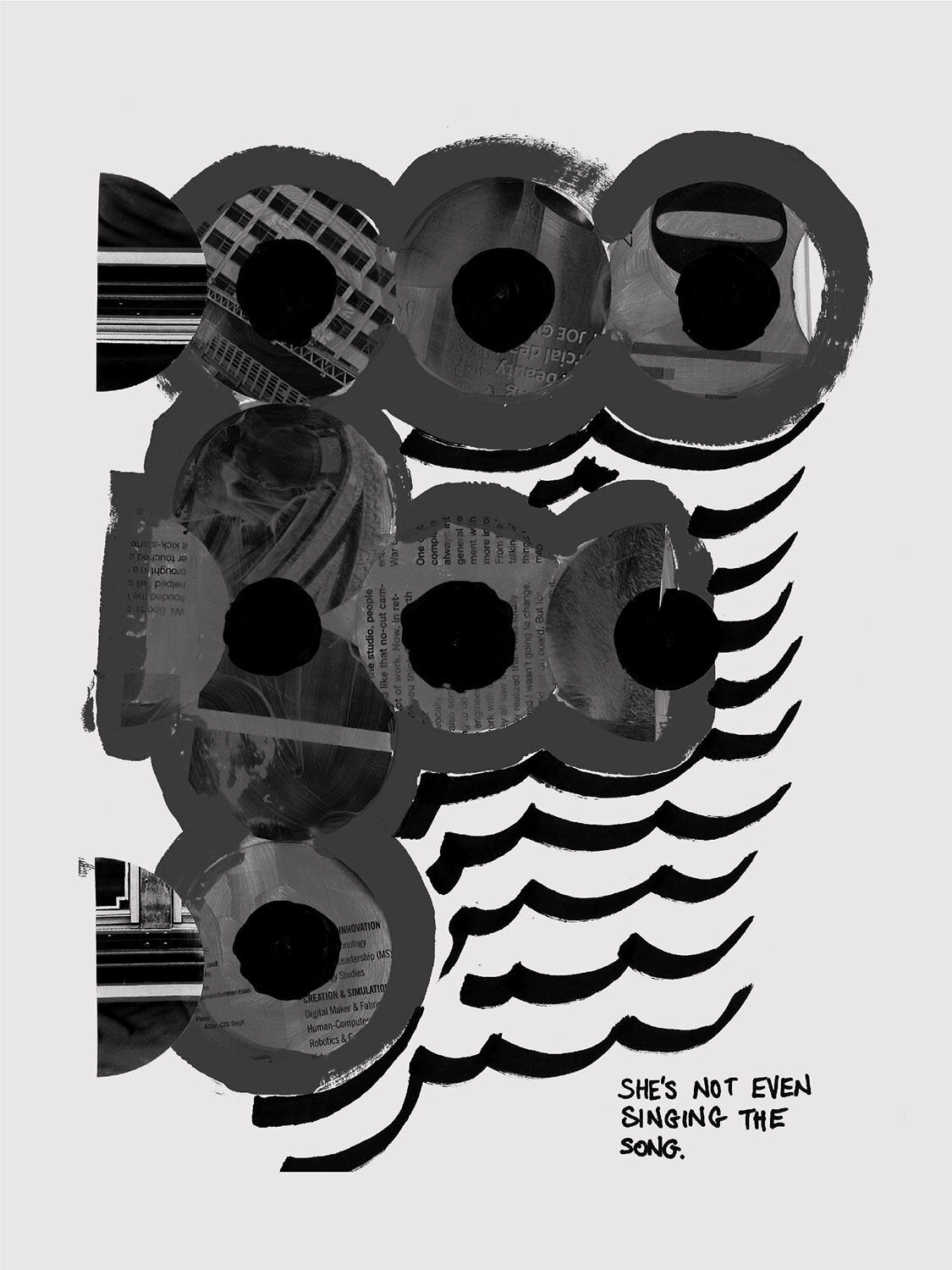
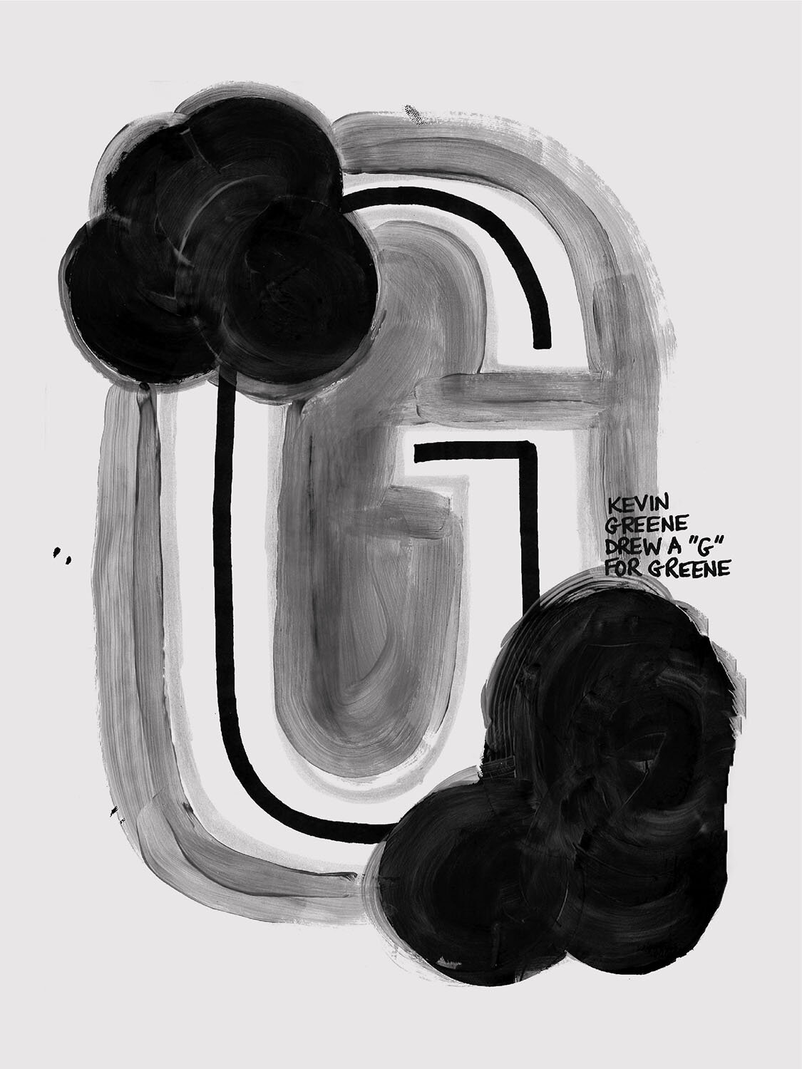
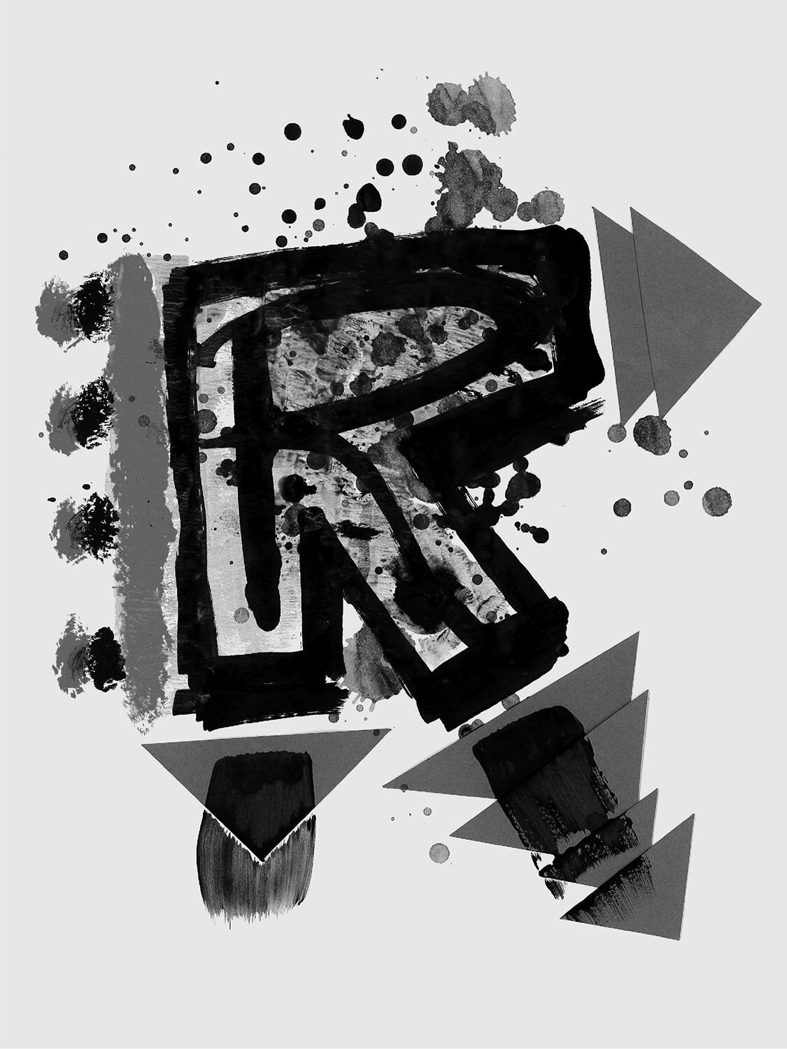
After scanning in the final results, a little Photoshop magic was employed to convert all letterforms to grayscale, since the abundance of supplies this round made for some eye-searing color combinations, and we needed a little consistency. All 26 characters we created can be viewed below. These Gestalt letterforms were special however, since they would then be used as inspiration for creating 26 unique typefaces. The results and second half of this project, Gestalt Part Two – 676 Characters, can be viewed here.
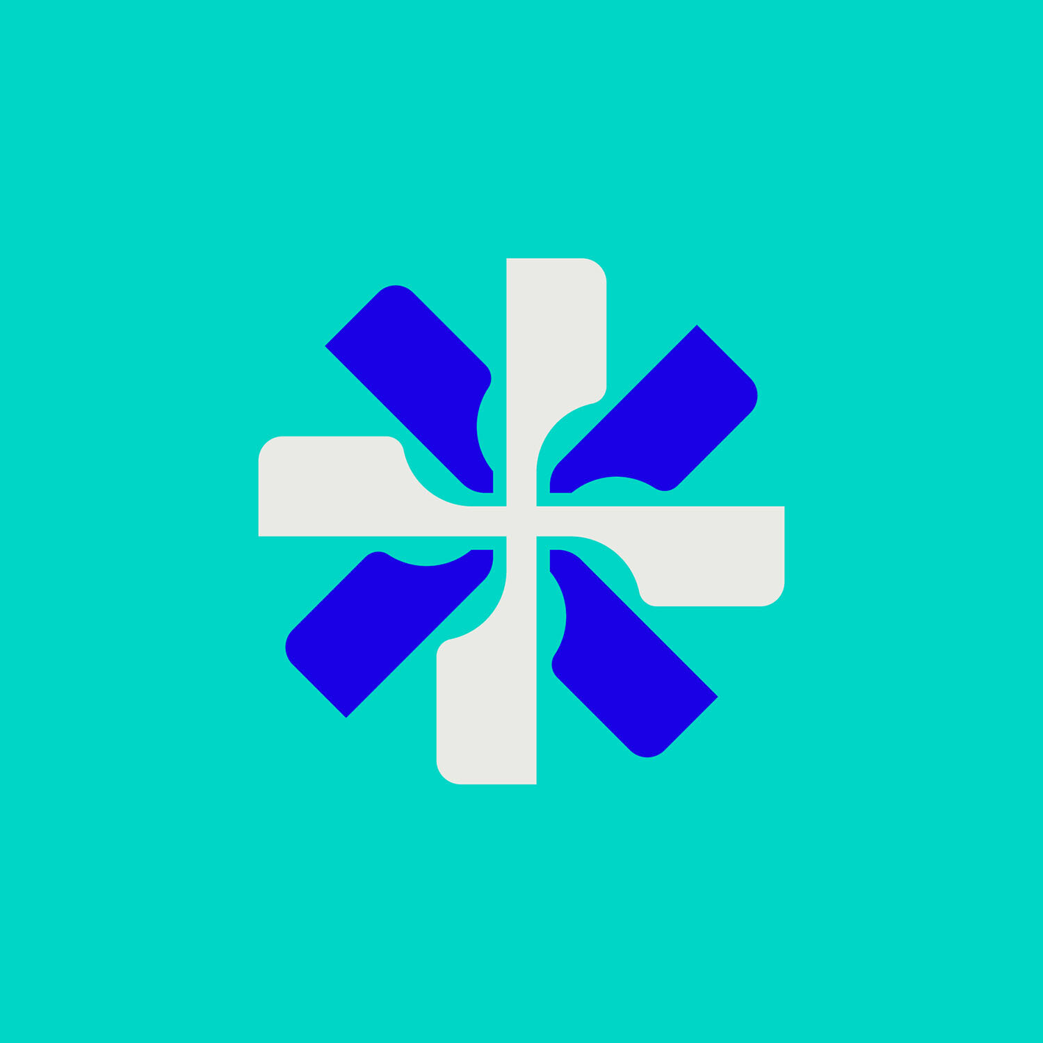
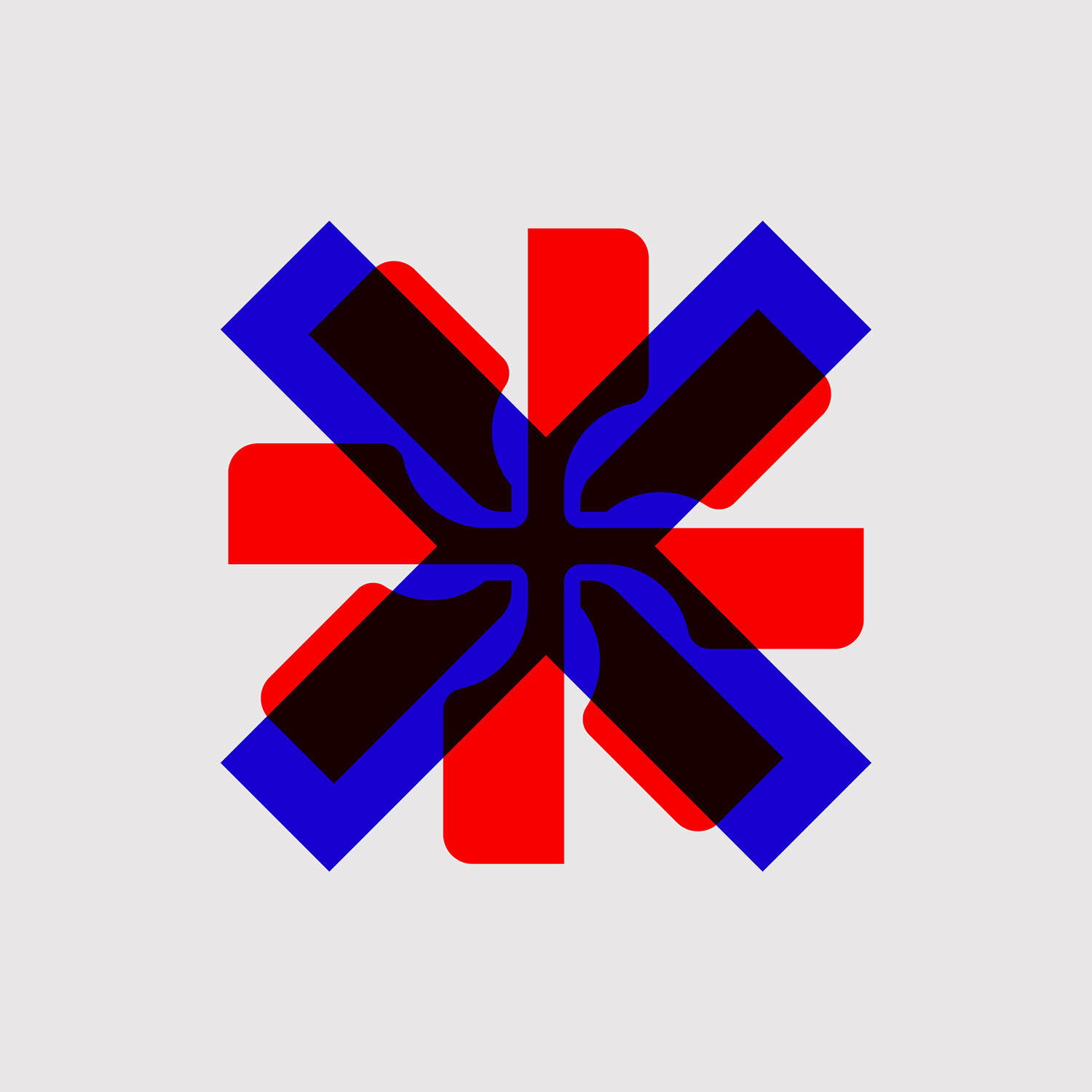
The Gestalt Mark was created as an easy way to identify workshop materials and as an identity for the project as a whole. This “pinwheel” logo was created with three concepts in mind: addition and multiplication of materials, repetition and circular motion, and chaos. The mark also resembles an everlasting gobstopper from the 1971 film adaptation of Willy Wonka & the Chocolate Factory. Both are experimental in nature and always changing.
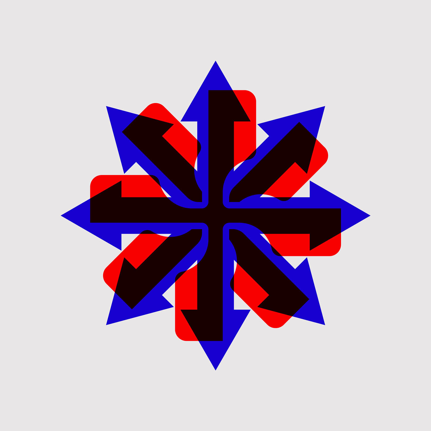
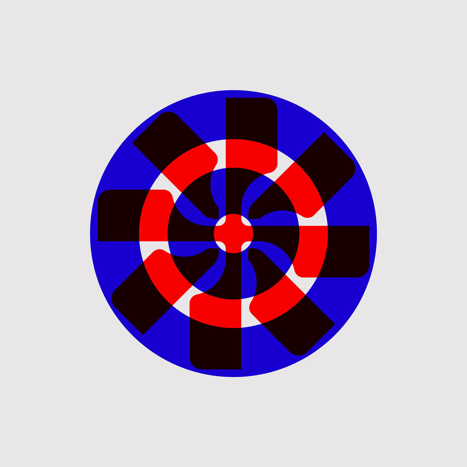
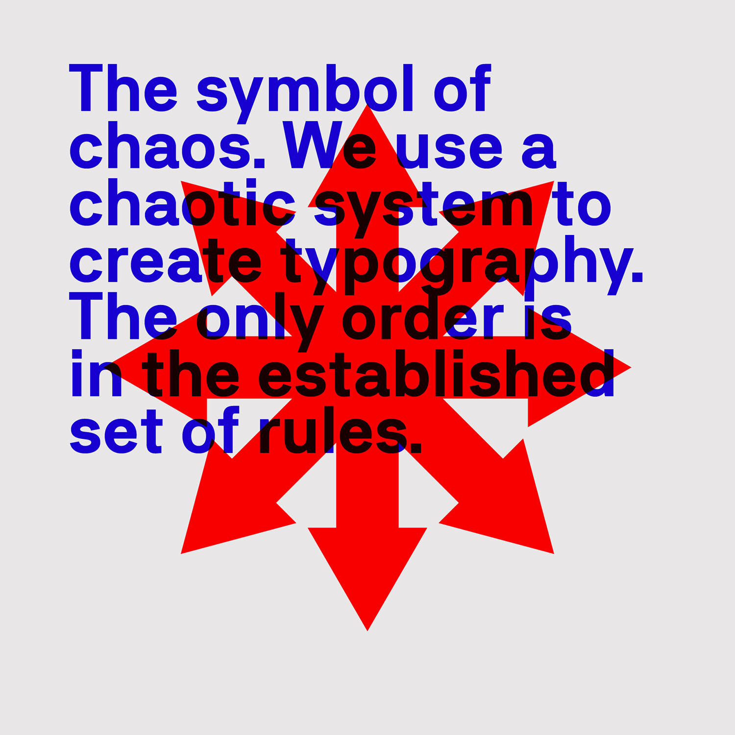
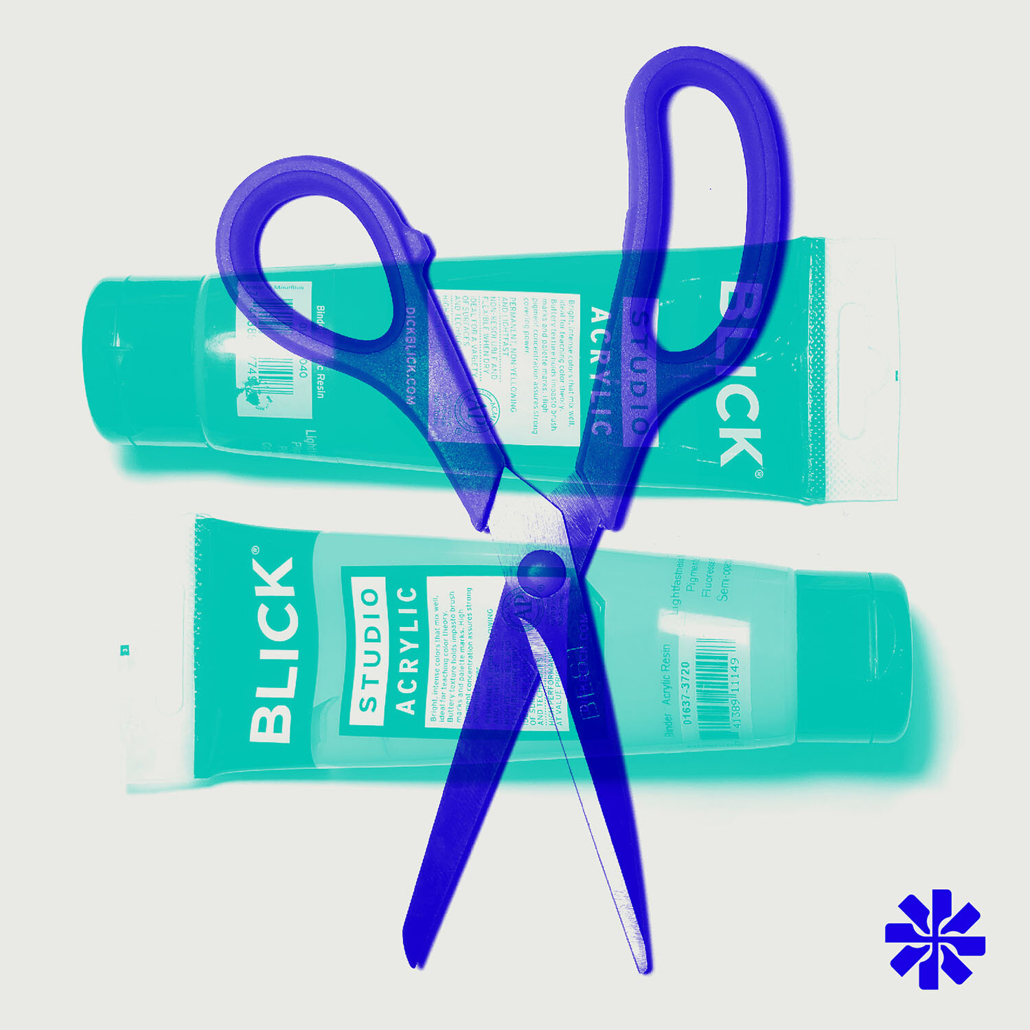
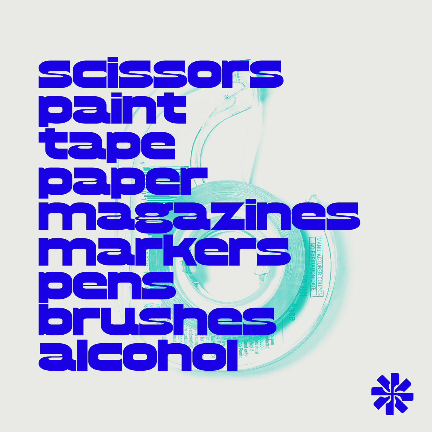
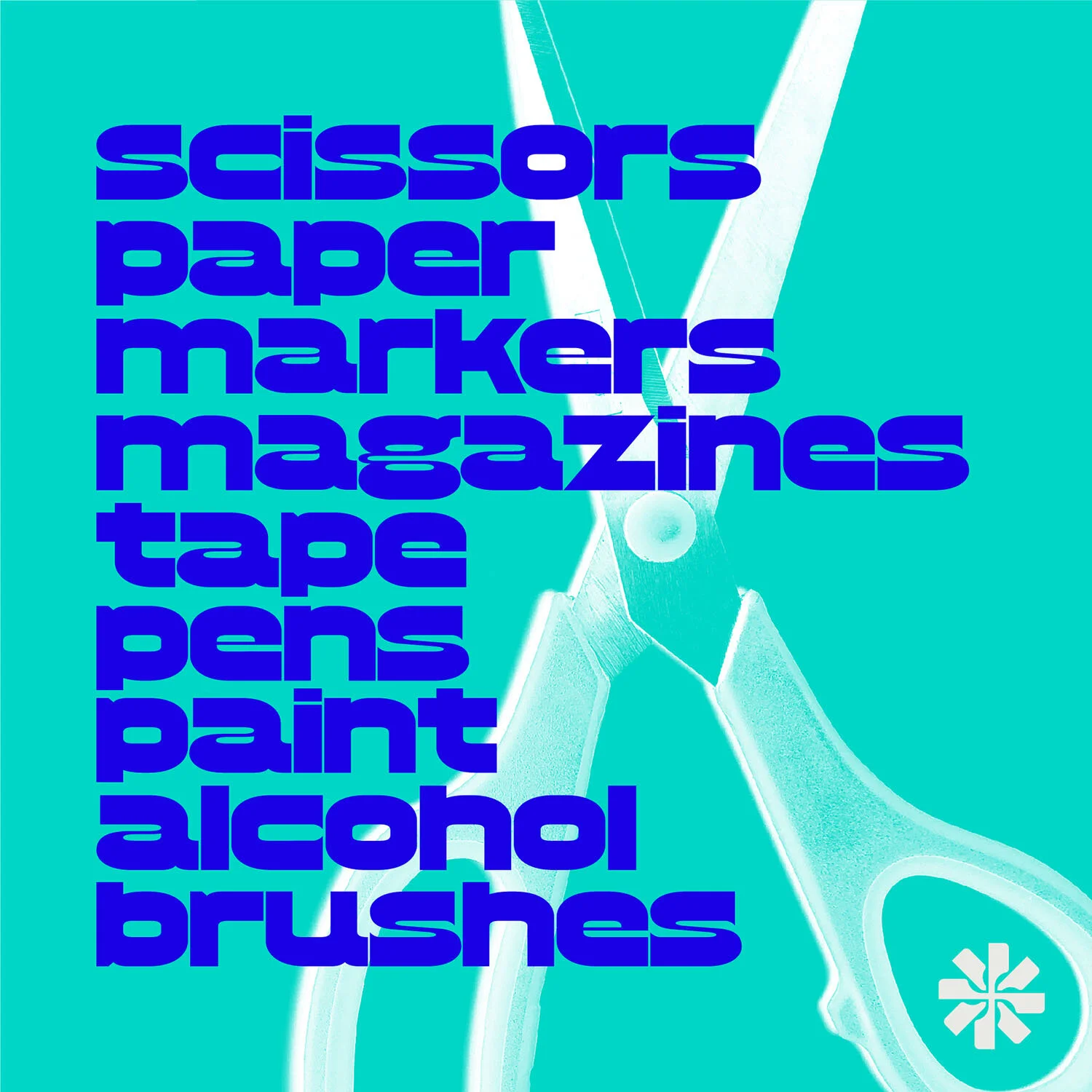
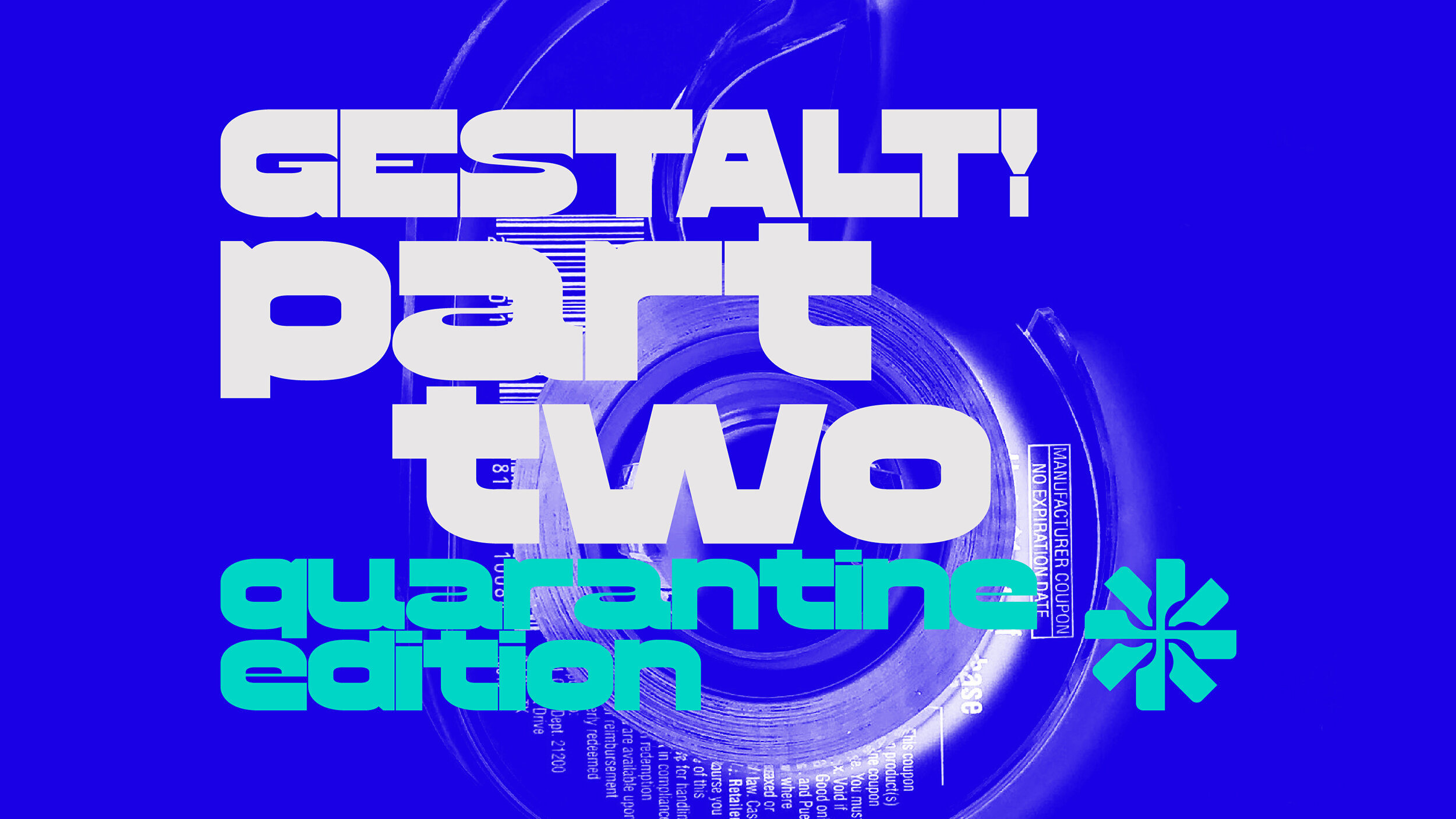
Some samples of social media posts used for the workshop. Since this was a smaller, more intimate workshop with only four participants, the driving force of these posts focused on photography of all the supplies we used, paired with Jamais Vu’s new font, Hamilton Gothic Neue.
