
Gestalt Session 03
November 2018
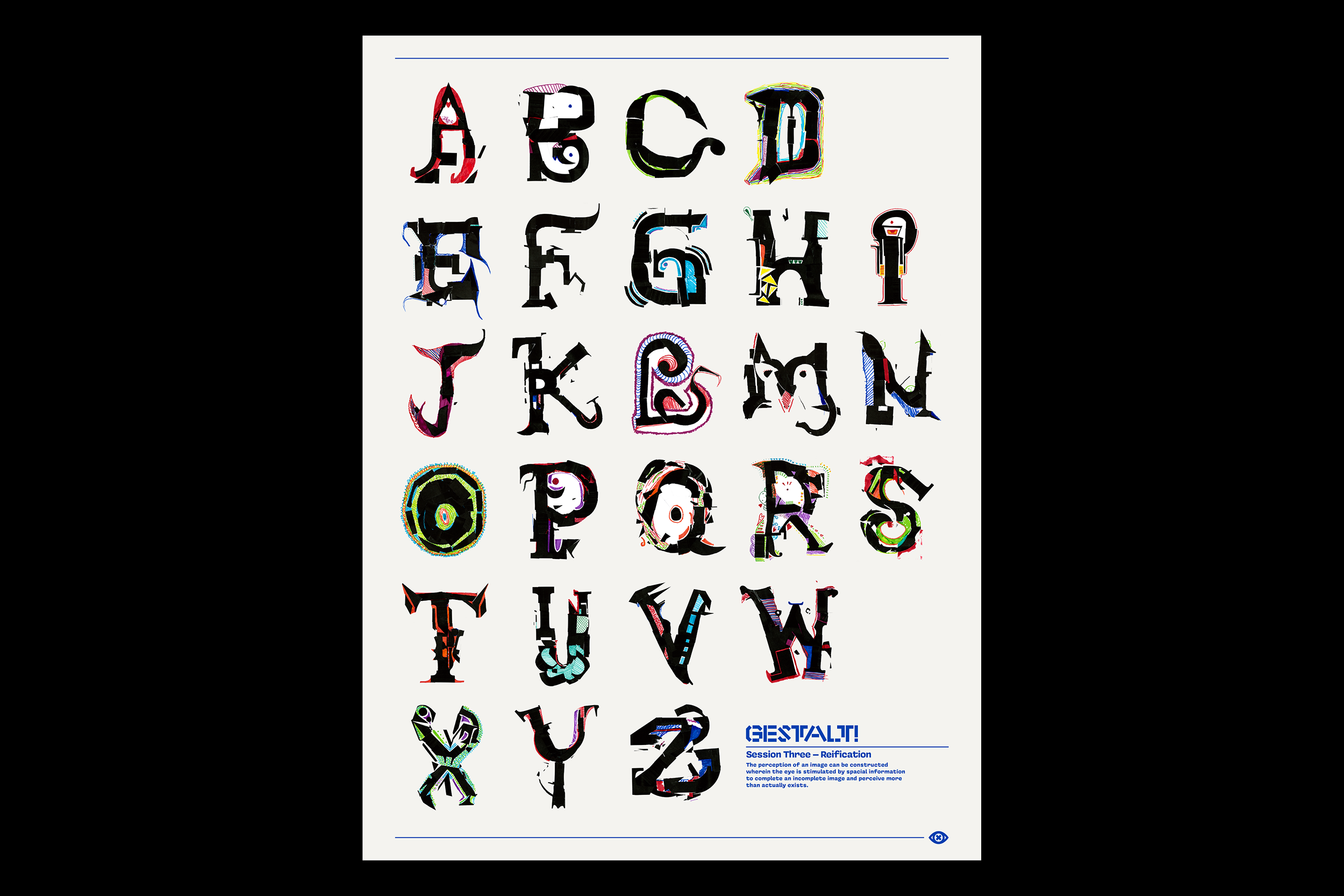
Gestalt! A Study of Communal Typography is the second entry in an ongoing research project called Conversations in Design. Gestalt is centered around a series of workshops where designers work together to build a unique 26-character alphabet using only a limited set of supplied materials. All other choices remain up to the designers. No rules, anything goes.
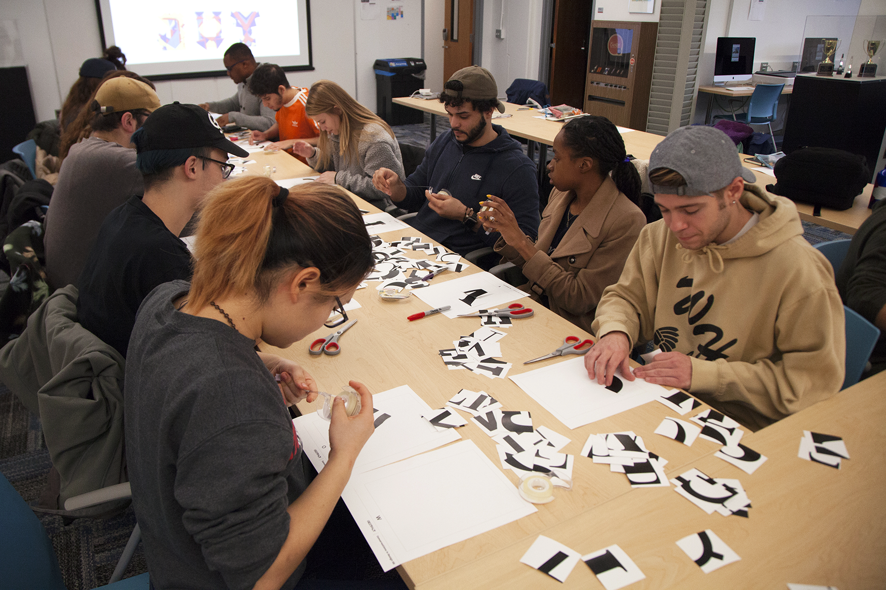
Gestalt Session Three consists of two separate workshops with the Typography I students of Montclair State University, made possible by Gestalt veteran and Visual Communication Design program director Anthony Inciong. These workshops explore the principle of Gestalt known as Reification, or “constructed perception.” This concept states that the perception of an image can be constructed wherein the eye is stimulated by spacial information to complete an incomplete image.
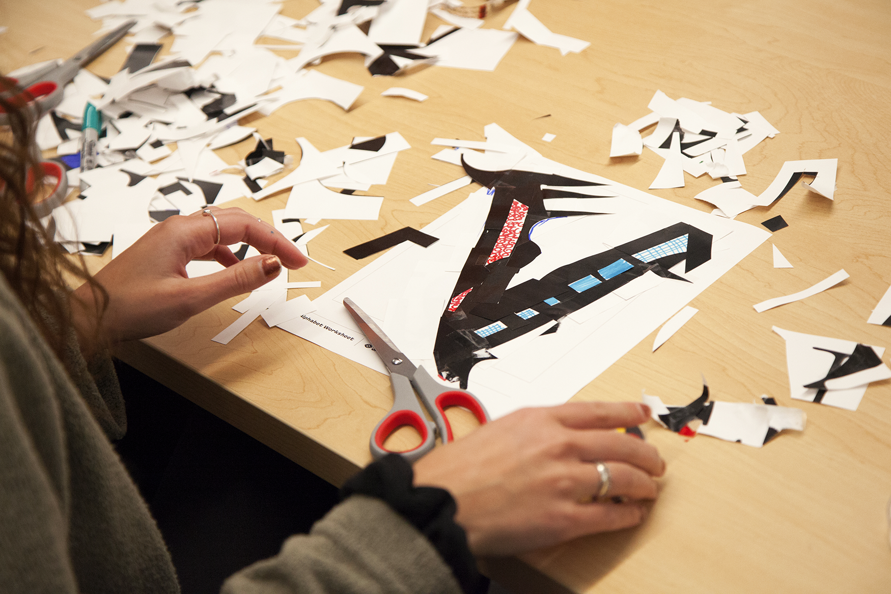
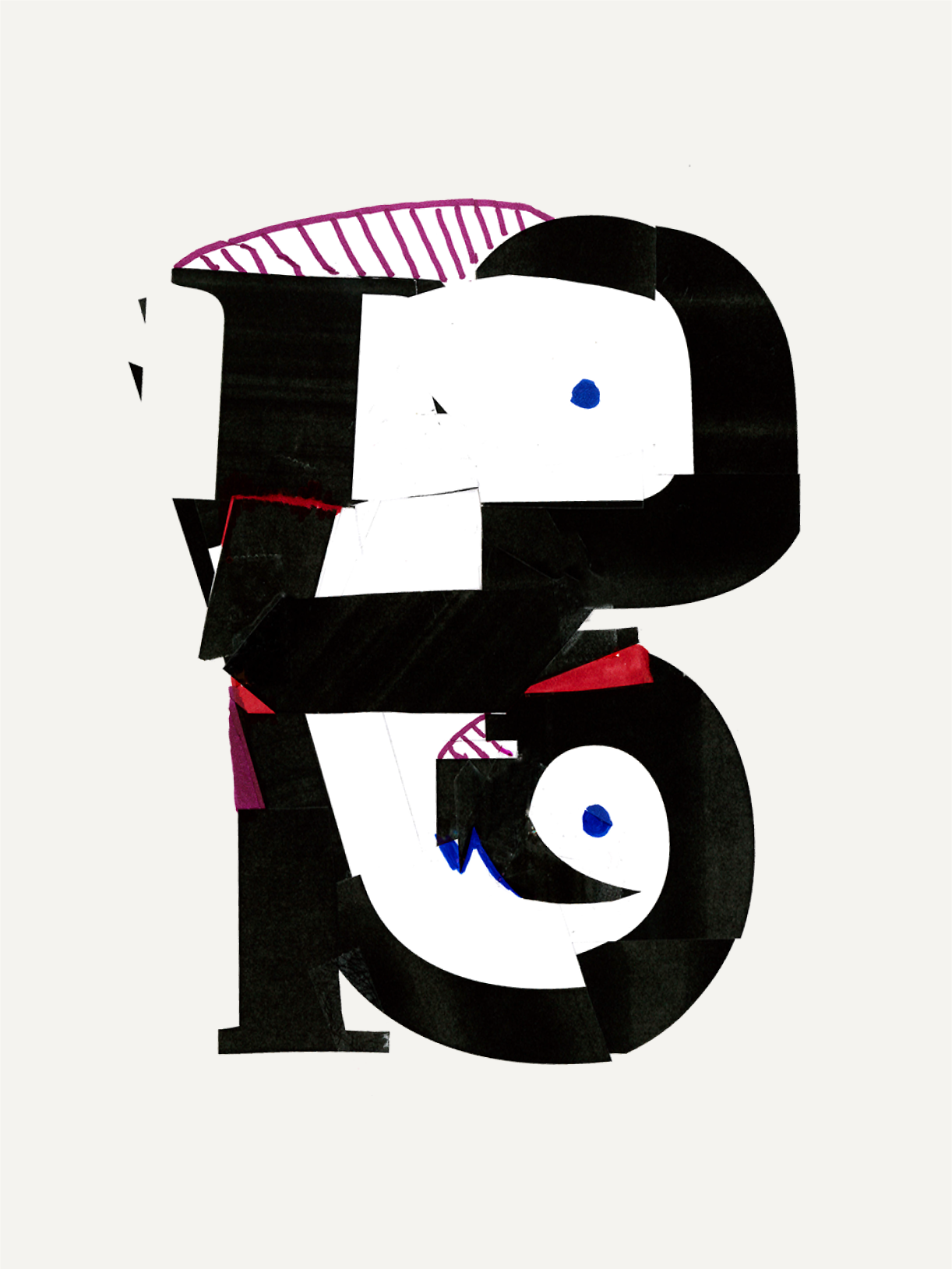
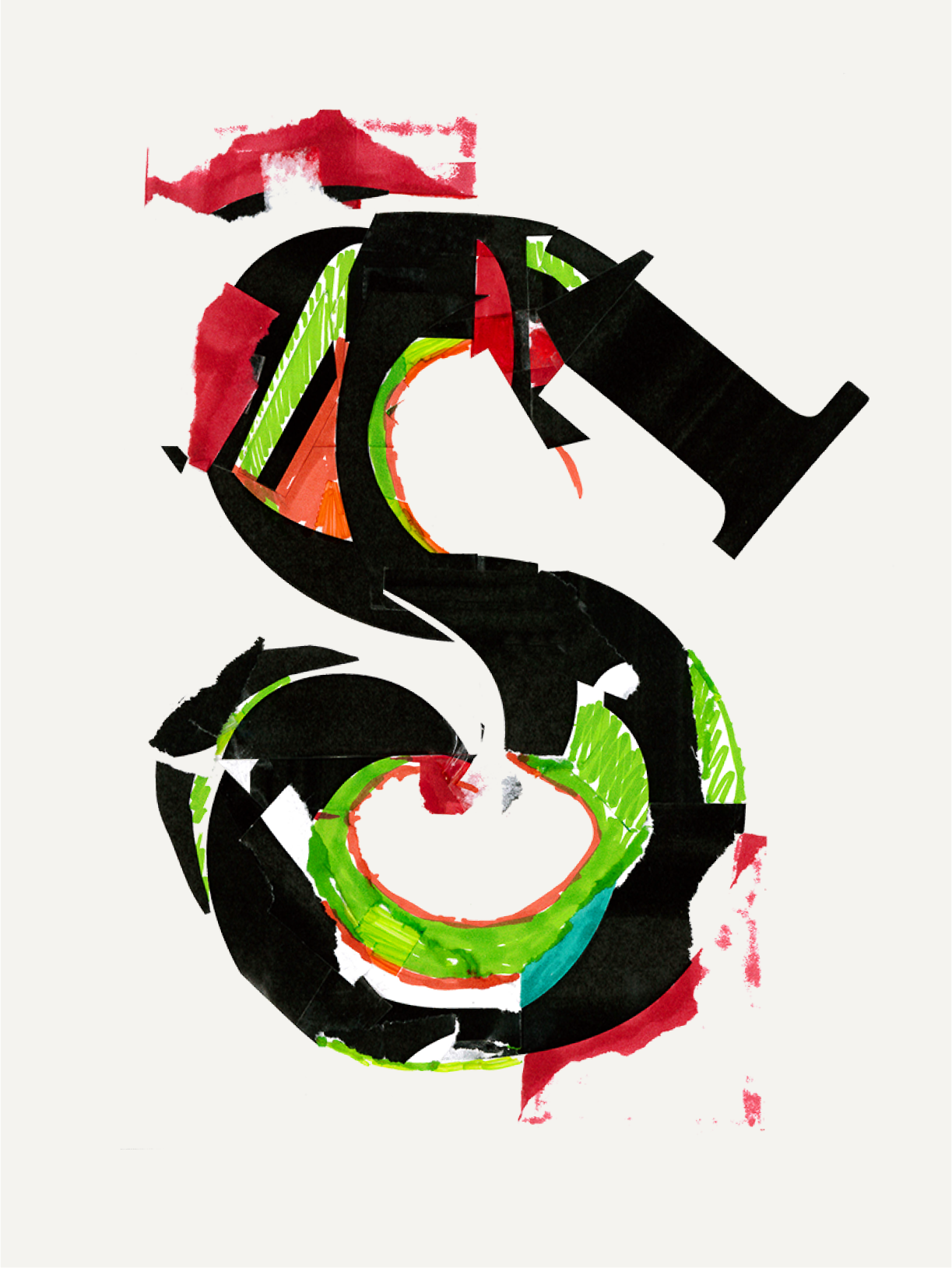
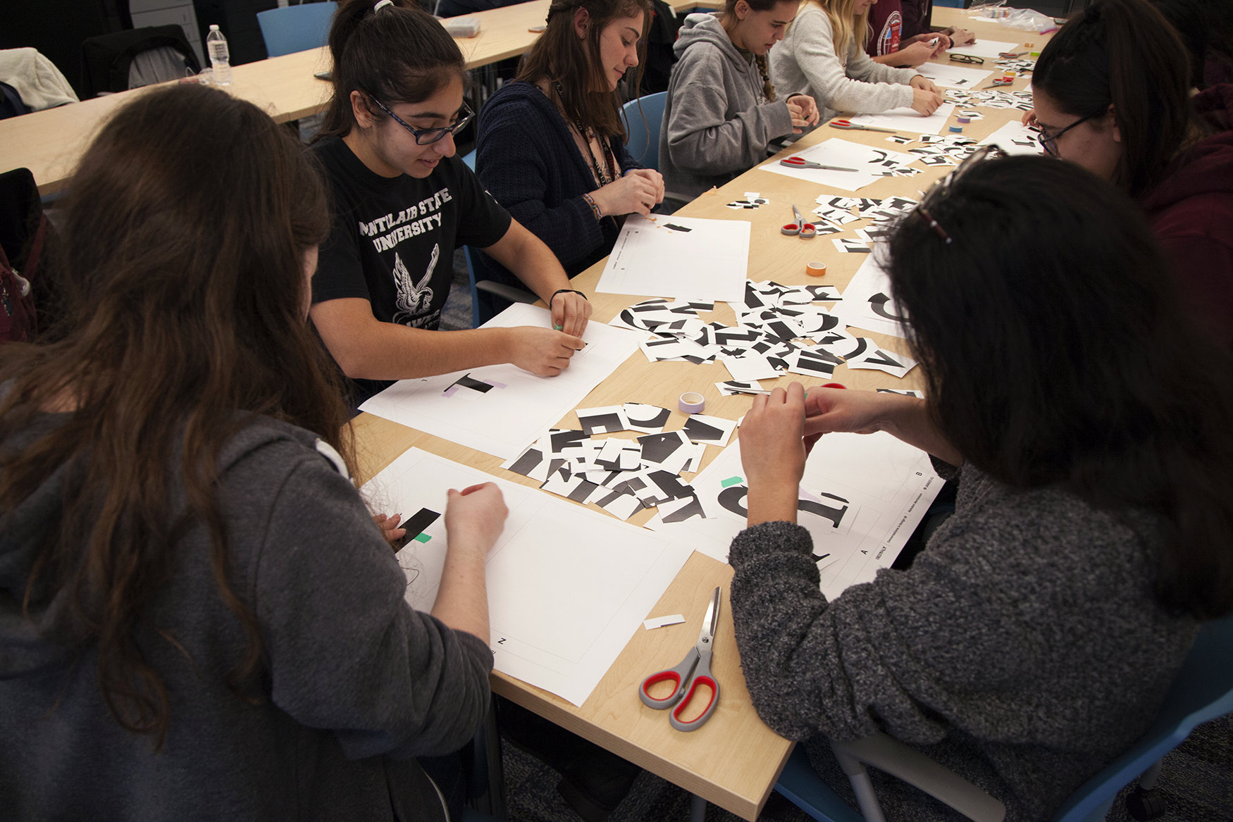
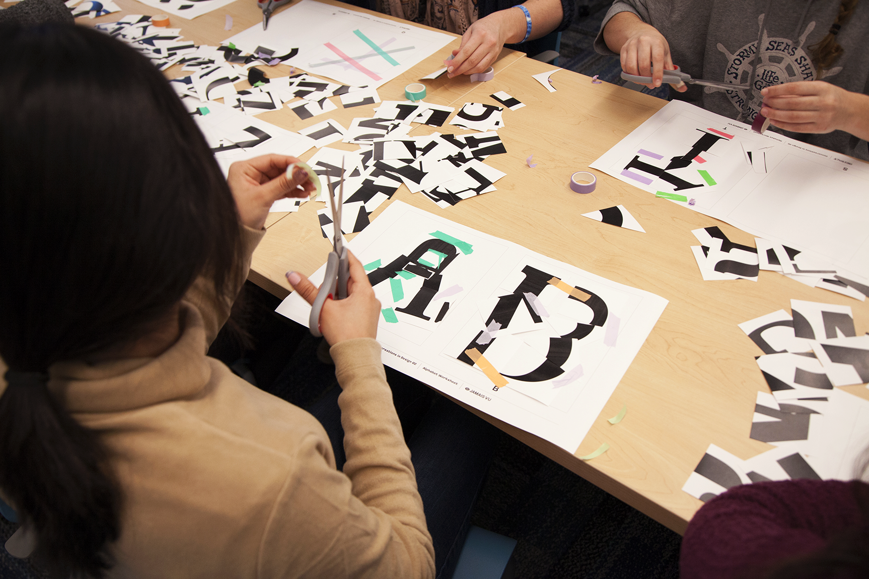
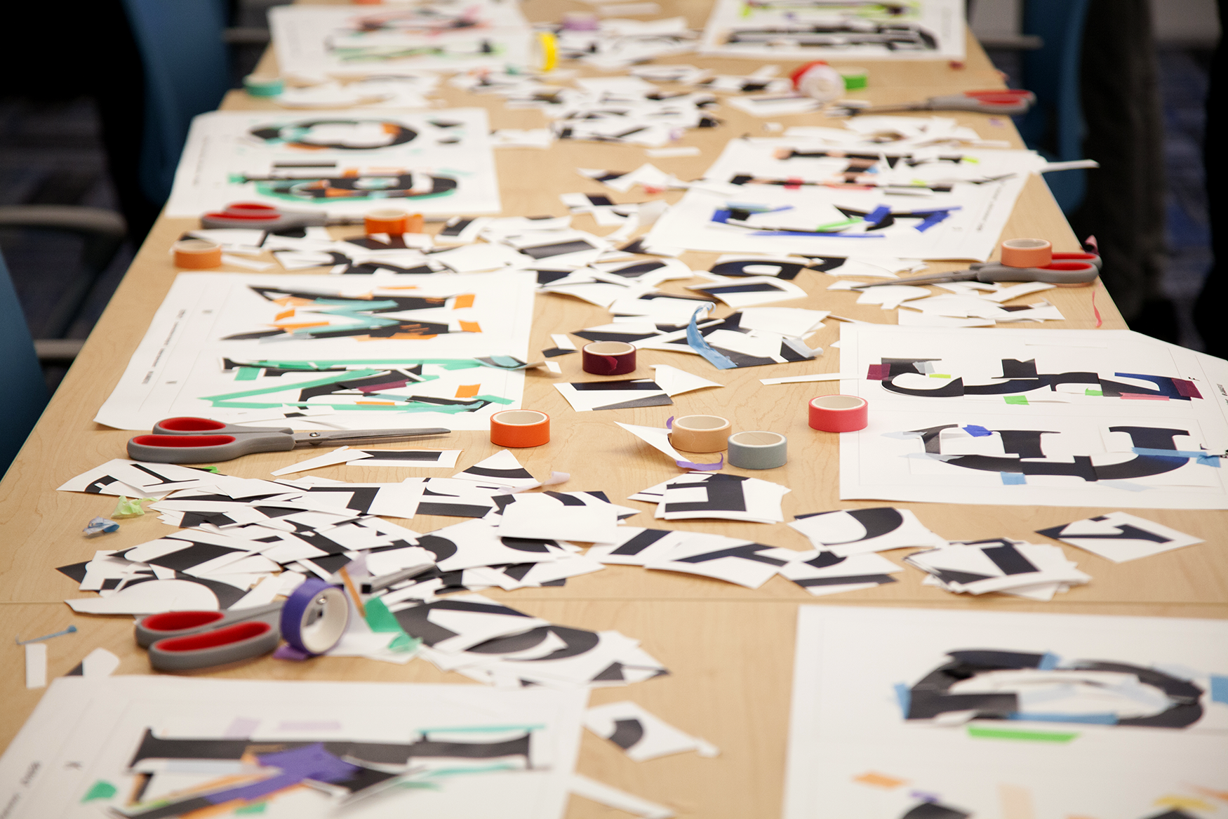
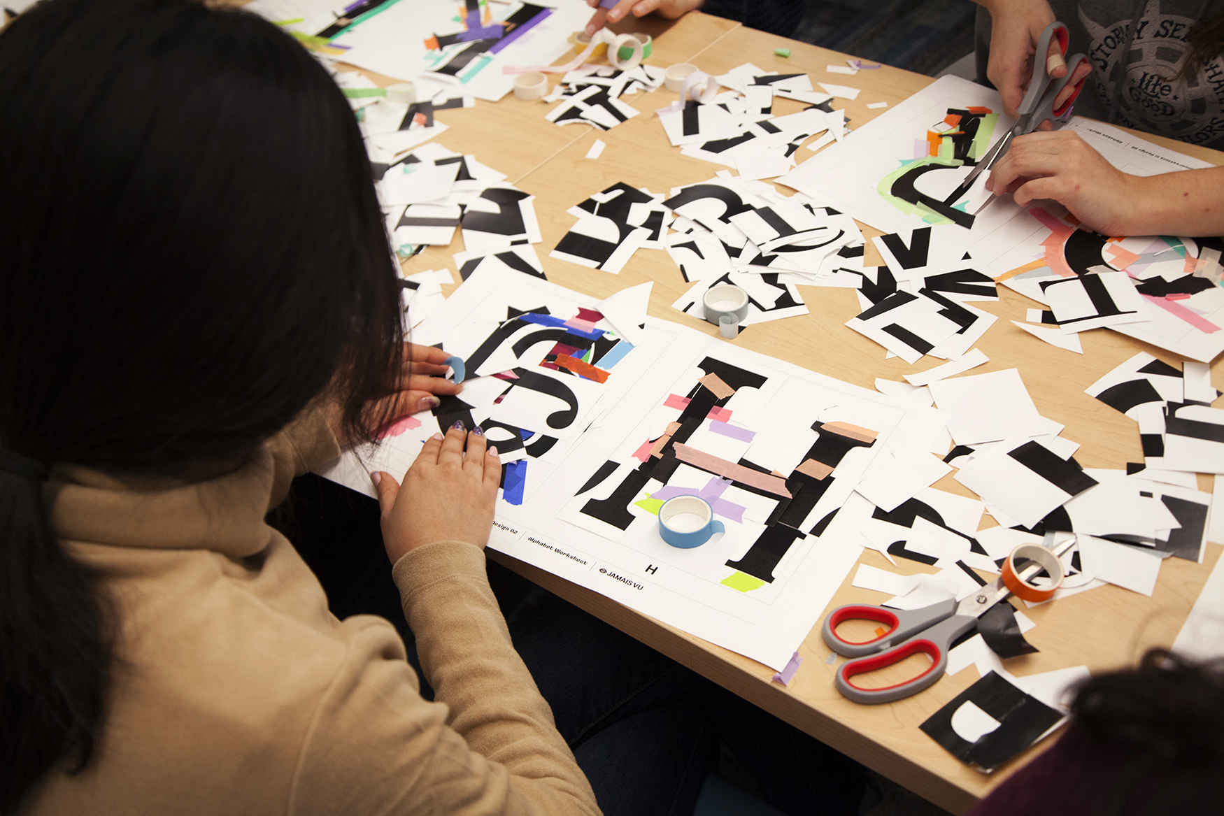
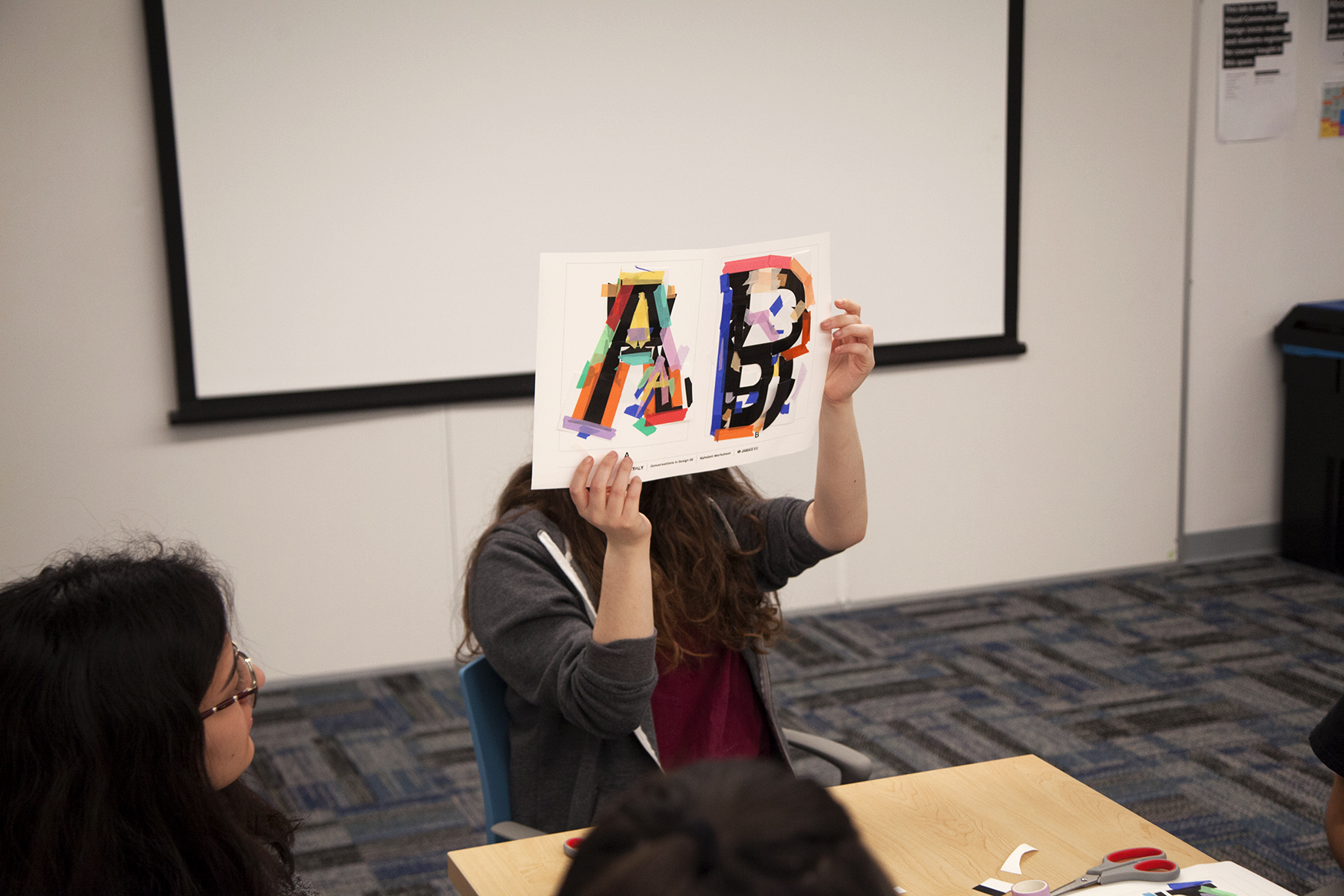
In line with the principle of Reification, the supplies for Session Three included hundreds of letterform fragments cut into 2x2 inch squares. The typefaces used were Akademie, Bodoni, Caslon, Clarendon, and Futura. As an additional twist, the two classes worked with slightly different materials; the first group was given 30 rolls of colorful washi tape to apply to their letters while the second group was given clear double-sided tape and sharpies. The students had two minutes to construct their letters and 30 seconds to tape down their work before all sheets were rotated around the table. This rotation was repeated until the class decided all letters were complete.
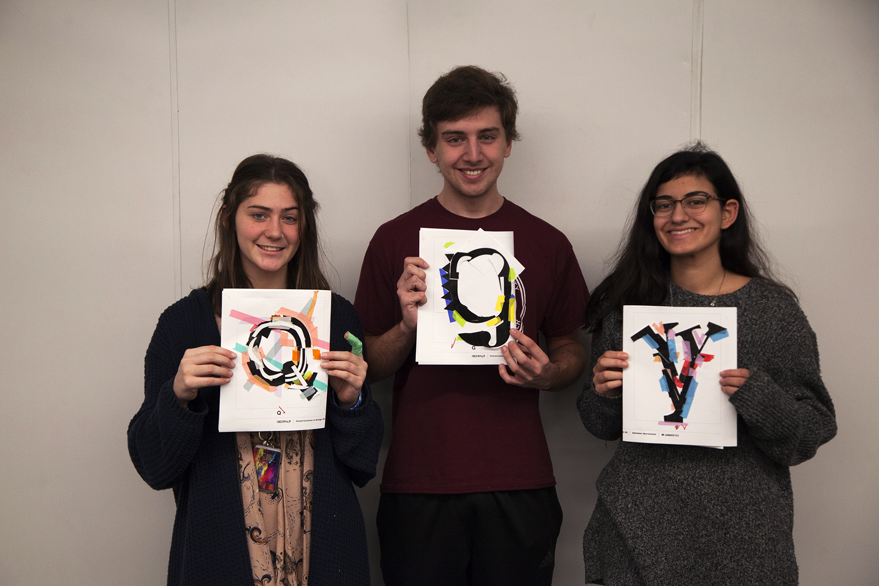
Prize packs consisting of a dozen stickers, a notebook, and a pin courtesy of Jeanette Pidi Design were given to three students from each class for exemplary letterforms.



Workshop A - Monday, 8:30a (Visual Communication Design freshmen students)
The morning class of eager freshmen gear up to create their first letterforms while Gestalt veteran Jeanette returns to assist the students. In addition to the chopped up letterforms, this first group was given 30 rolls of colorful washi tape; they had two minutes to work out their letterforms and 30 seconds to tape it all down before rotating around.








Workshop B - Wednesday, 11:00a (mixed bag of Art & Design sophomores, juniors, and seniors)
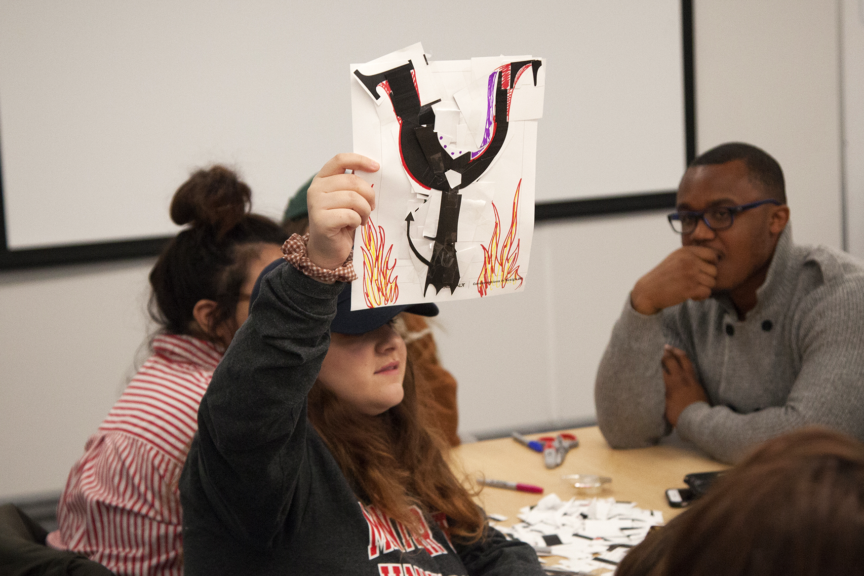
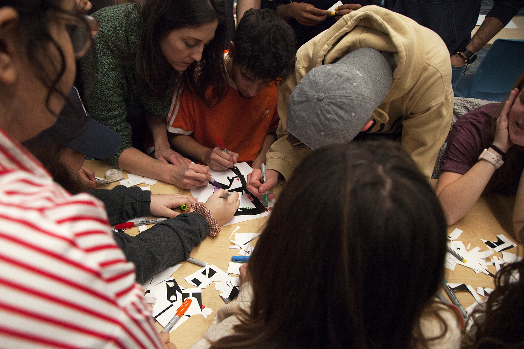
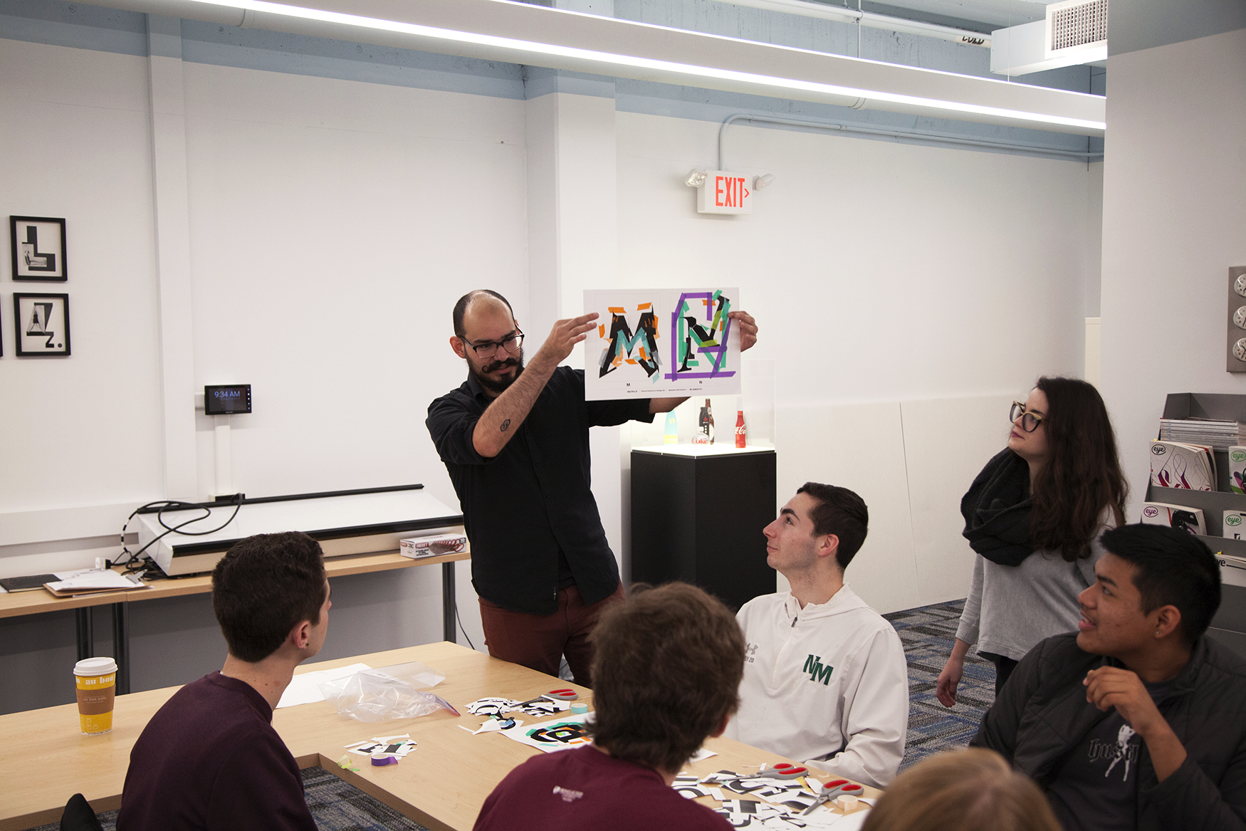
To mix things up with group two, they were given double-sided tape and a dozen colorful sharpies to work with. Unique to this workshop is that eventually the students would form small groups to finish off the few remaining letterforms towards the end. Eventually it was realized that the R sheet had been missing this whole time and the students were given five minutes to work as a group to assemble the final letter. They settled on the name “Demonic” for their alphabet.

