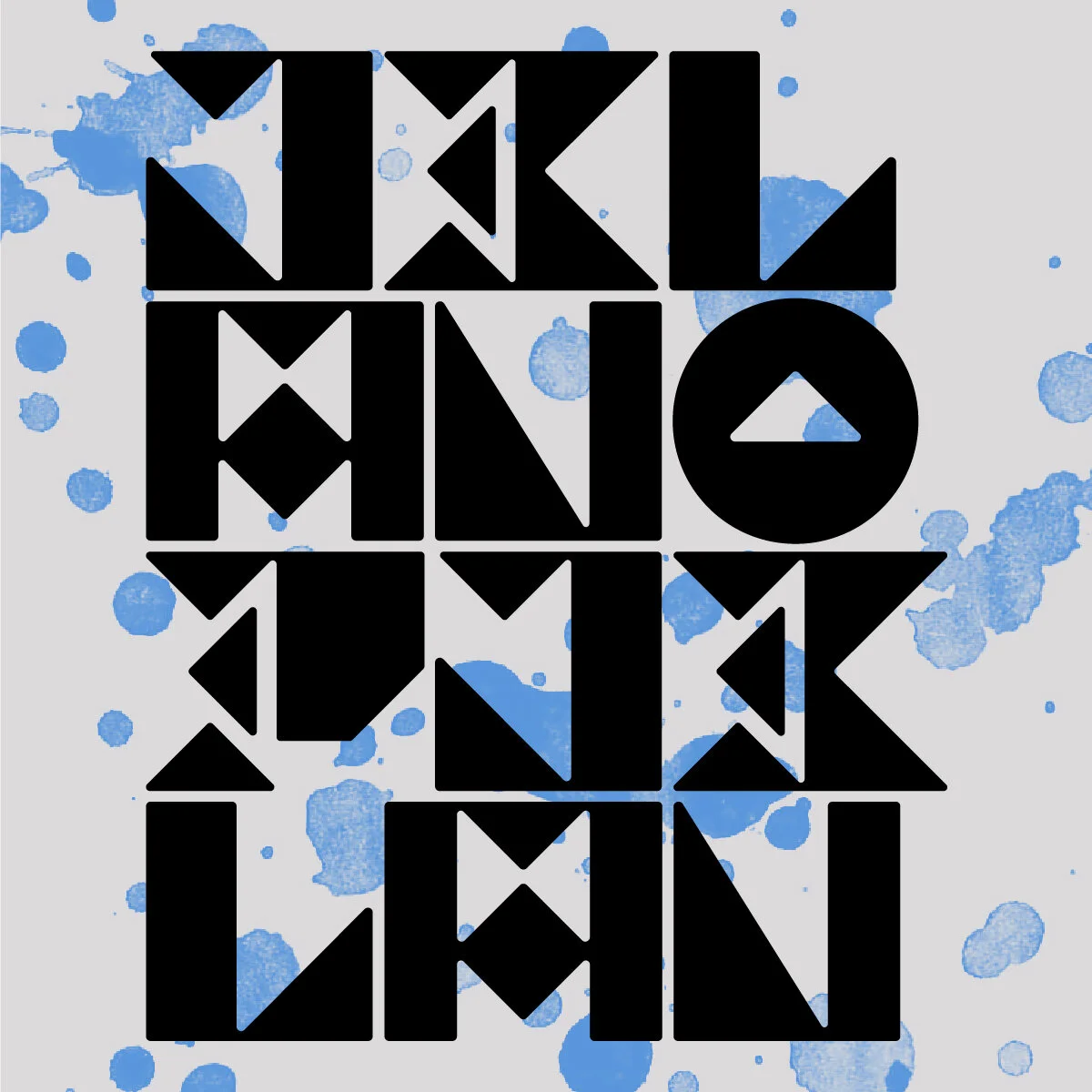
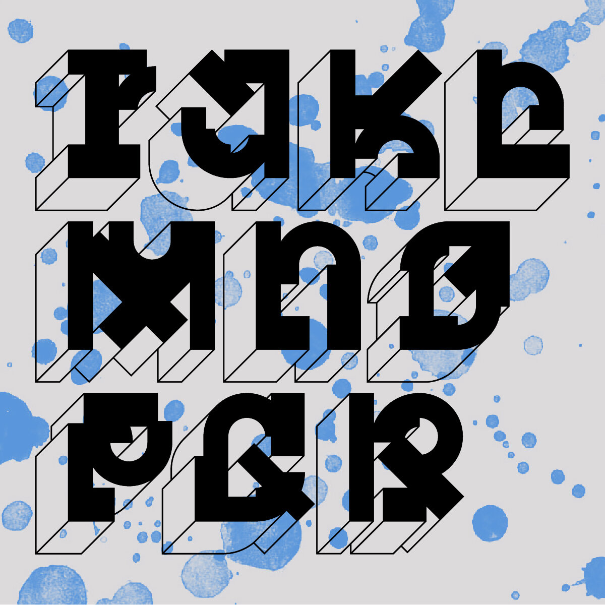
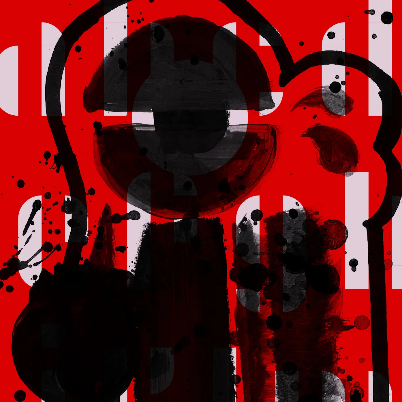
Jumping off of the Gestalt Quarantine Edition, the resulting 26 collaborative arts and crafts letterforms were used as inspiration to create functioning typefaces. Each Gestalt letter was translated into a typeface using its quirks and oddities as influences on the shape and style of the new type. From there, a full alphabet was designed based on this single character. 26 unique typefaces with 26 characters each, for a grand total of 676 characters.
Below are the A – N typefaces, in reverse chronological order.


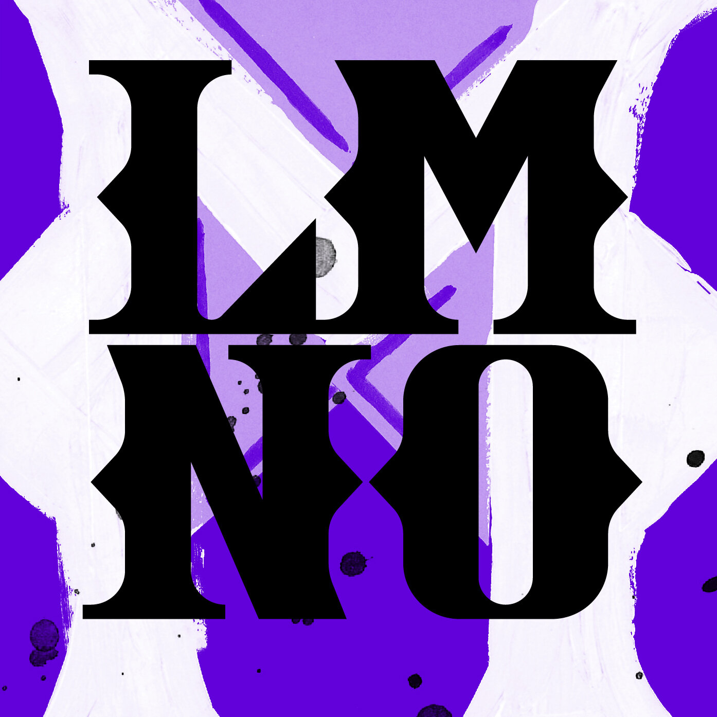
This odd pairing of serious and sans-serious display typefaces starts with an intense wedge-serif “M” sporting peculiar spurs and a little bit of a big attitude. Next is a childproofed “N” with rounded corners on all edges and something of an aversion to negative space; it’s chunky and playful and just a hair tantalizing.


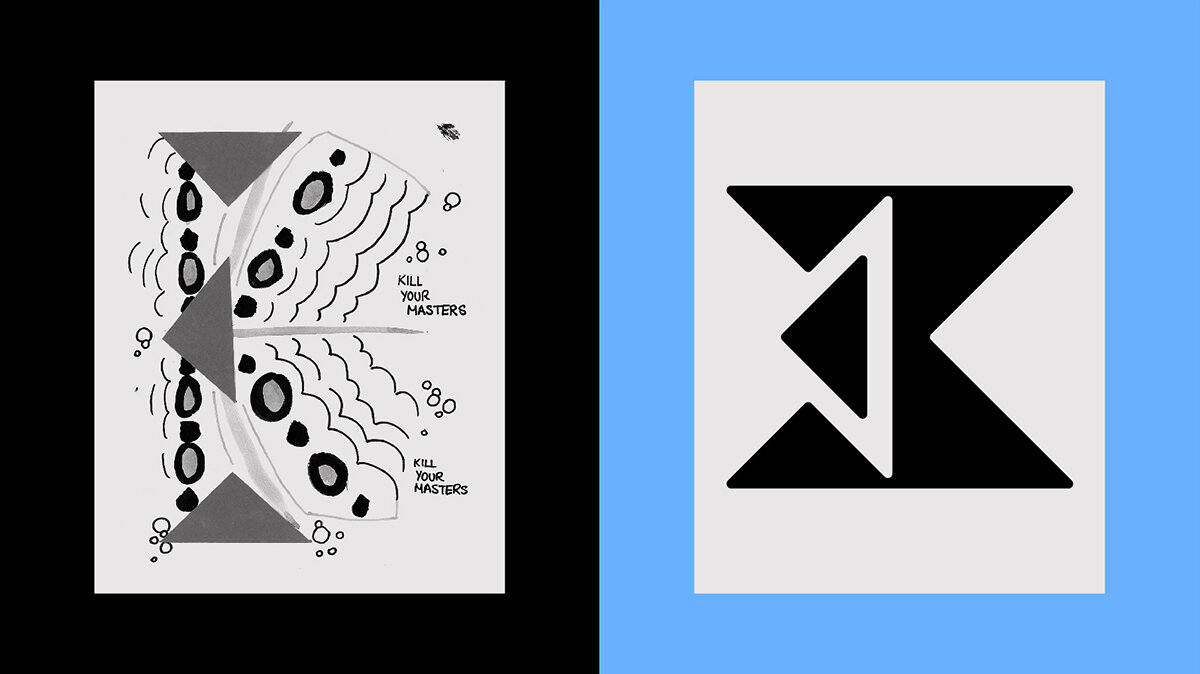
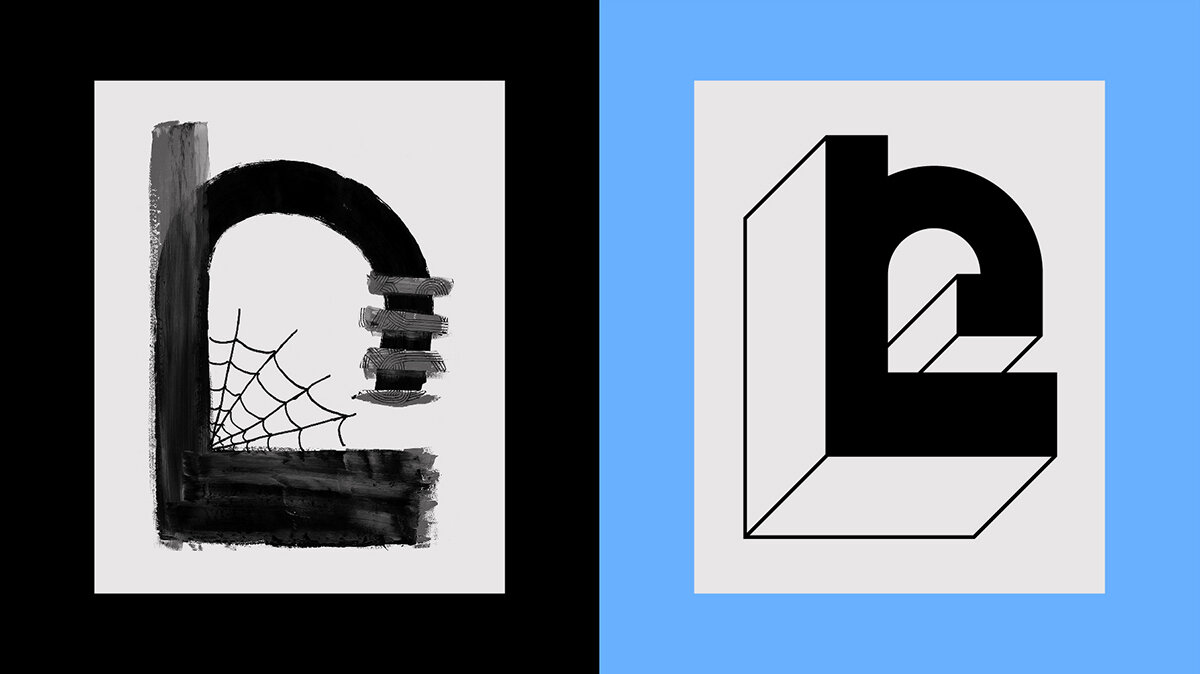
The structure of the “K” was formed from a trio of triangles and a smattering of dots, which creates an oddly geometric typeface consisting of only 45 and 90 degree angles. The “L” started it’s life as a J due to a misunderstanding on what letter was being drawn, but it transformed into a cobbled together system of type based on simple cut-out shapes, akin to building blocks.


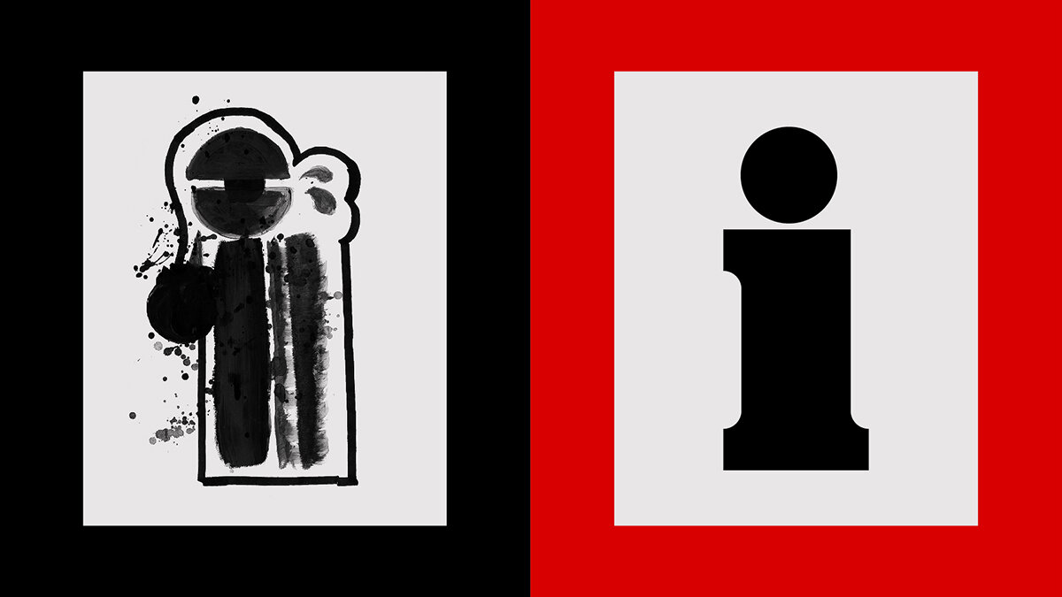

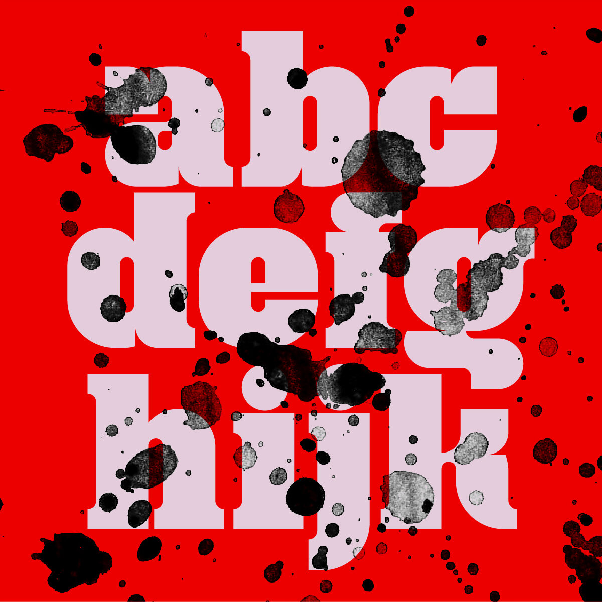
The Orwellian Big Brother “i” developed into a stern and serious slab serif (#alliteration) harboring a hidden whimsical side. The bonus eyeball-tittle is available as an alternate character. For the J, by extracting the negative space, you are left with a very modular Bauhaus-inspired stencil face that packs a lot of personality into what is essentially two shapes.


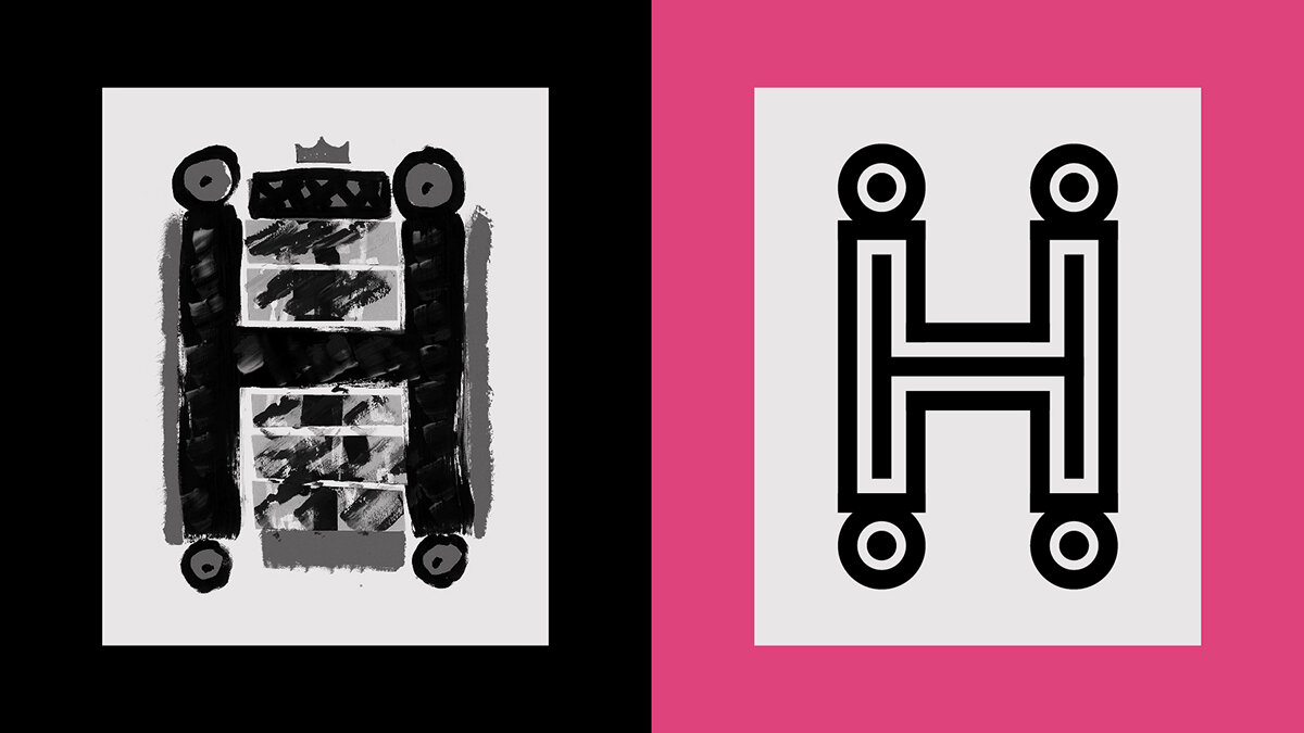
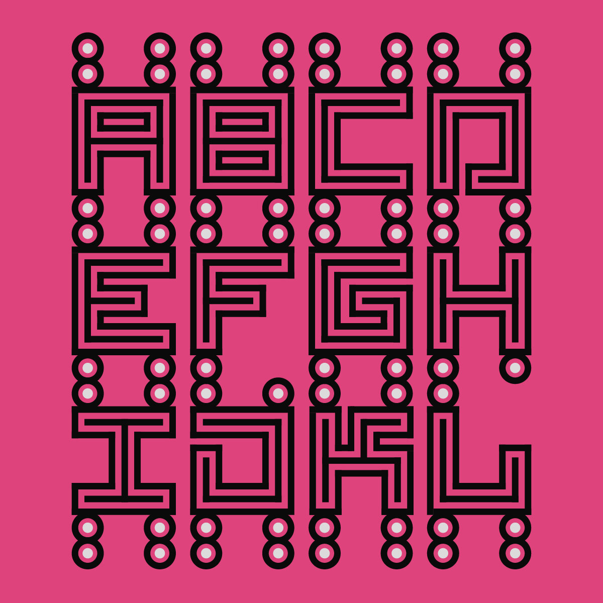
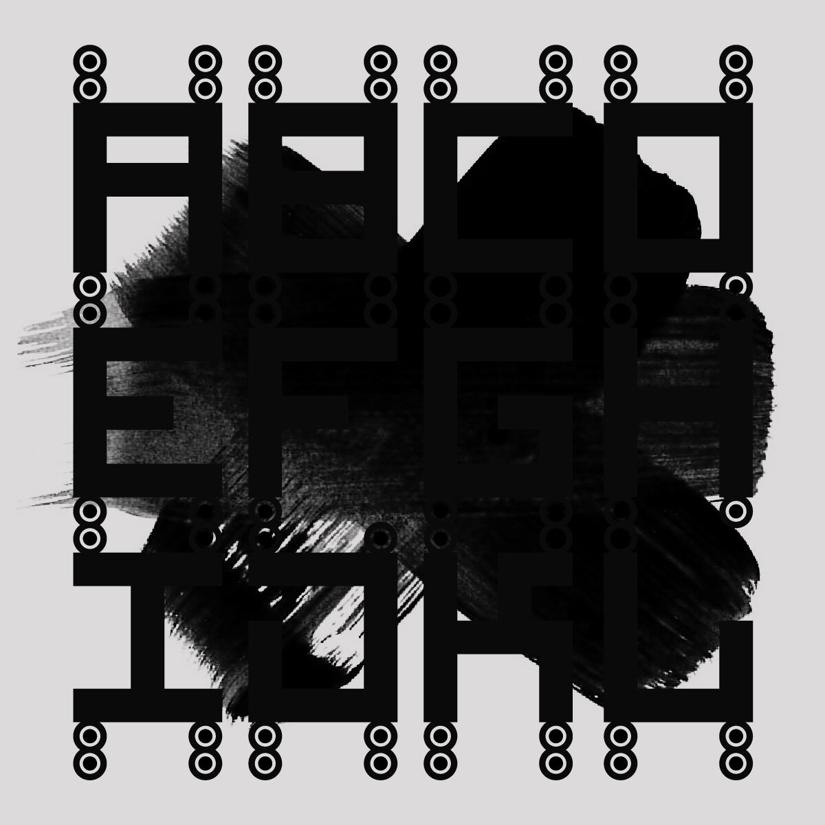
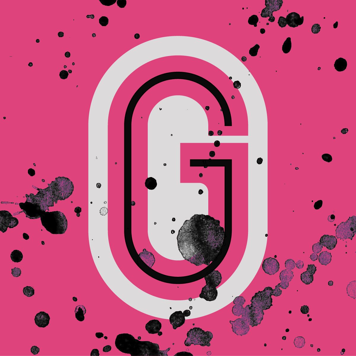
The “G” was constructed as a three-layer character: a solid pill shape envelopes a thin neon-like character surrounded by negative space forming an additional G. The “H” informs a set of blocky Jurriaan Schrofer-inspired letters, each sporting a pair of frog-like eyes taken from the source collage.


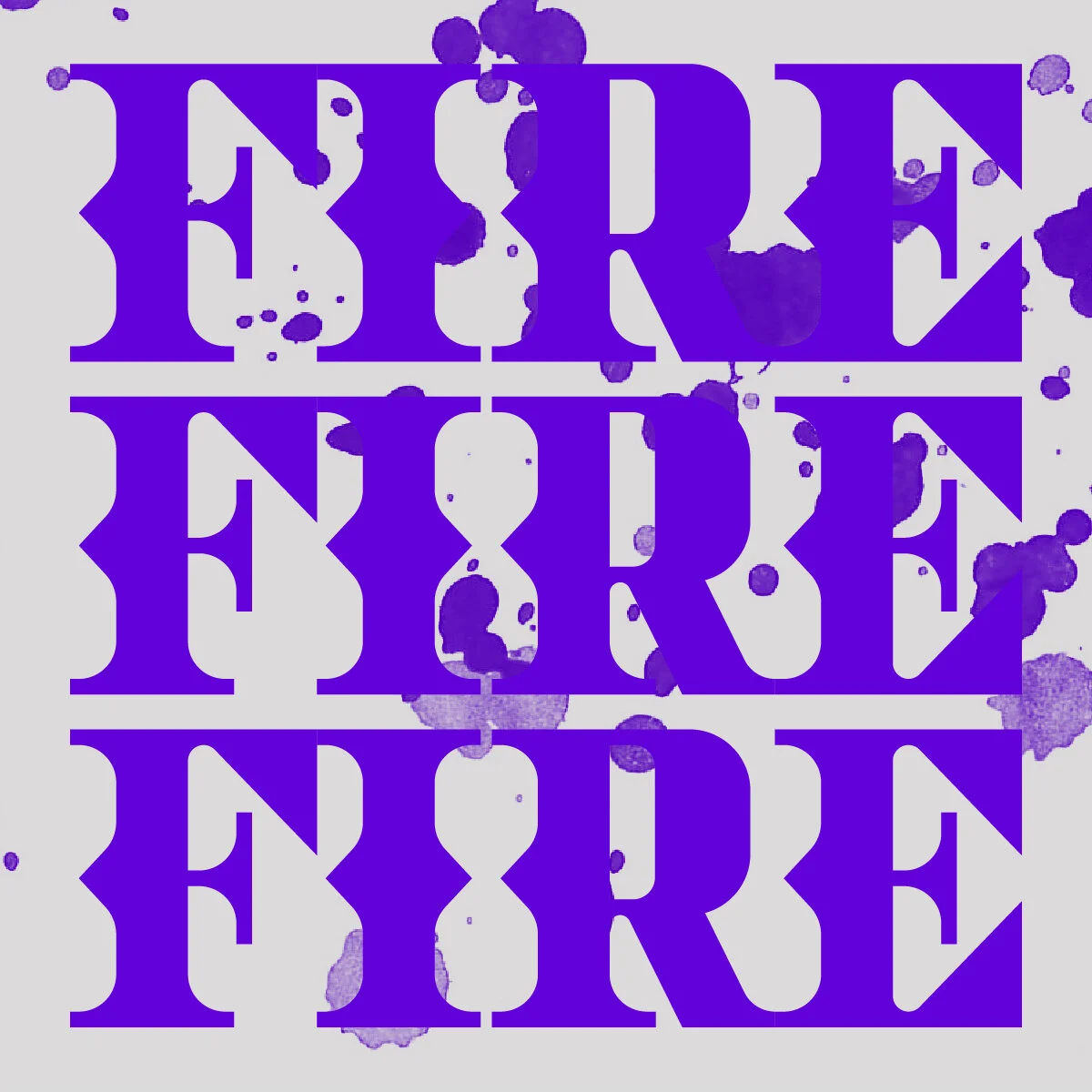
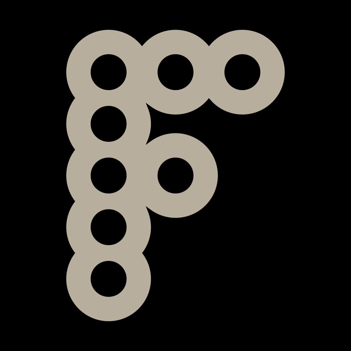
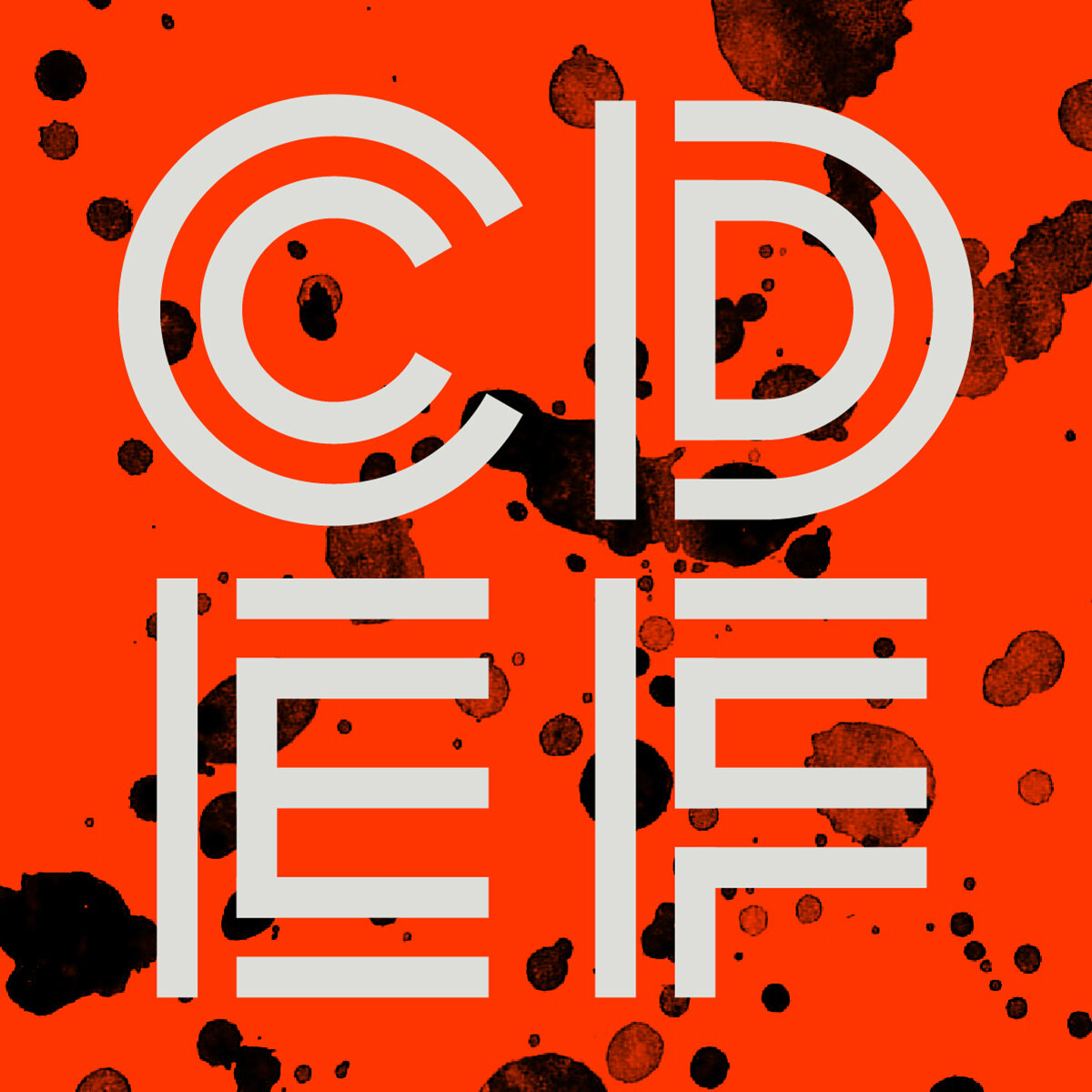
The “E” is about as geometric as you can possibly get – a blocky semi-stencil font that’s brutalist with a hint of aviation and futurism. The “F” is bubbly and elementary; reminiscent of a classic childhood toy, the Lite Brite. This type is based on a grid of overlapping circles inspired by the collage F letterform.


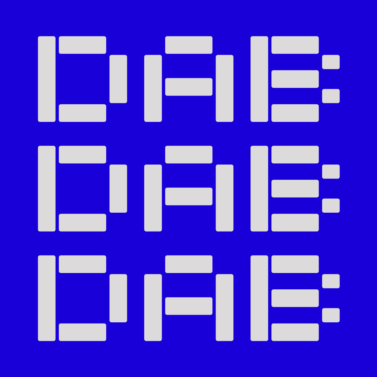
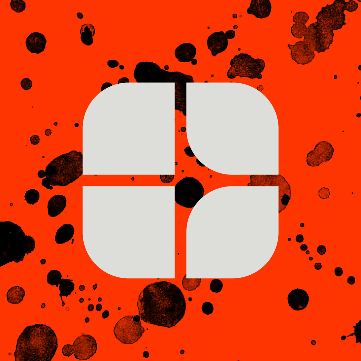
The double-outline “C” is directly translated into its typeface form, creating a system of letters encapsulating smaller versions of the letters within, like a protective suit of armor. The multiple overlapping triangles and harsh geometry of the collage “D” provides the structure for an expressive modular system of letters made from basic shapes.


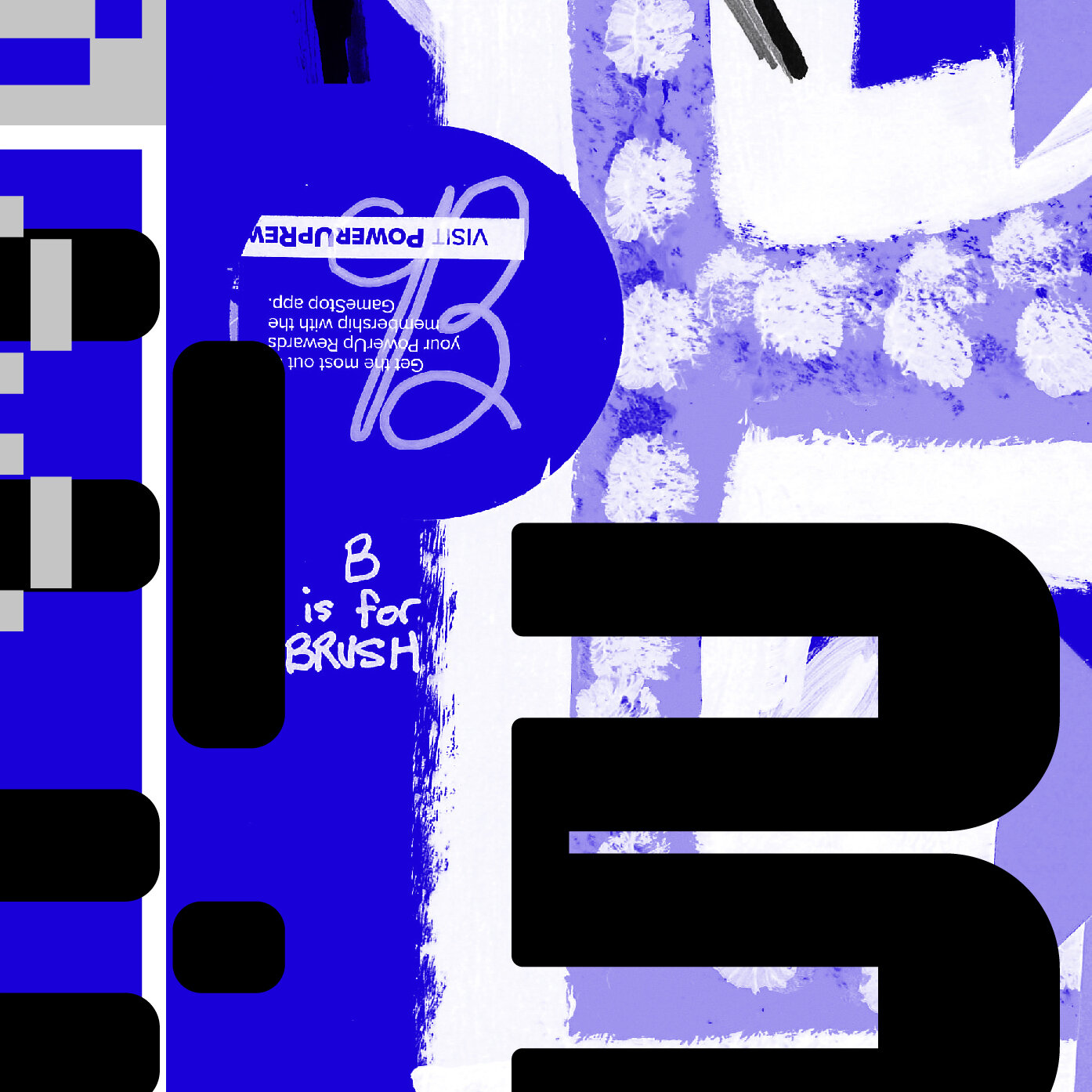
Breaking down the collaborative “A” reveals a unique repeating pattern of rectangles, inspiring a funky, retro 8-bit font that can be rounded into a neo-futuristic set of letterforms. Inspiration for the “B” comes from the right-side of the collage, which features multiple overlapping shapes. This translates into a lopsided set of characters where the stress was put on one side of the character, leaving the other side open and airy.