
Conversations in Design 02
Gestalt! A Study of Communal Typography
Identity | Print | Type Design | Workshops
Conversations in Design is a series of papers created to discuss obscure, irrelevant, paramount, anecdotal, and untold stories in the world of graphic design and visual culture.
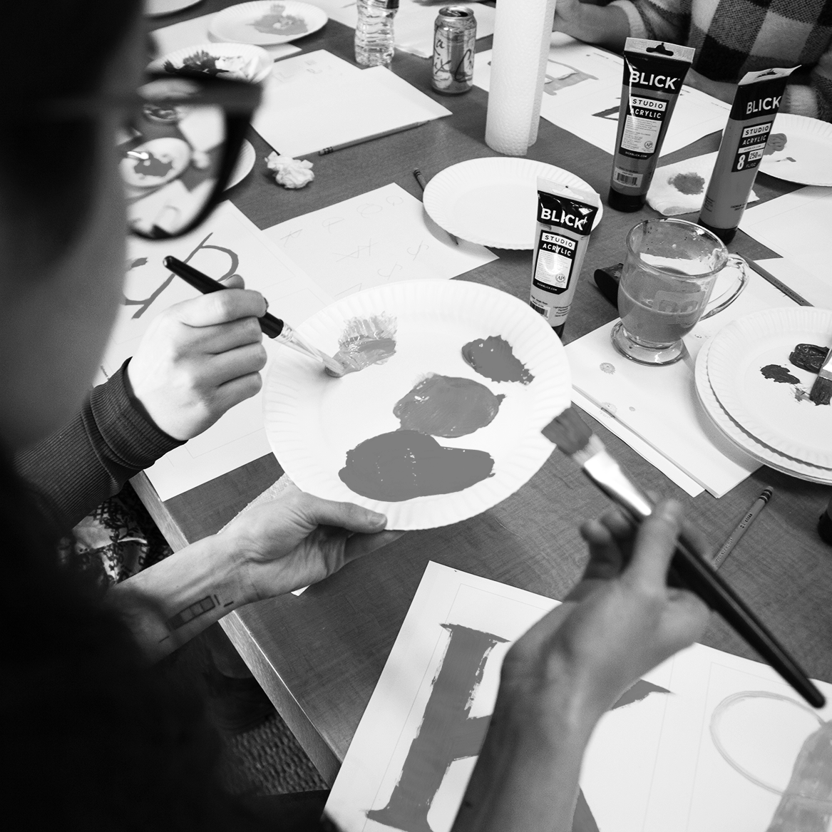
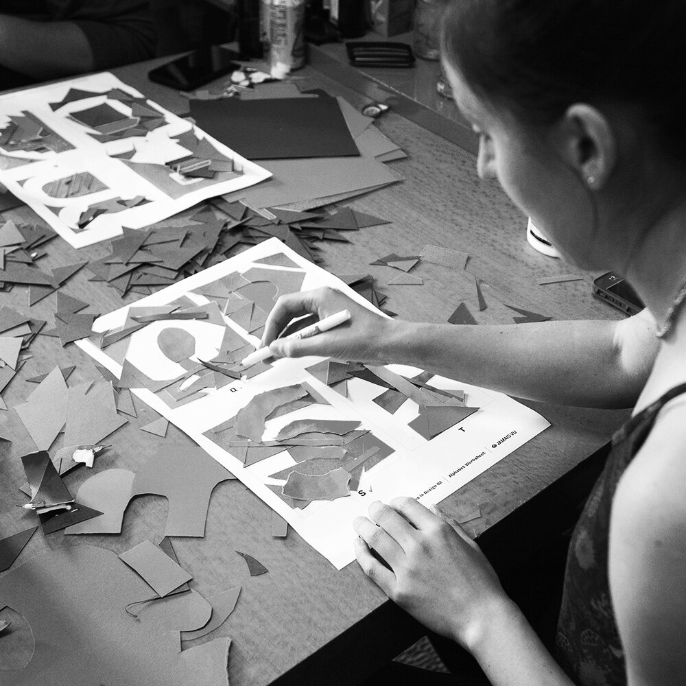
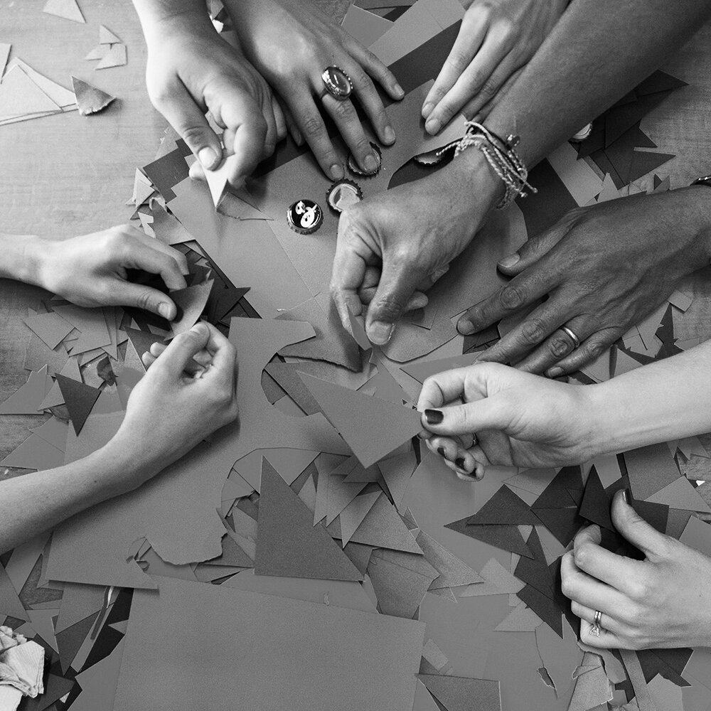
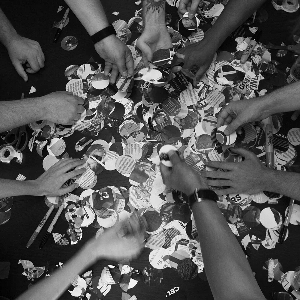
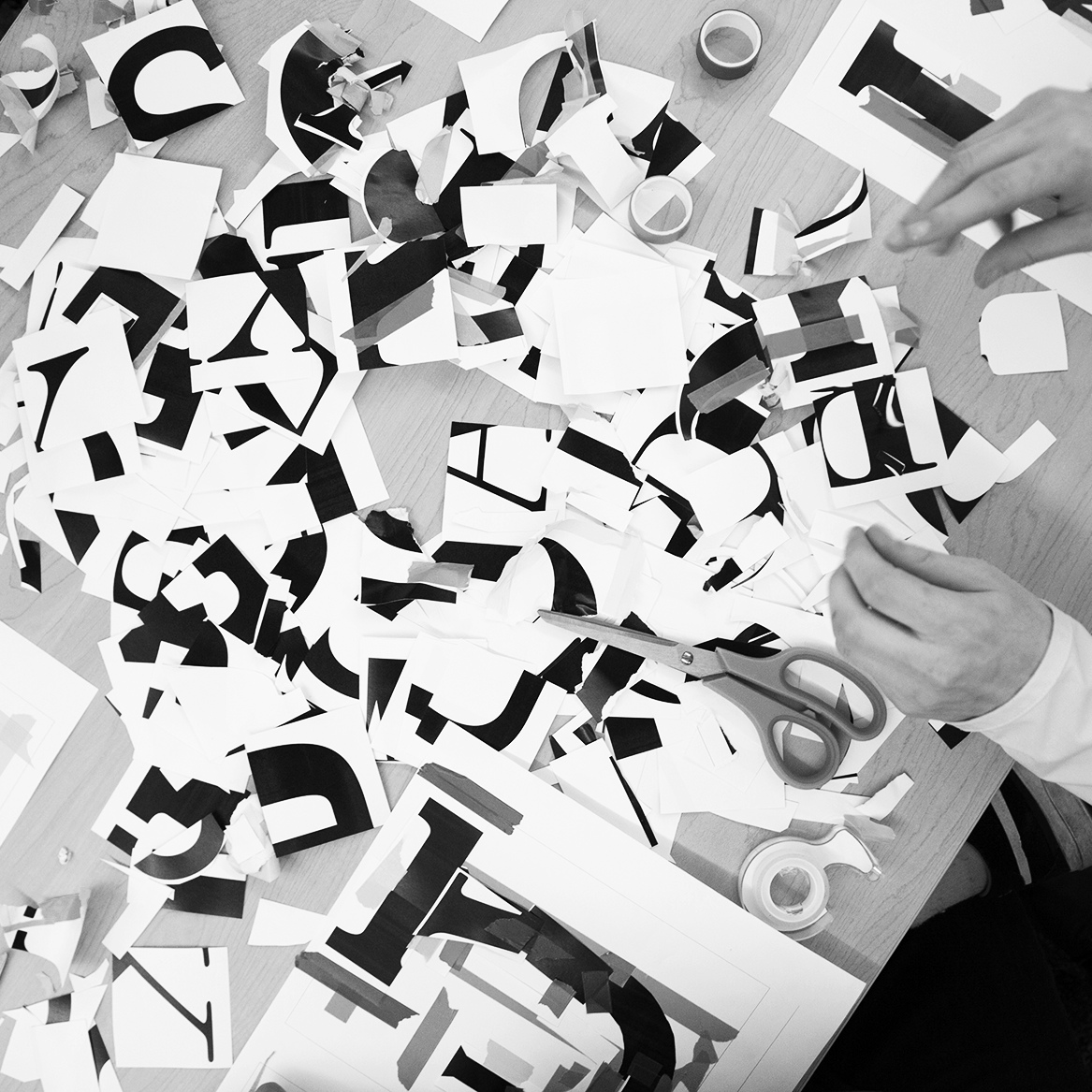
The second paper, "Gestalt – A Study of Communal Typography," documents work sessions with groups of designers working together to create unique typography. Four hands-on workshops were planned where designers would build a communal alphabet using only a limited set of supplied materials within a strict time limit. All other choices remain up to the group. No rules, anything goes.
This 40-page paper is a culmination of the entire Gestalt project, and thoroughly documents all final typography, discusses the lessons learned, and studies the way designers react to certain restrictions and freedoms.
A full breakdown of each session, including photos from the in-progress workshops and the final letterforms, can be found on the Workshops page.


The front and back cover share a dynamic relationship with their typography: the Gestalt logo on the front is gradually reduced as it moves away from the center, while the logo on the back inverses that relationship. The custom gestalt typeface is also split between the front and back, enforcing the theme of reification.
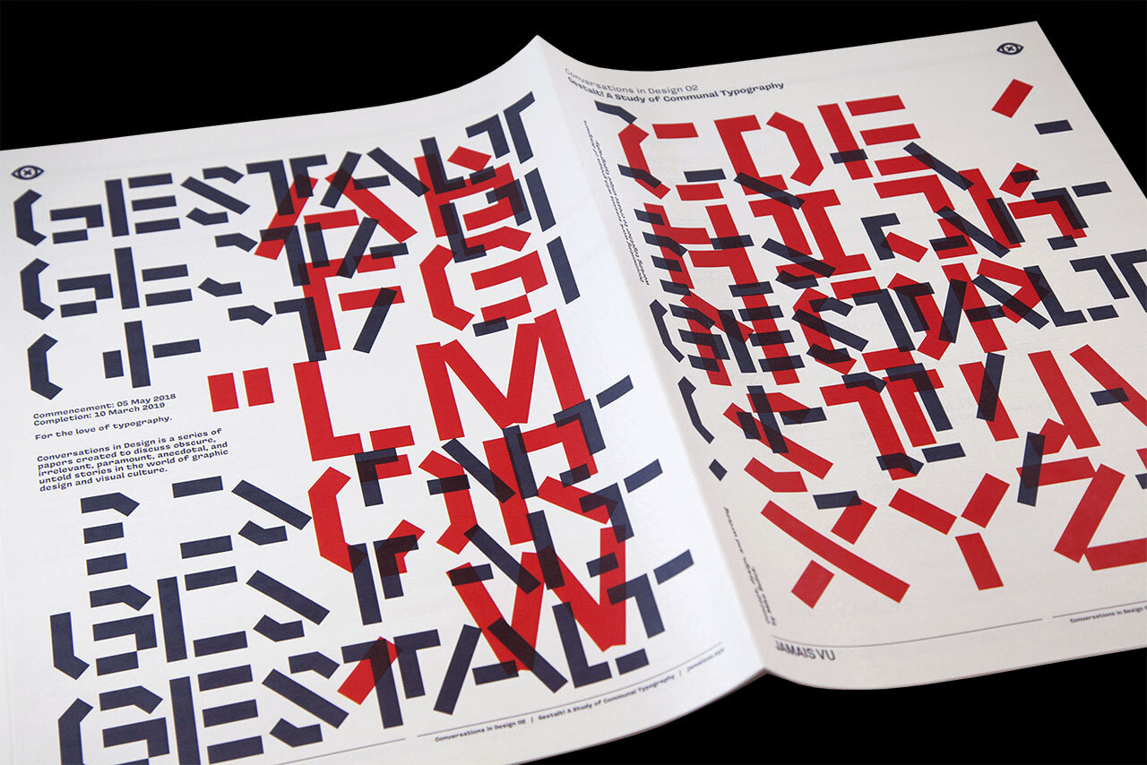


Only two typefaces are used throughout the Gestalt paper. The first is a stencil-like display typeface created specifically for this project. It was designed as an embodiment of the philosophies of gestalt; it consists of letterforms made up of smaller rectangular shapes that on their own are meaningless, but when merged together create the characters of the alphabet. The other typeface used is Covik Sans by Ohno Type Co, which compliments the project beautifully.
Pairs of bookmarks were created and eventually affixed to the red acetate slip covers.


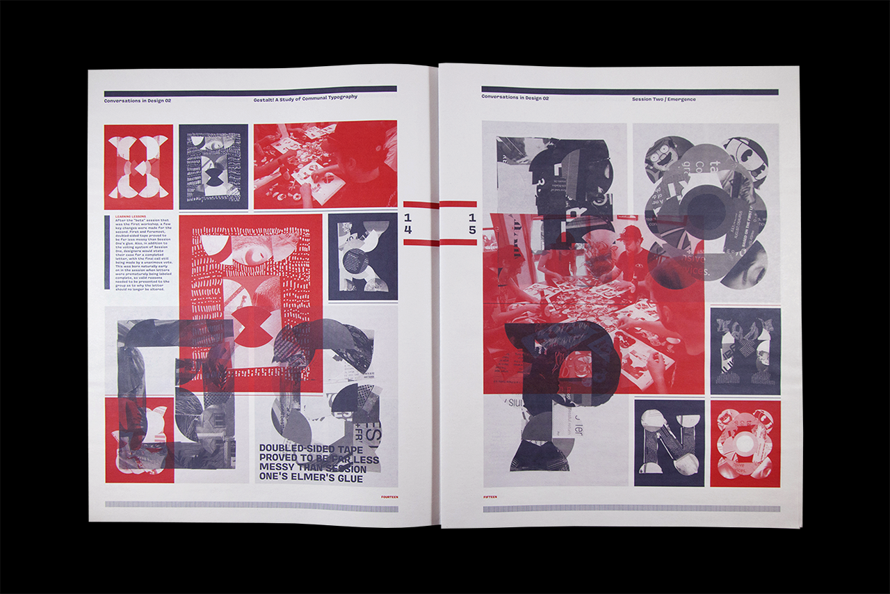


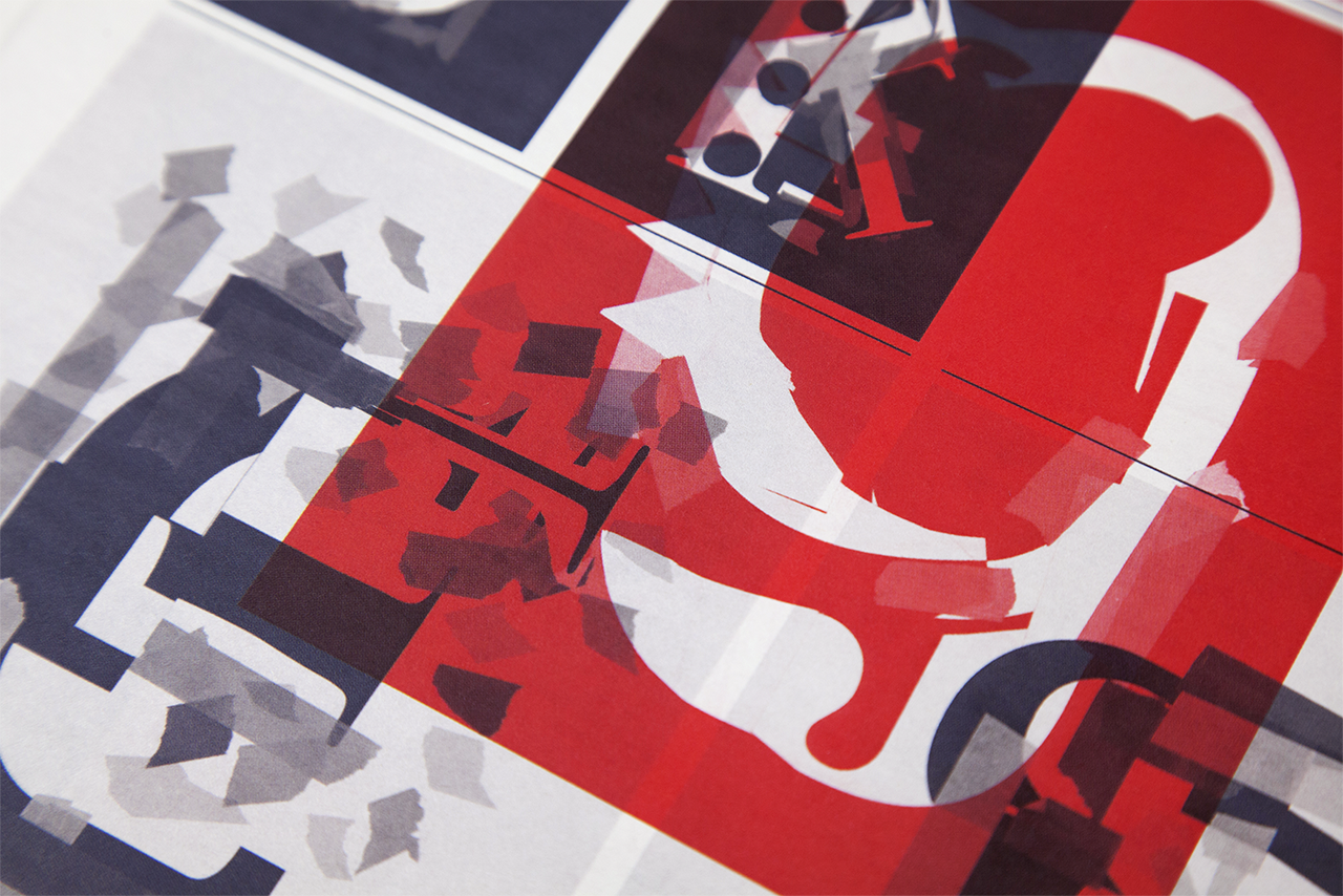
Each spread overlays various completed characters from the gestalt alphabets in reference to the principle of multistability. The four main principles of gestalt were kept in mind when designing each part of the paper. Overlapping many elements is a visual theme carried out through the whole project.
The red acetate slip cover was added as the “cherry on top” of the piece. It reinforces the theme of transparency within the workshops, where all creative output from the project was shared well in advance to the final printing of the paper. It also makes it stand out on any bookshelf.