
2019 Typefaces
Type Design | Posters
The Bike Chain, Spilt Milk, and Bureau Mosaic typefaces were based on three distinct eras of design: 90s dot matrix, 60s psychedelic, and 50s brutalism, respectively.
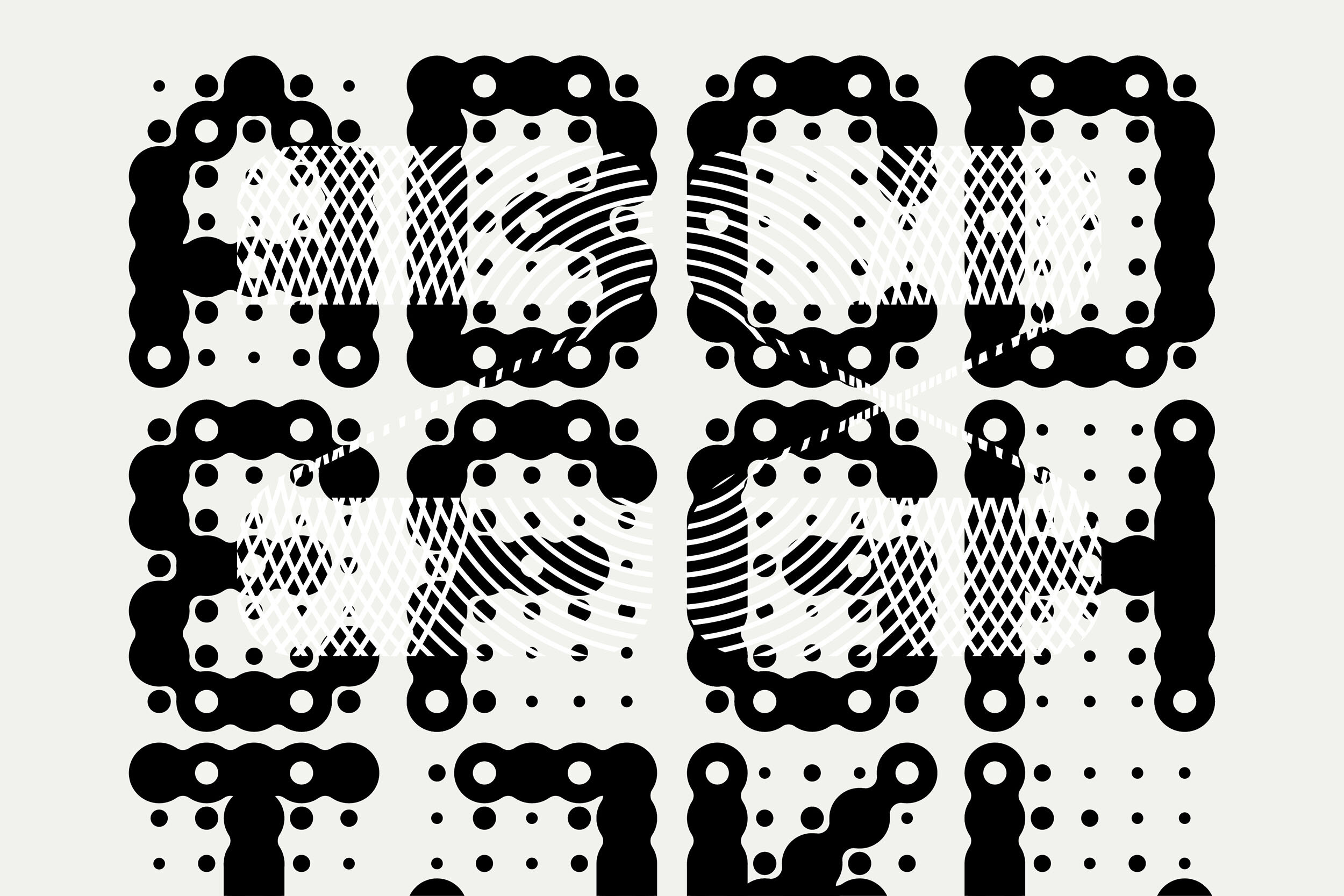
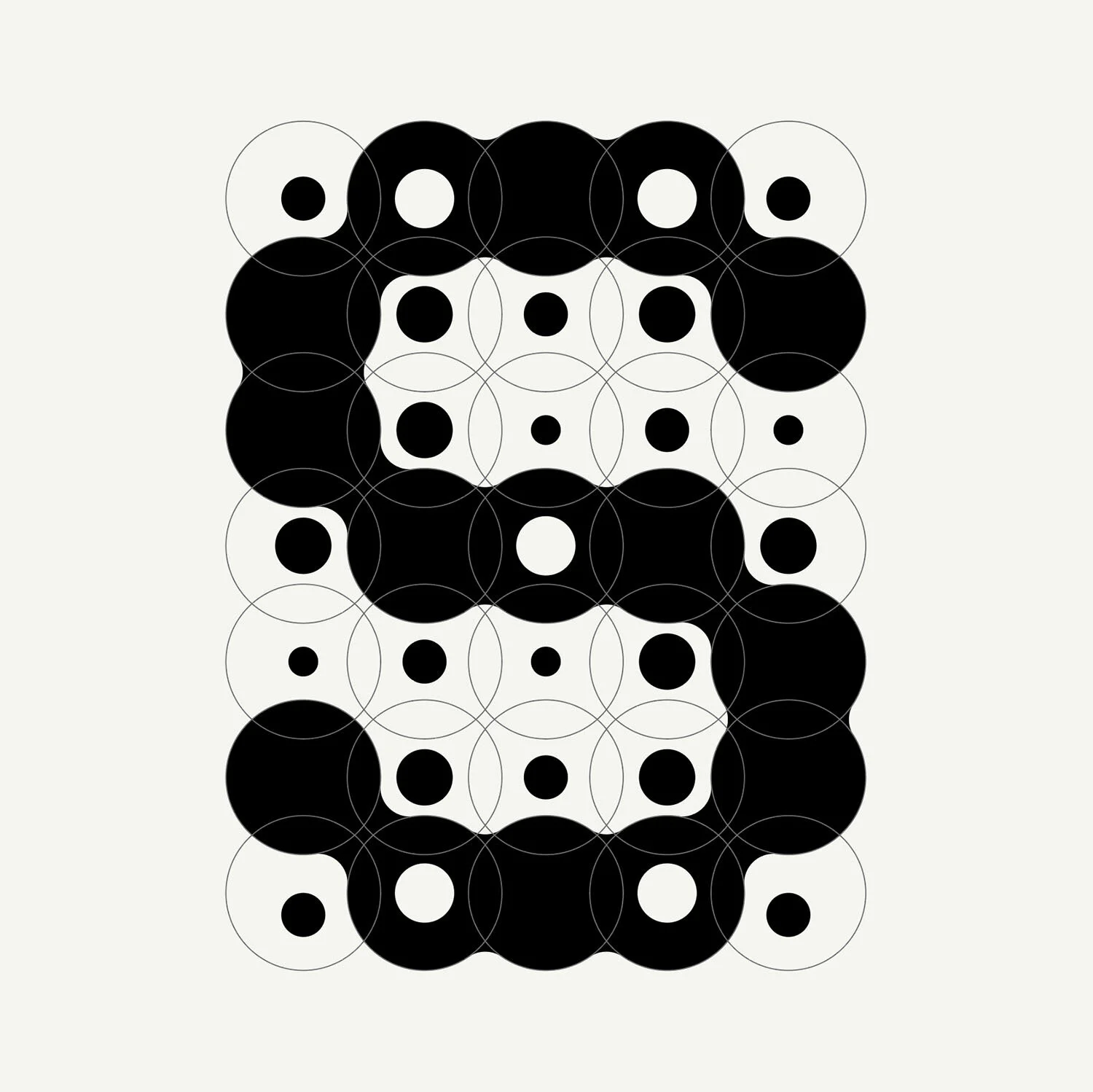
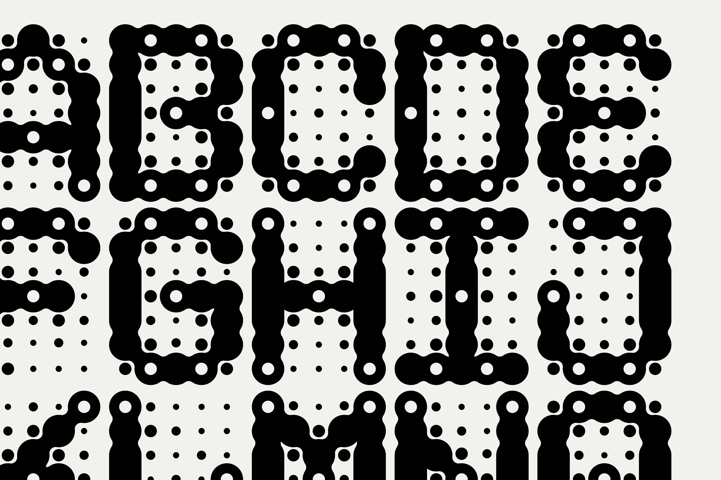
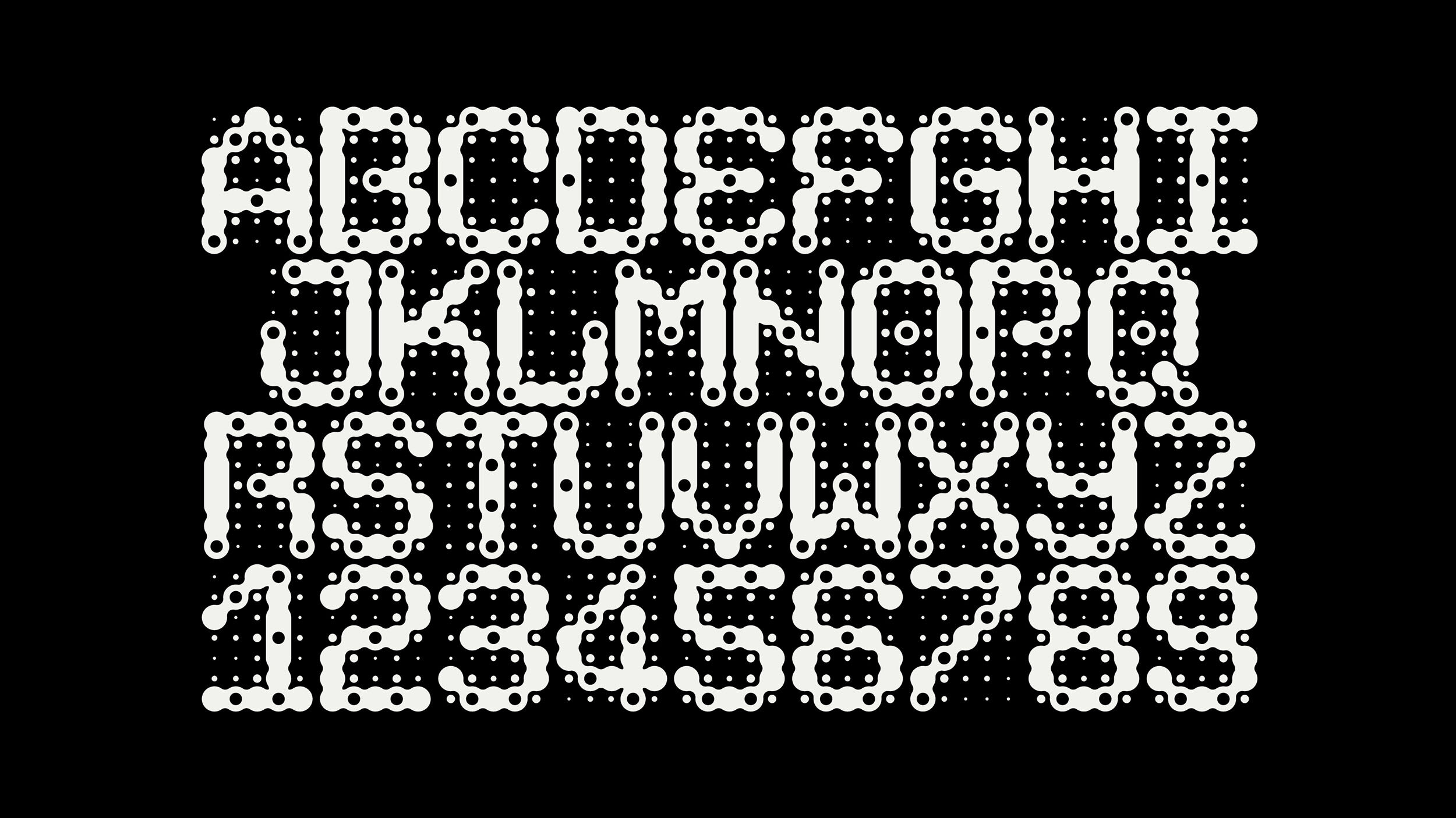
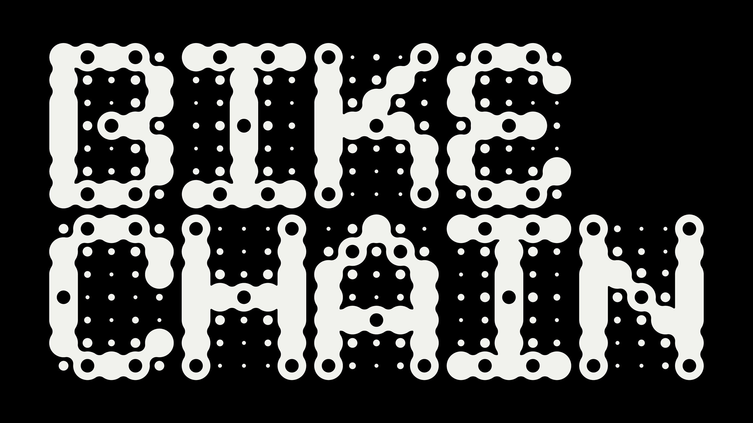
Bike/Chain is a bubbly monospaced display typeface inspired by 1990s dot matrix printing, exuding an odd sense of nostalgia. It is built on a simple 5x7 grid system consisting of overlapping circles. This grid is lovingly exposed by the cascade of shrinking and expanding dots surrounding each character.
“It feels like a kind of blurry, amoebic, gurgling, sci-fi font based on a future of gridded circles instead of squares. I’m trying to avoid the overused “organic,” but it feels like it gurgled up from the mud through bubbles and hot steam.”
- description by Martin Flores
Tasting notes: Chewy, Complex, Expressive, Floral, Hollow, Mellow.
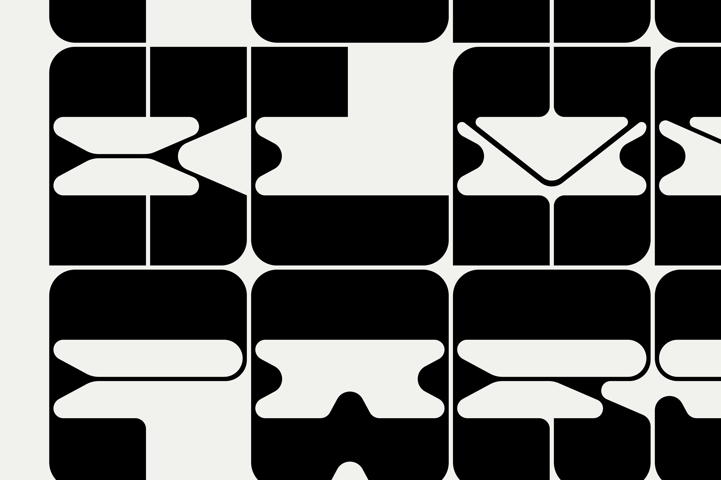
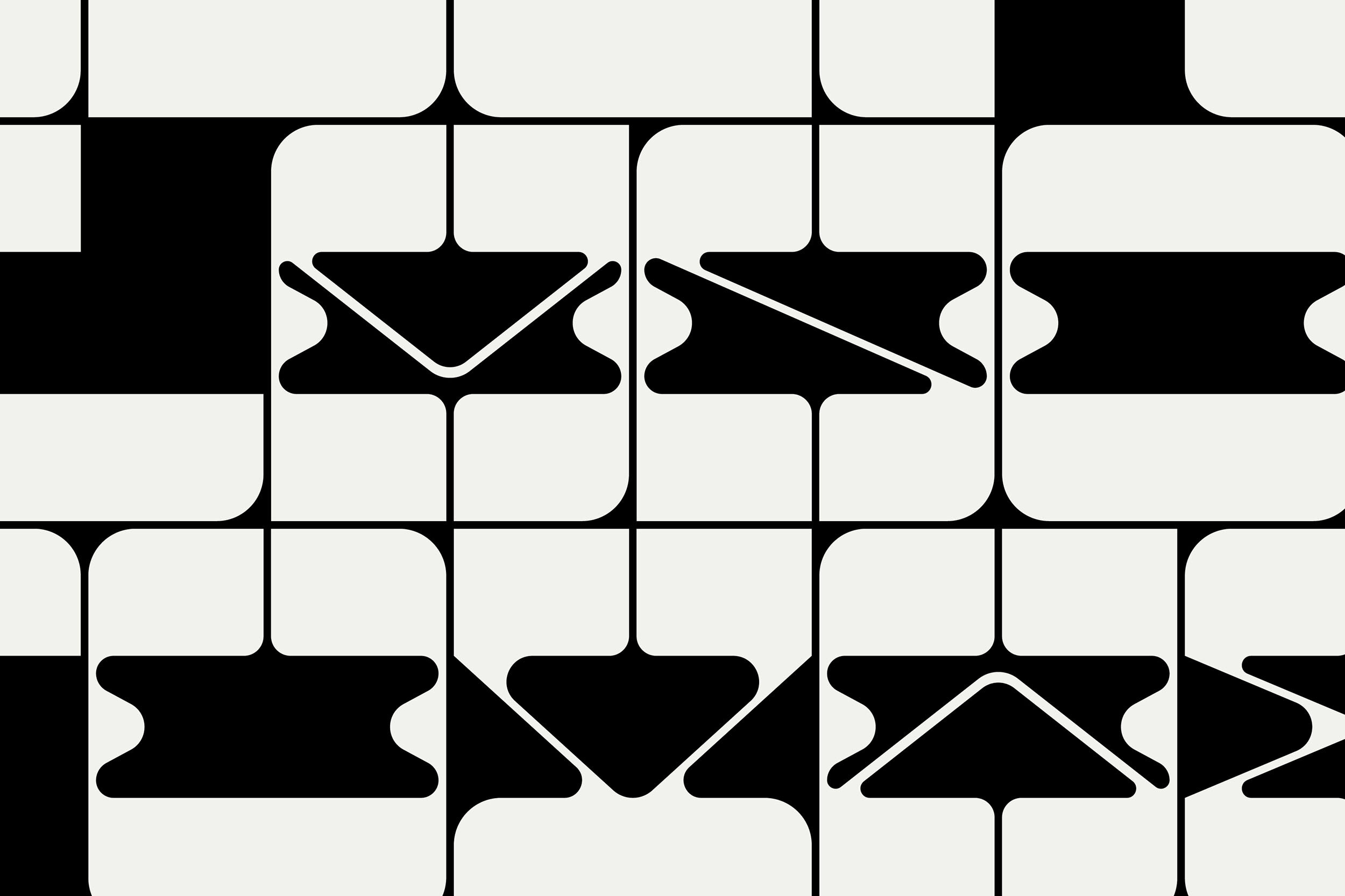
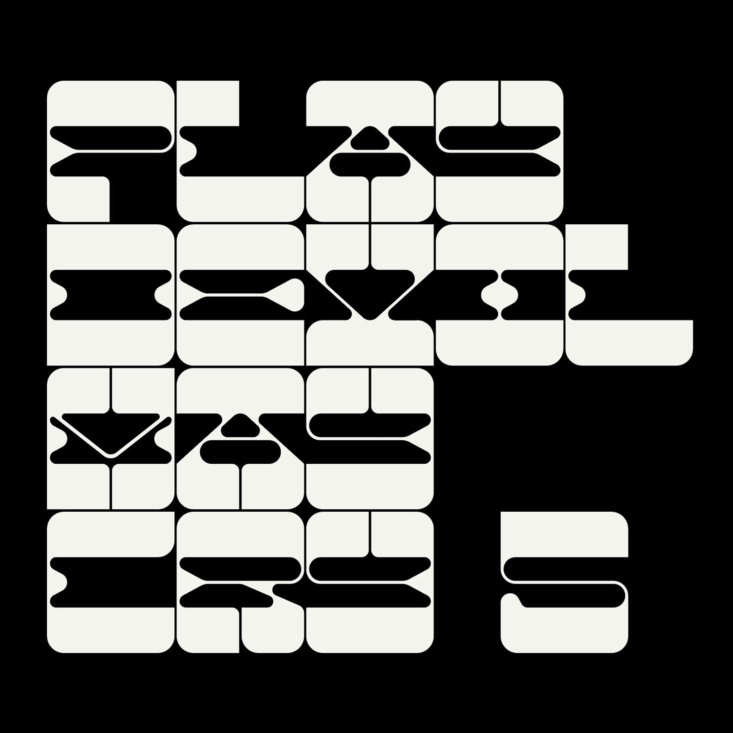
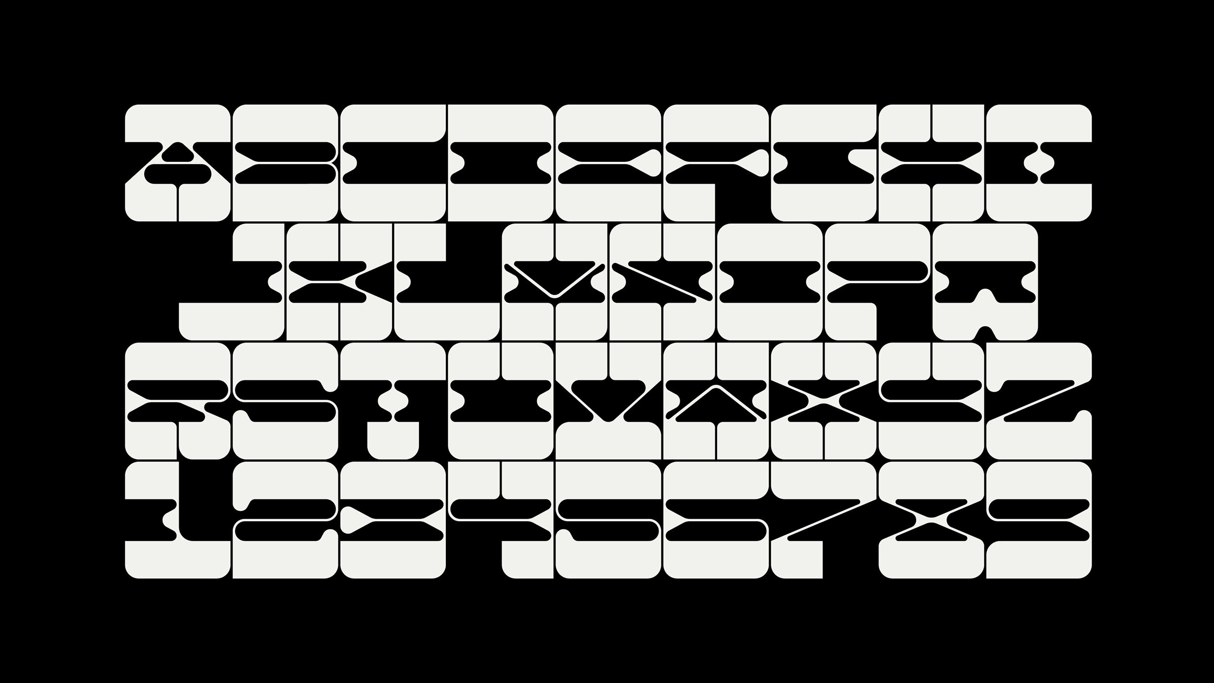
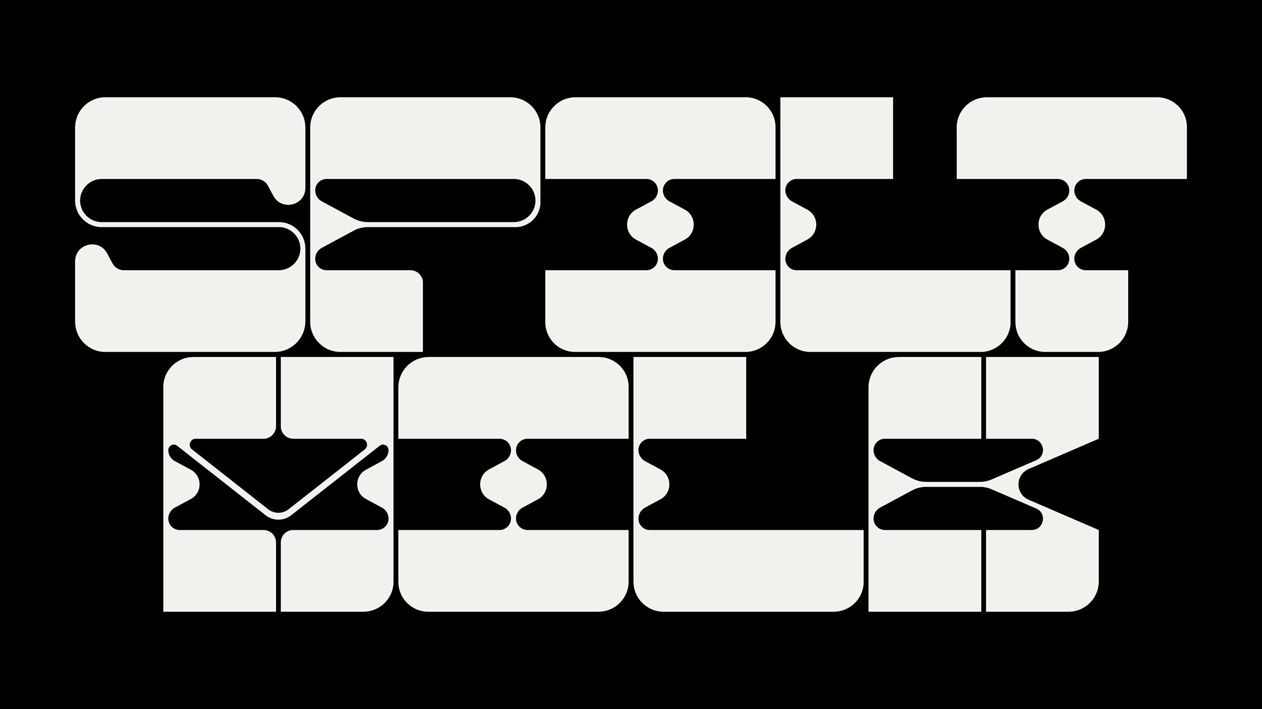
Spilt/Milk is a peculiar display typeface inspired by the psychedelic typography of the 1960s. Its funky reverse contrast characters have what appears to be a constantly shifting center of gravity, and their distinguishing features are the massive slabs and bulbous inward-facing protrusions that make the letters appear as if they have been smeared.
“Futuristic era lettering for an Art Deco and Art Nouveau time right before a Great Depression but located on another planet. To be used on some machine grid, black and backlit. It is a font for a society that doesn’t know it’s about to experience immense tragedy due to its own greed.”
- description by Martin Flores
Tasting notes: Buttery, Dense, Full-Bodied, Powerful, Rich, Zesty.
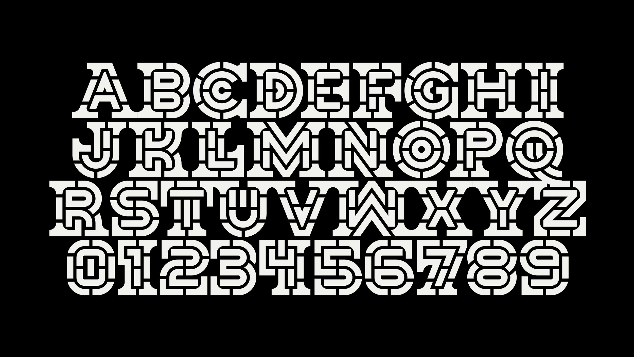

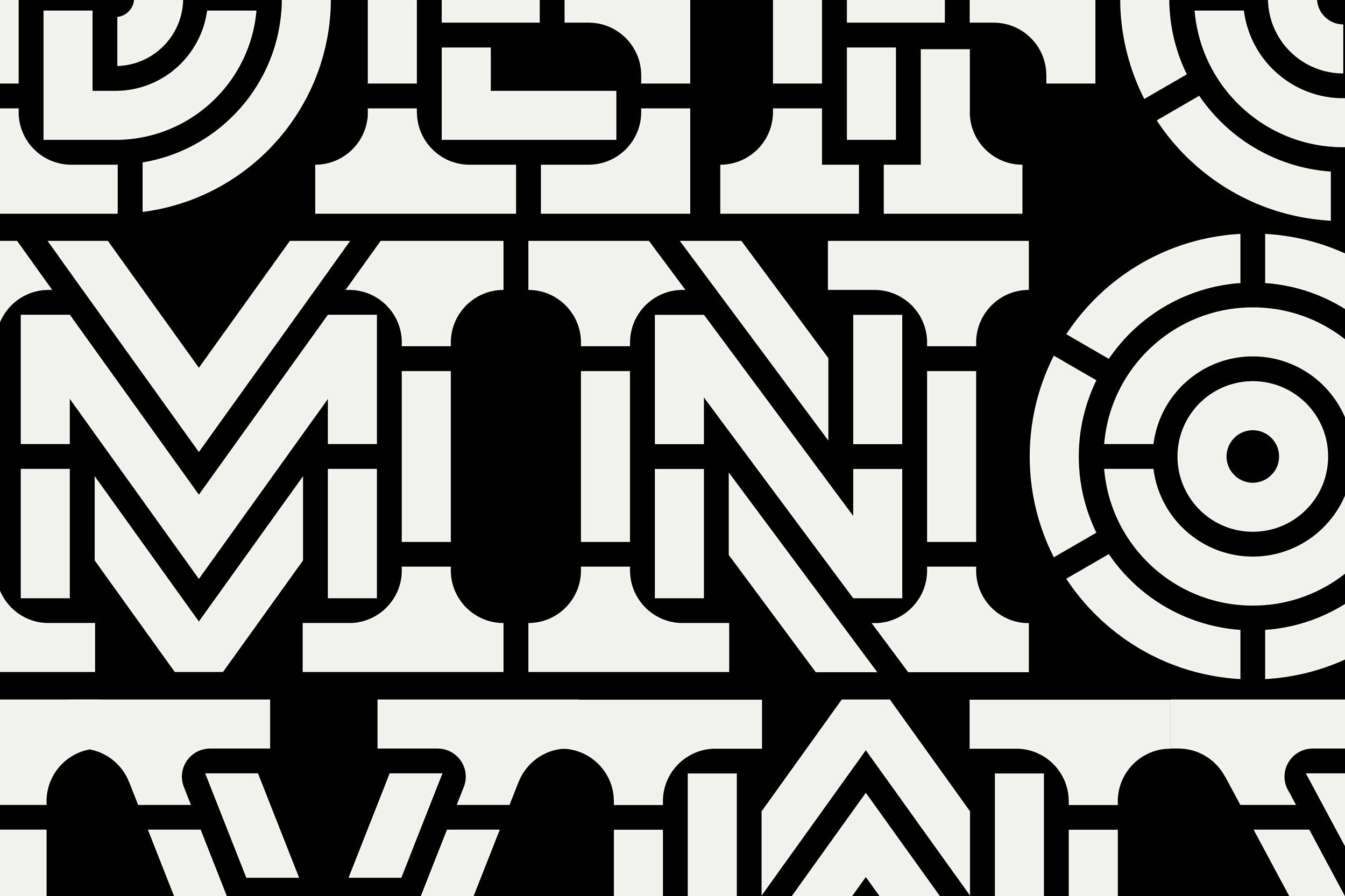
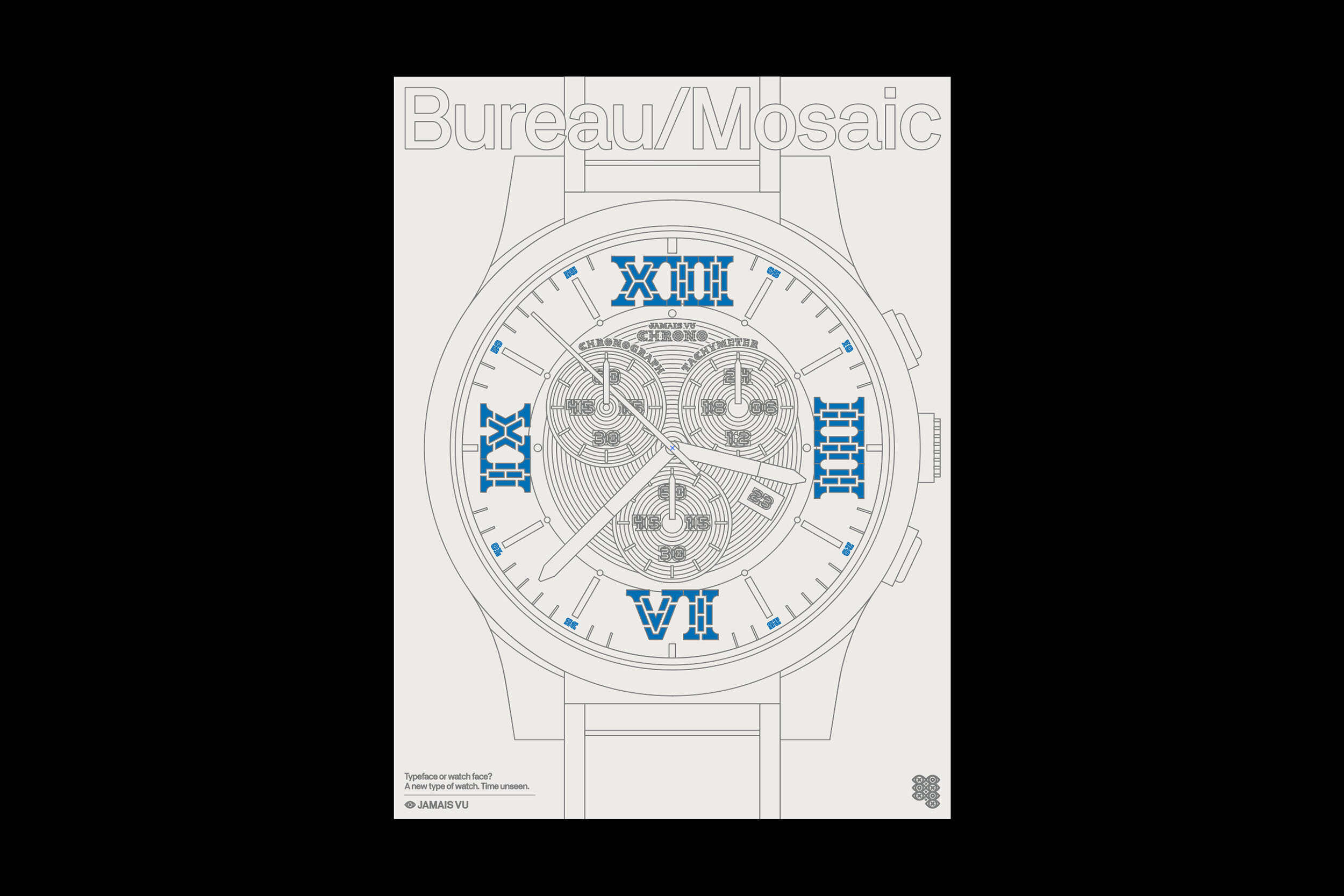
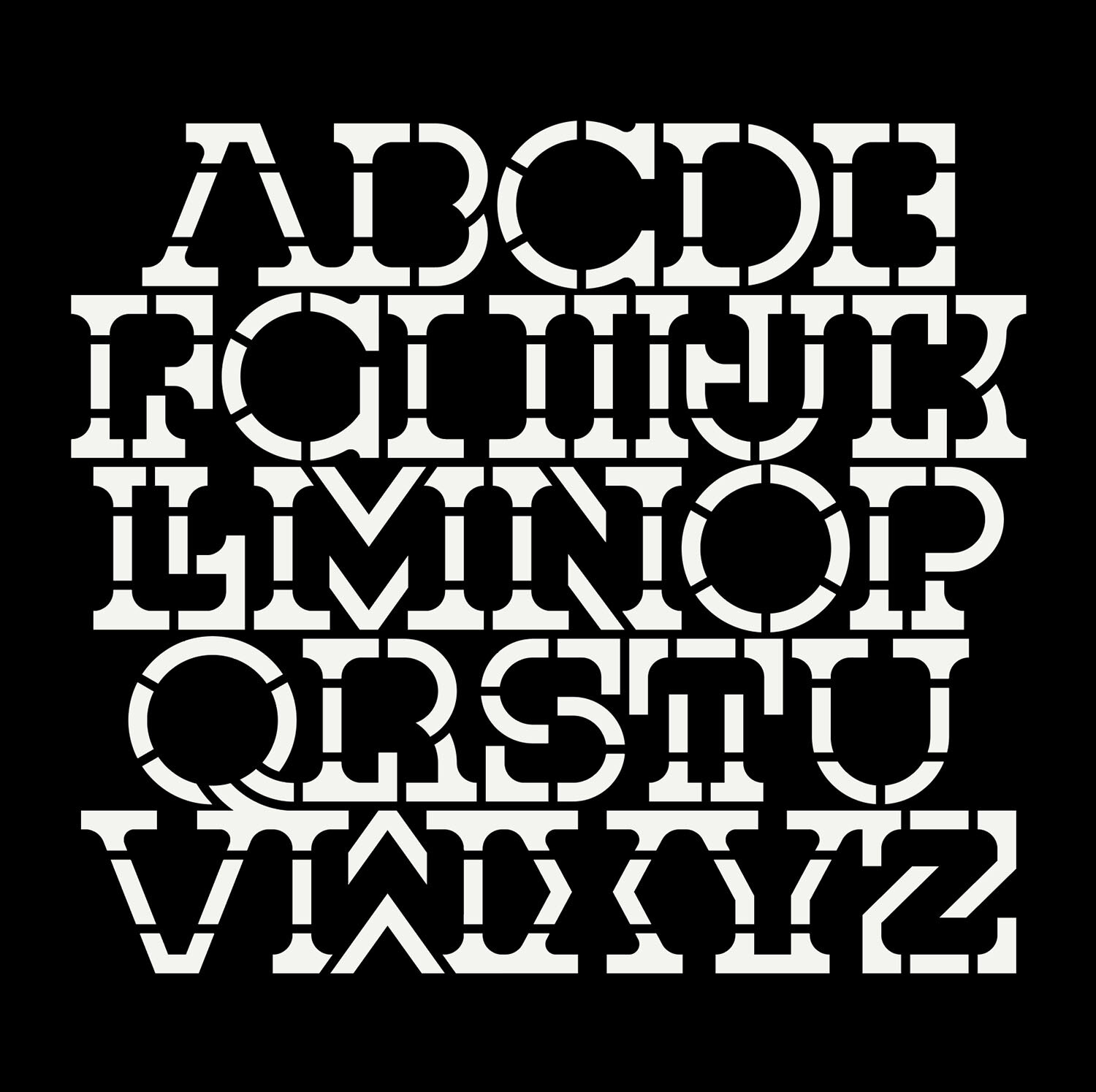
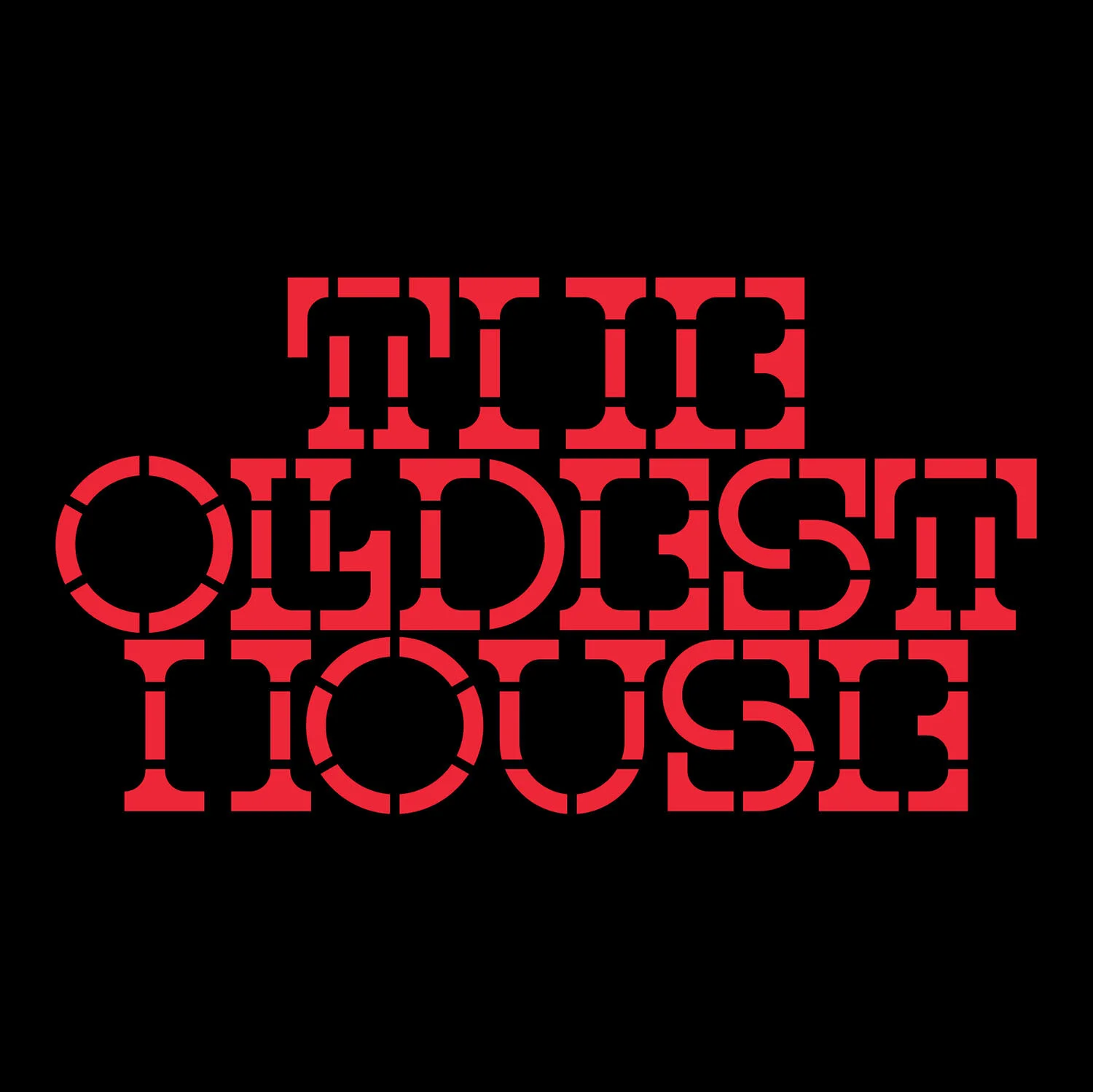
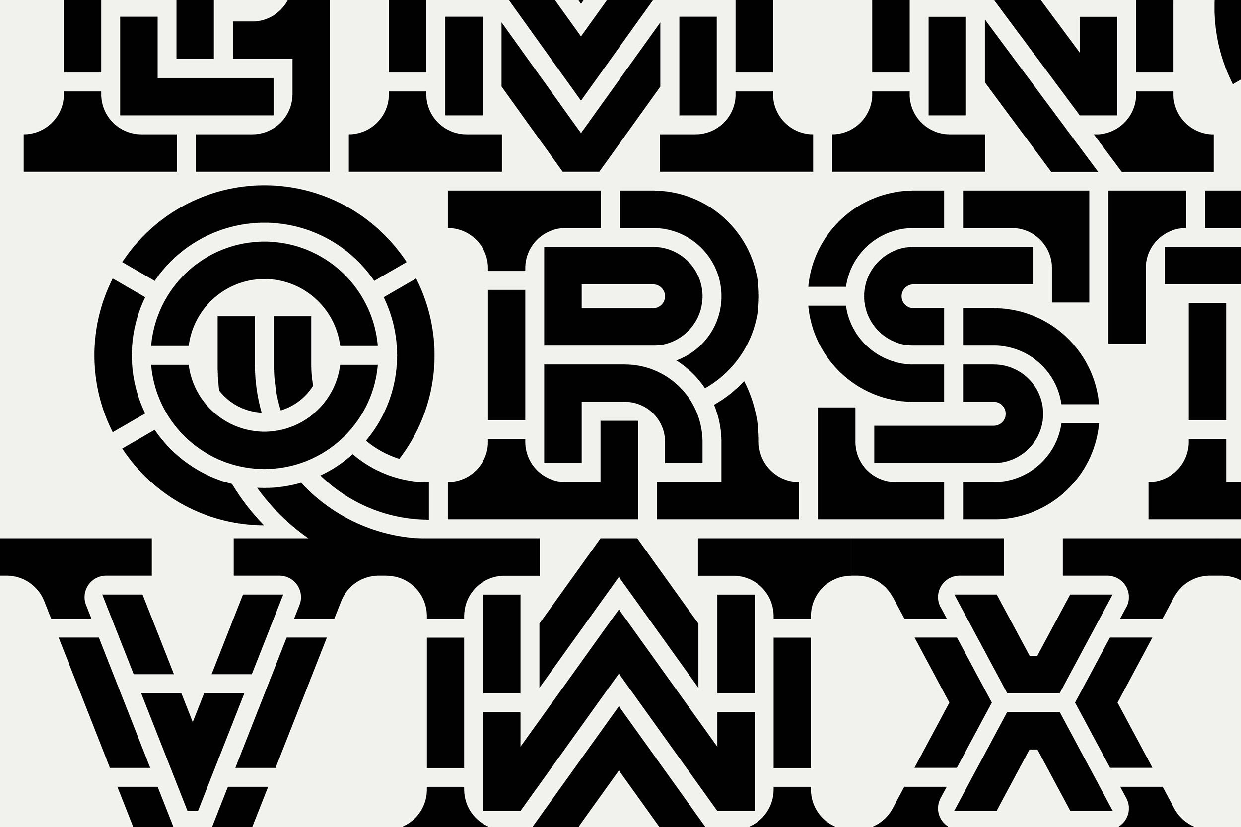
Bureau/Mosaic is an anti-corporate yet semi-serious utilitarian typeface inspired by the brutalist design styles of the 1950s, especially popular in architecture, and would feel right at home in London’s Barbican Centre. Each character features two layers, the inner mono-weight letter and the outer shell that encases it. Additional breaks in the letters give the font its characteristic imposing tiled look.
“This one reminds me of a font you would use for engraving manhole cover. Maybe kind of steampunk but more iron wrought. It feels industrial but maybe a bit more cobblestone street rather than heavy-handed grunt work.”
- description by Martin Flores
Tasting notes: Angular, Bold, Crisp, Elegant, Polished, Tart