


Amerikana Typeface
Type Design | Print
Amerikana is a typeface inspired by the flair of high-octane anime like Kill la Kill, Attack on Titan, and Jojo’s Bizarre Adventure. It incorporates both the standard English 26-character alphabet and the style of Japanese kanji and katakana, giving it the name Amerikana. It was developed with three styles: Standard, Outline, and Shadow.
Created alongside the typeface is a specimen that shows off examples of each style and folds open into a poster inspired by the dynamics of manga panels.
The type specimen uses scans from Jojo’s Bizarre Adventure Part 5: Vento Aureo, which belong to Hirohiko Araki and Lucky Land Communications.


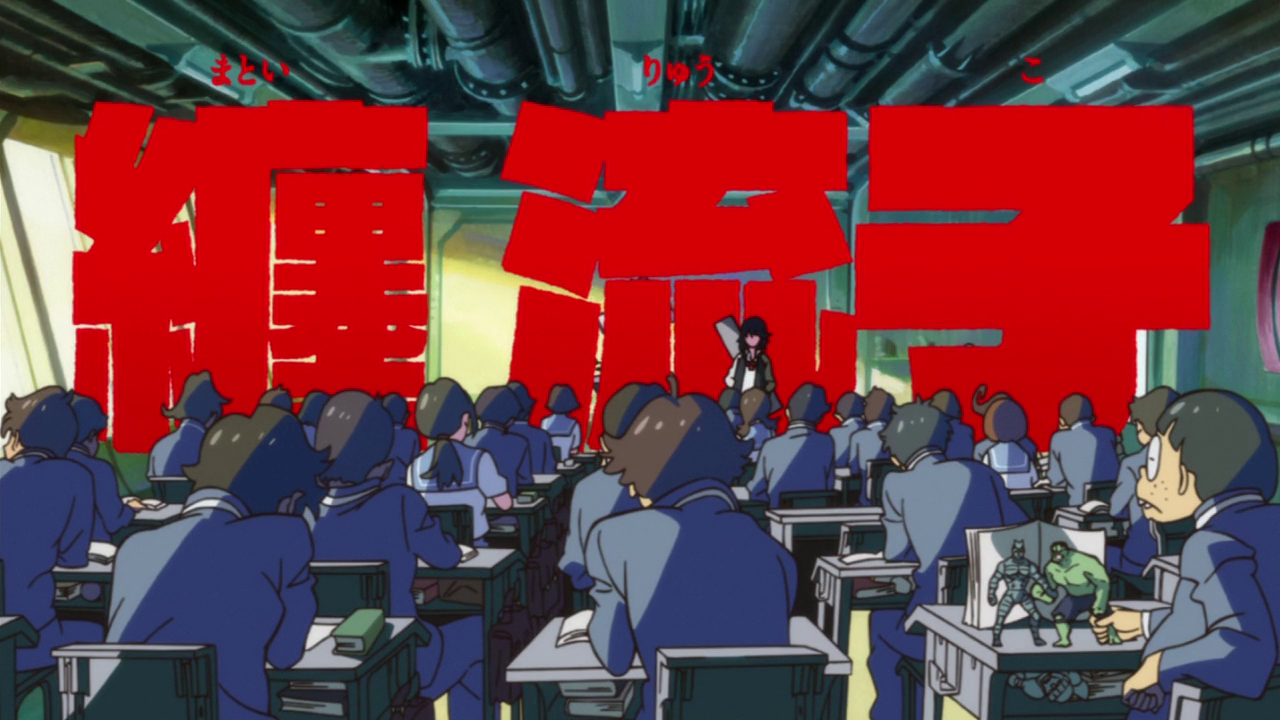
Amerikana’s design is rooted in stylish and explosive anime. The intro credits for Kill la Kill, Attack on Titan (Season 1), and Jojo’s Bizarre Adventure: Stardust Crusaders serve as three examples of some of the influences for the letterforms. The kanji, katakana, and overall use of typography ooze personality, and the overall design and craft of the characters are what was transferred into Amerikana.
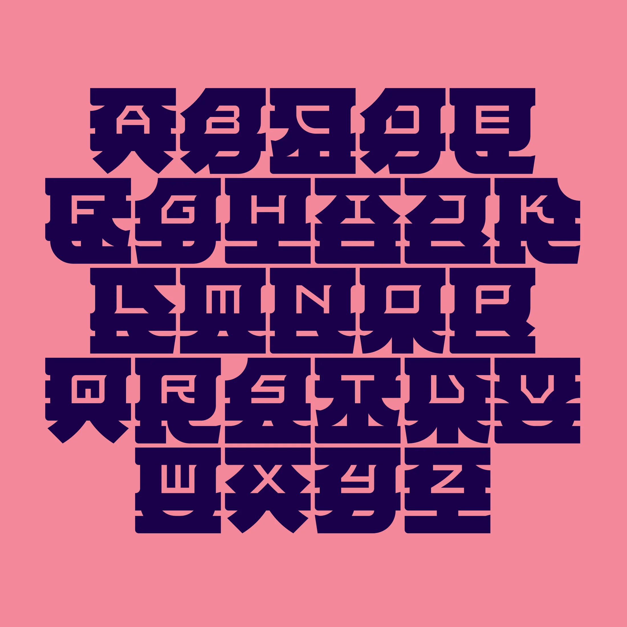
The type specimen was designed to flip open like a book and unfold into a poster. The reverse side displays all twenty-six characters in a style reminiscent of manga panel layouts.


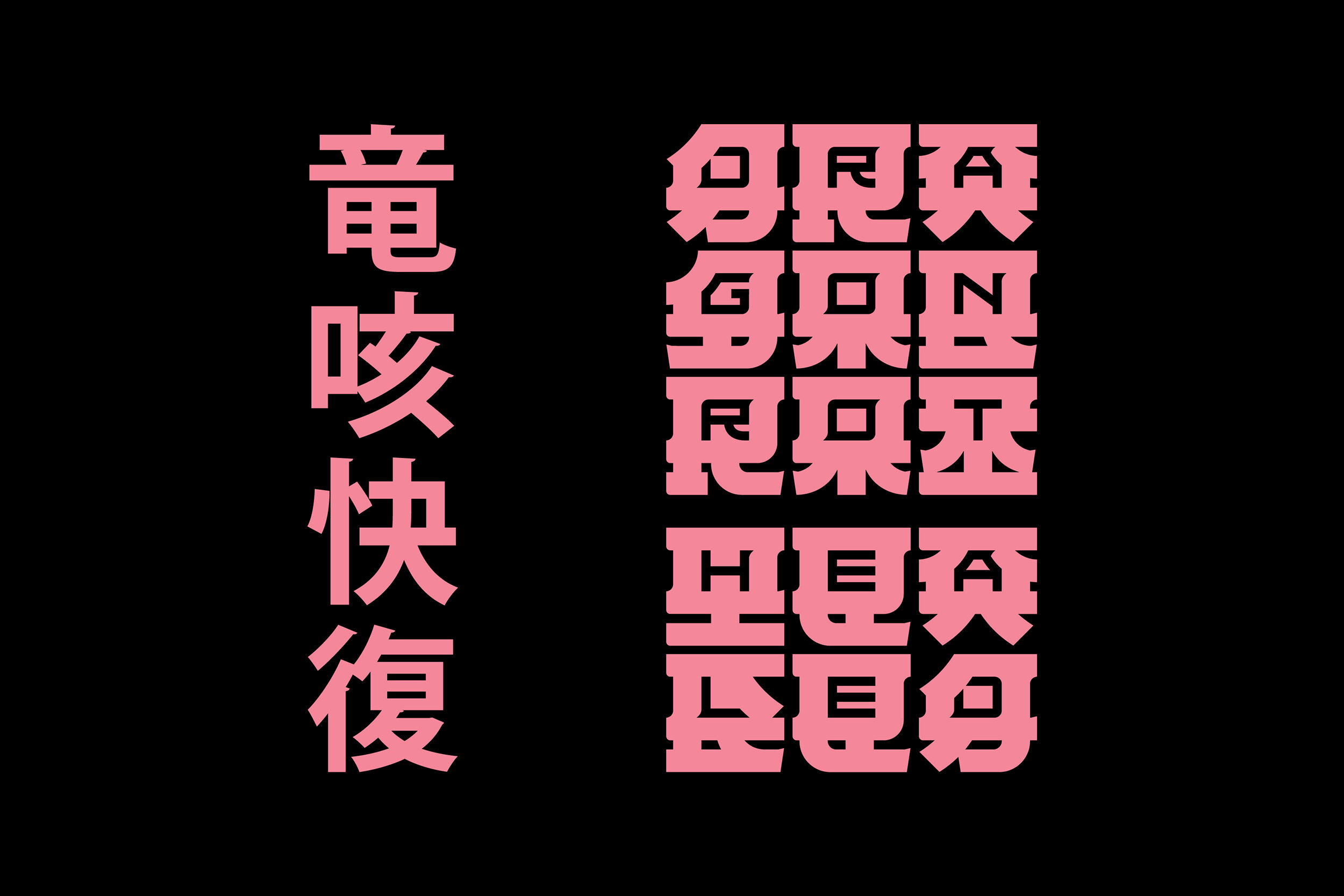
An example showing how language translates between typefaces. On the left is Monotype’s SST Japanese typeface and on the right is Amerikana. Both say the same phrase, “Dragonrot Healed,” a status seen in FromSoftware’s 2019 video game, Sekiro.


Manga scans from Jojo’s Bizarre Adventure Part 5 and Part 8.


These phrases from Sekiro were used to sample and test out the dimensional and building block-like qualities of Amerikana. The color palette unintentionally ended up taking after the Powerpuff Girls.


At one point in the project various kanji were painted as part of the sample phrases, but were ultimately scrapped in favor of more typeface-centric examples.
