
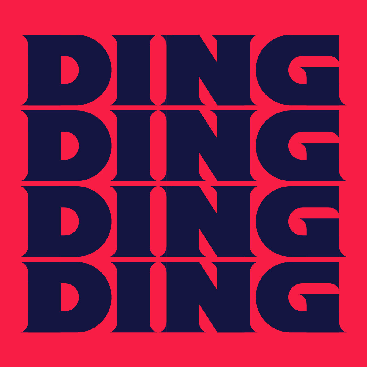
Gestalt Part Two - 676 Characters
This project is a result of a simple question: How can we use the Gestalt type workshops to create new typefaces?
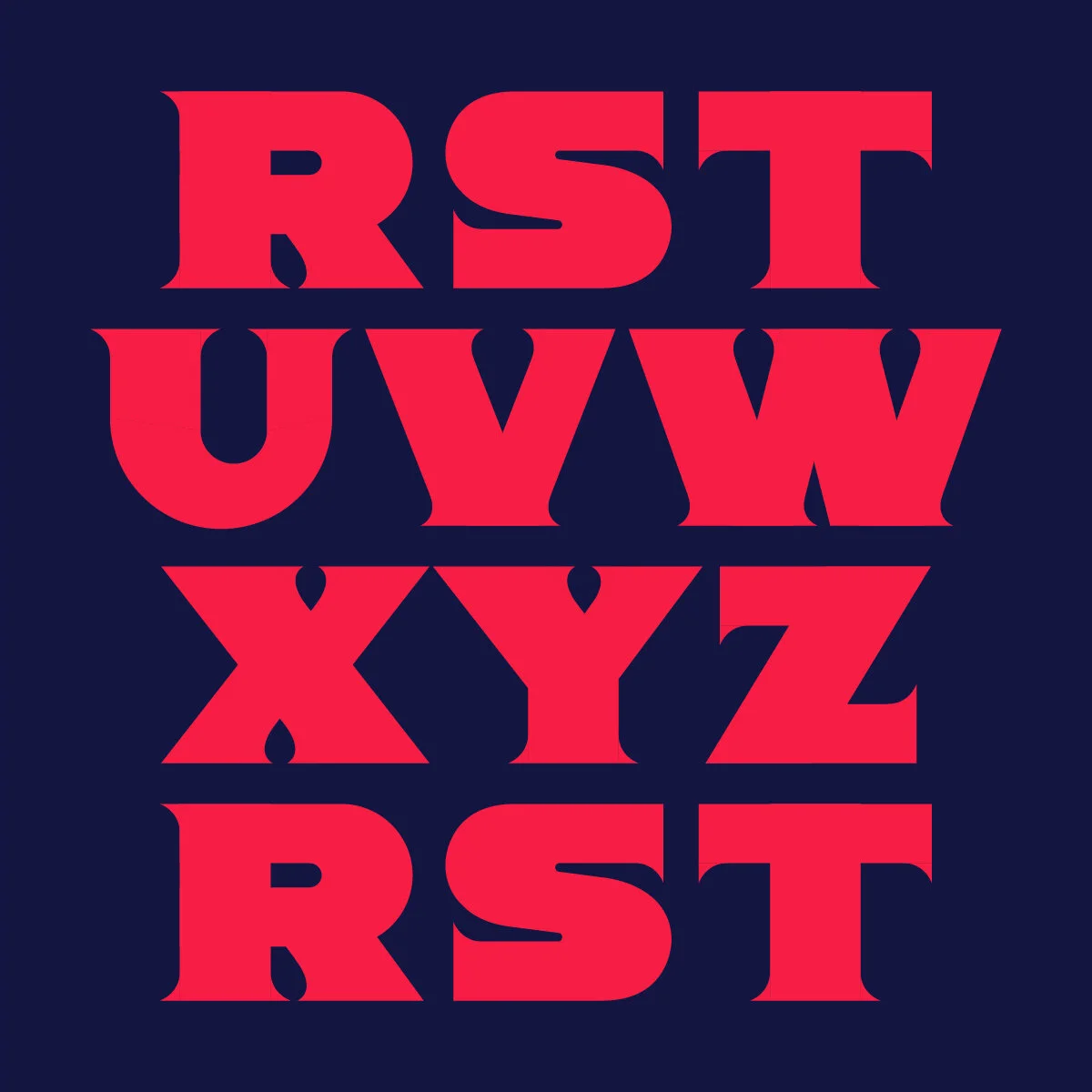
Jumping off of the Gestalt Quarantine Edition, the resulting 26 collaborative arts and crafts letterforms were used as inspiration to create functioning typefaces. Each Gestalt letter was translated into a typeface using its quirks and oddities as influences on the shape and style of the new type. From there, a full alphabet was designed based on this single character. 26 unique typefaces with 26 characters each, for a grand total of 676 characters.
The following typefaces that could not have been made by a one person, they exist as the product of group effort. This is the final product of the Gestalt type workshops – a new method of creating unique typography.
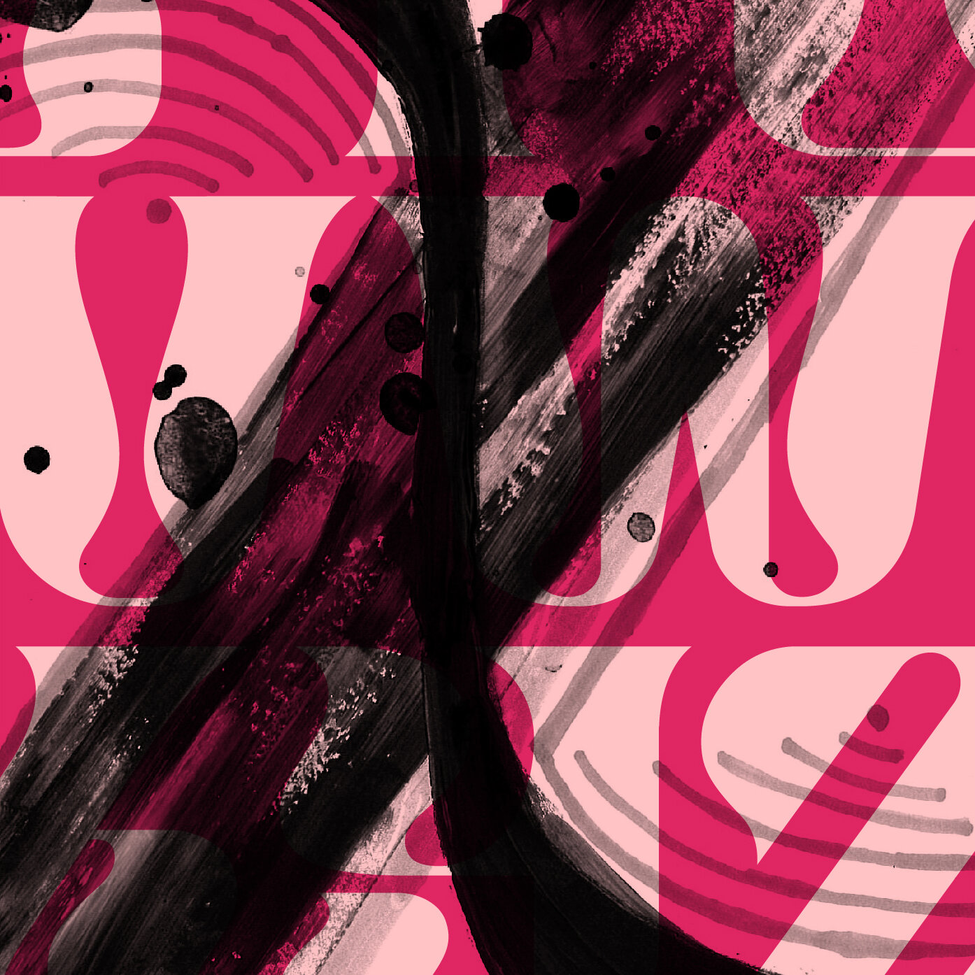
Below are the O – Z typefaces, in reverse chronological order.
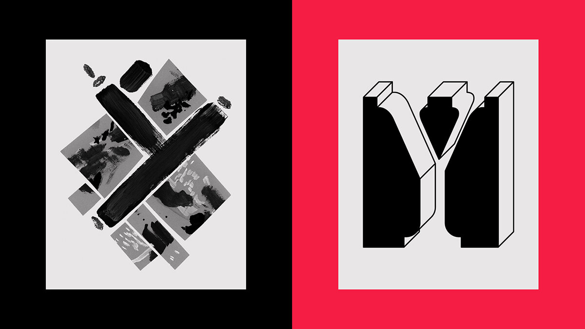

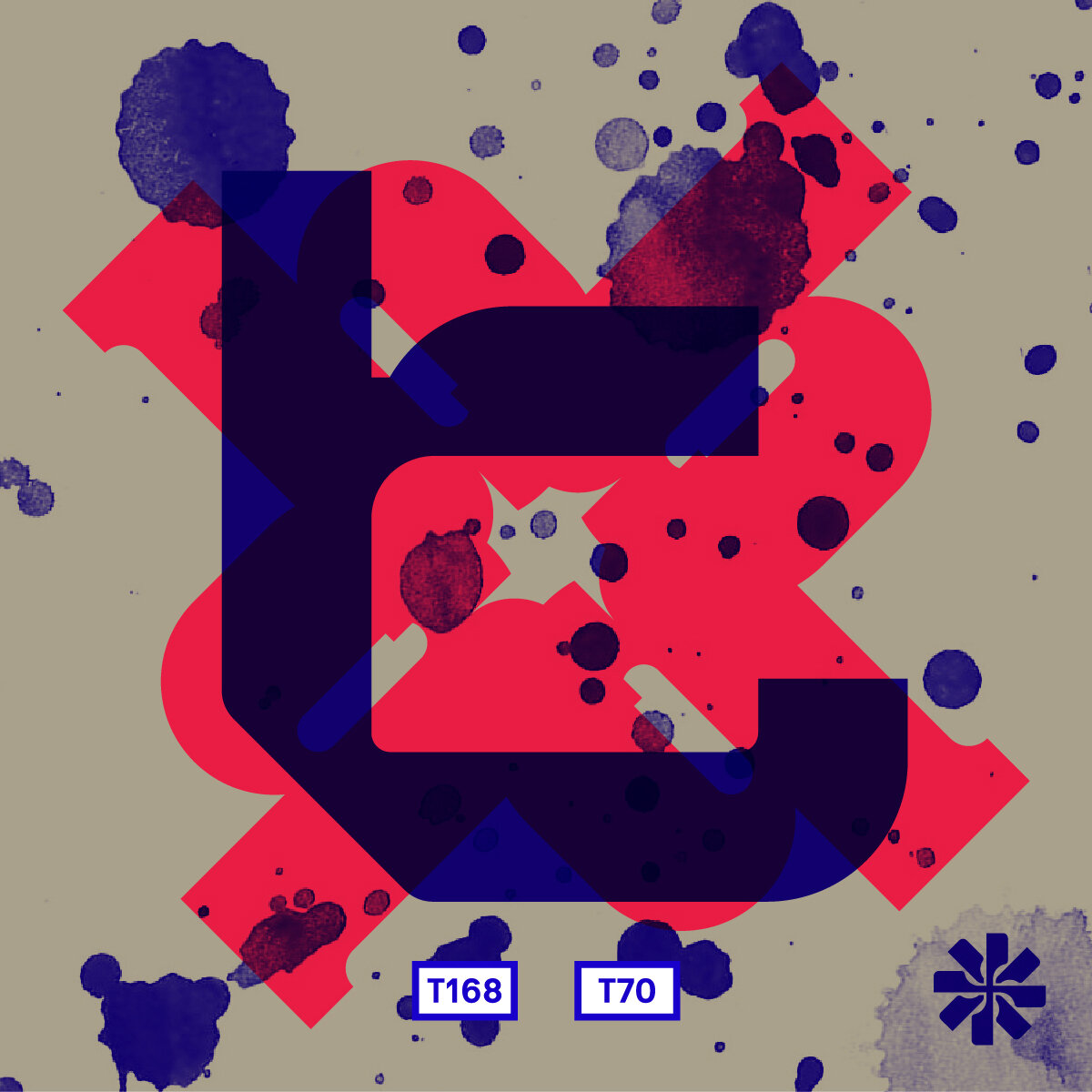
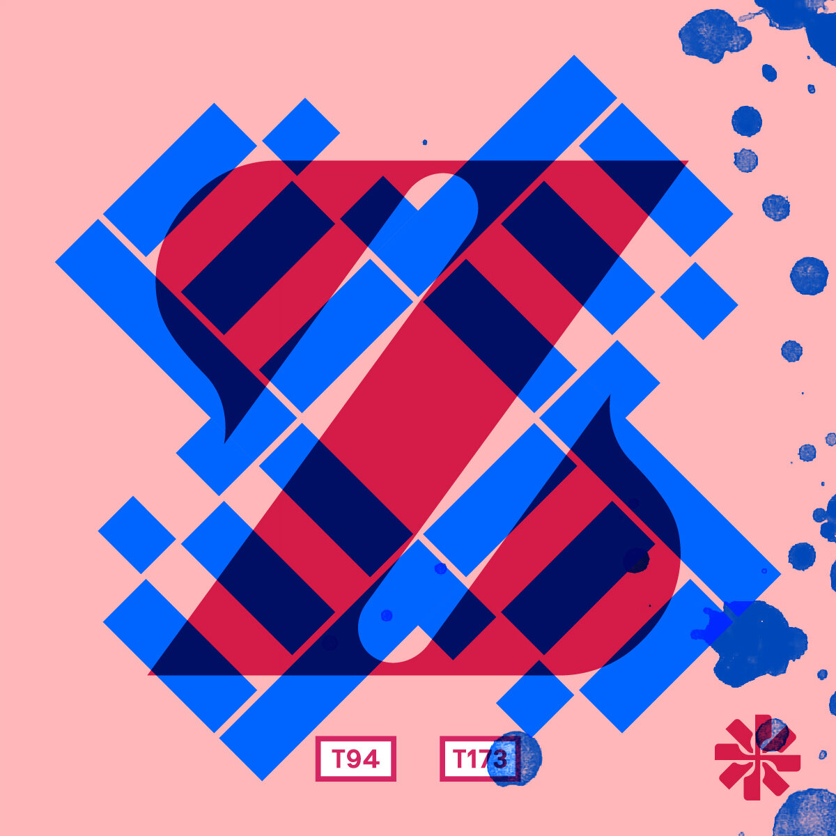
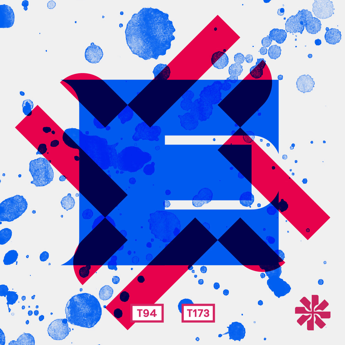
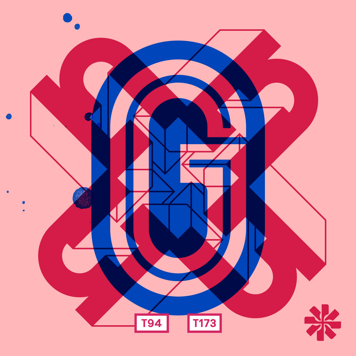
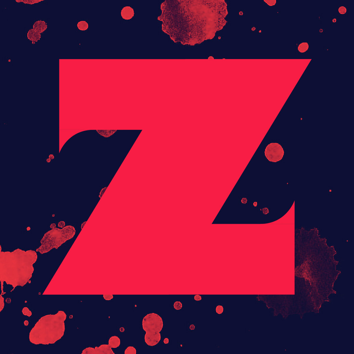
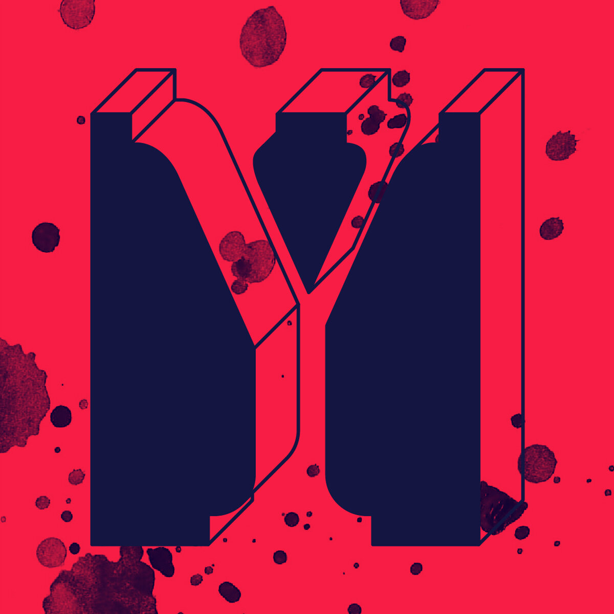
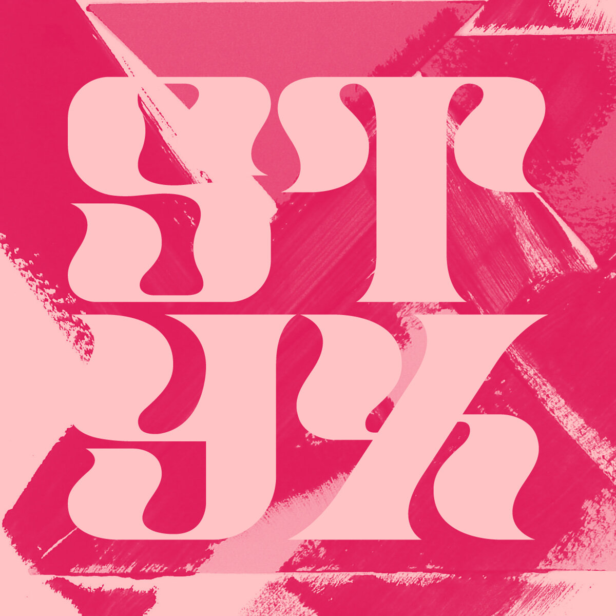
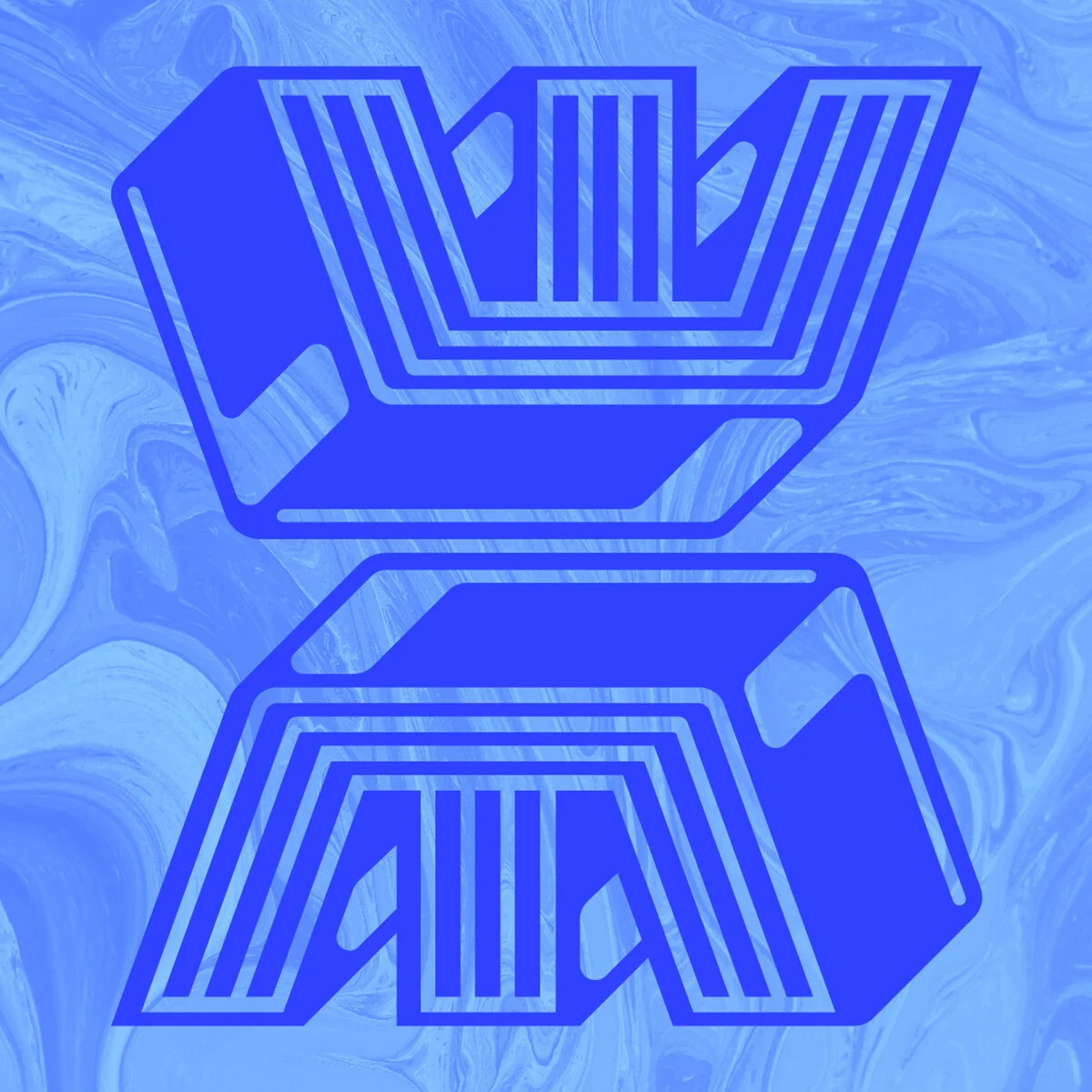
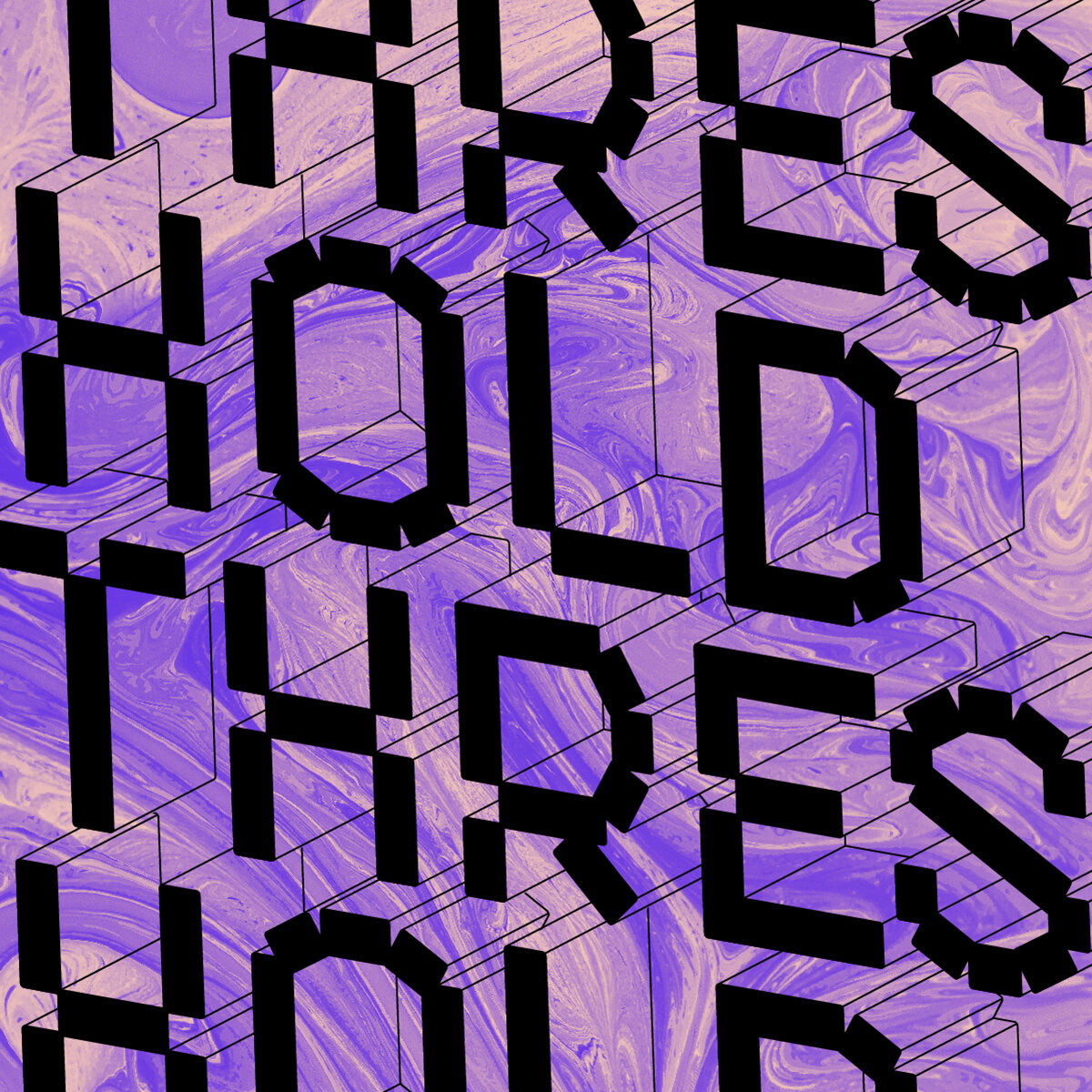
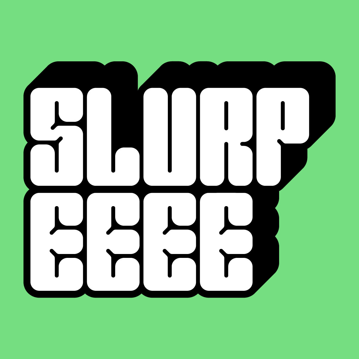
The Y was built in such a way that a channel of paint formed between the tetris-like construction of cut out shapes. This idea of type “punching through” became the hook of the typeface, having traditional slab serif characters built out of the negative space of the surrounding blocks. The Z was constructed with thick strokes and aggressive serifs, translated pretty directly into the next typeface. It’s regal and a just little threatening.
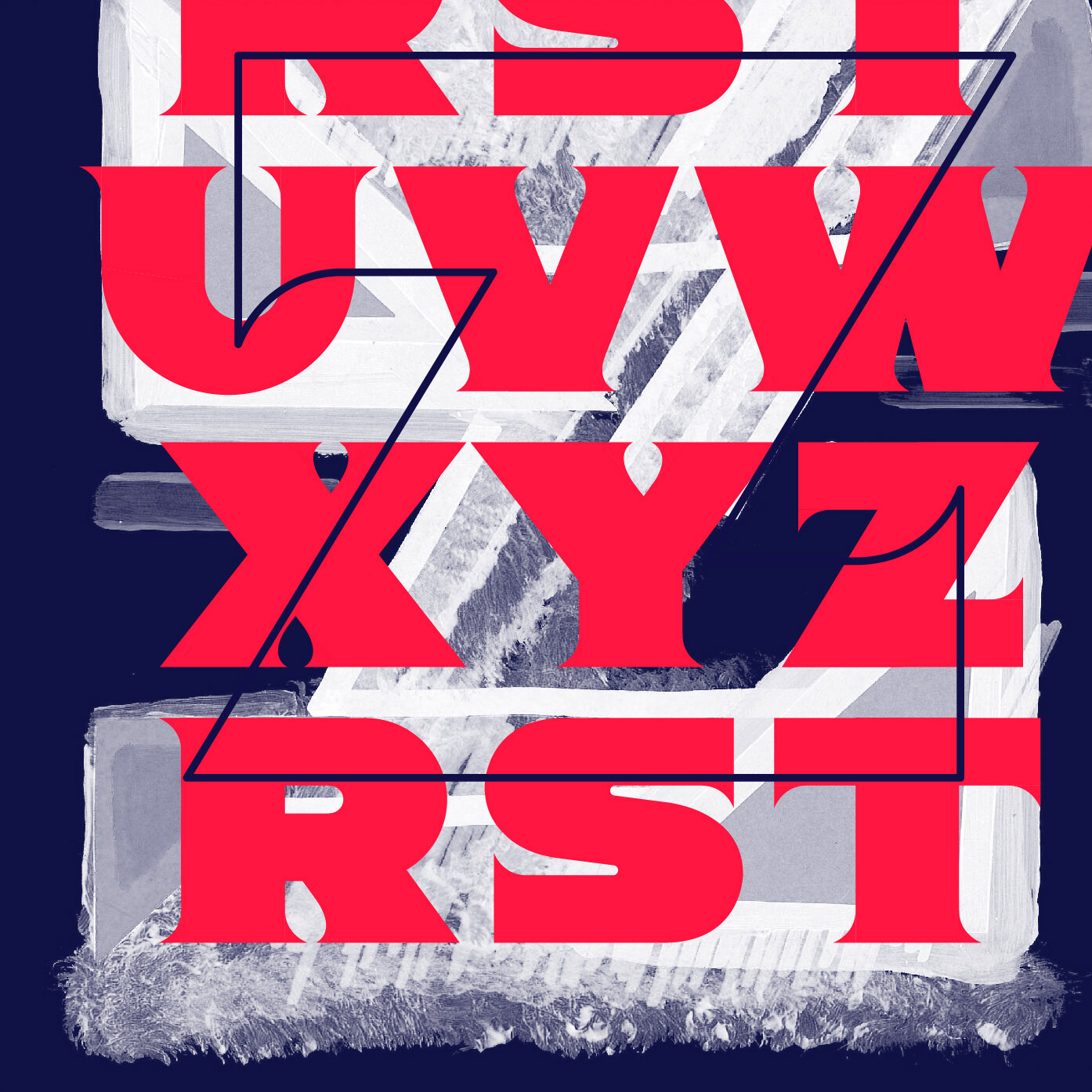
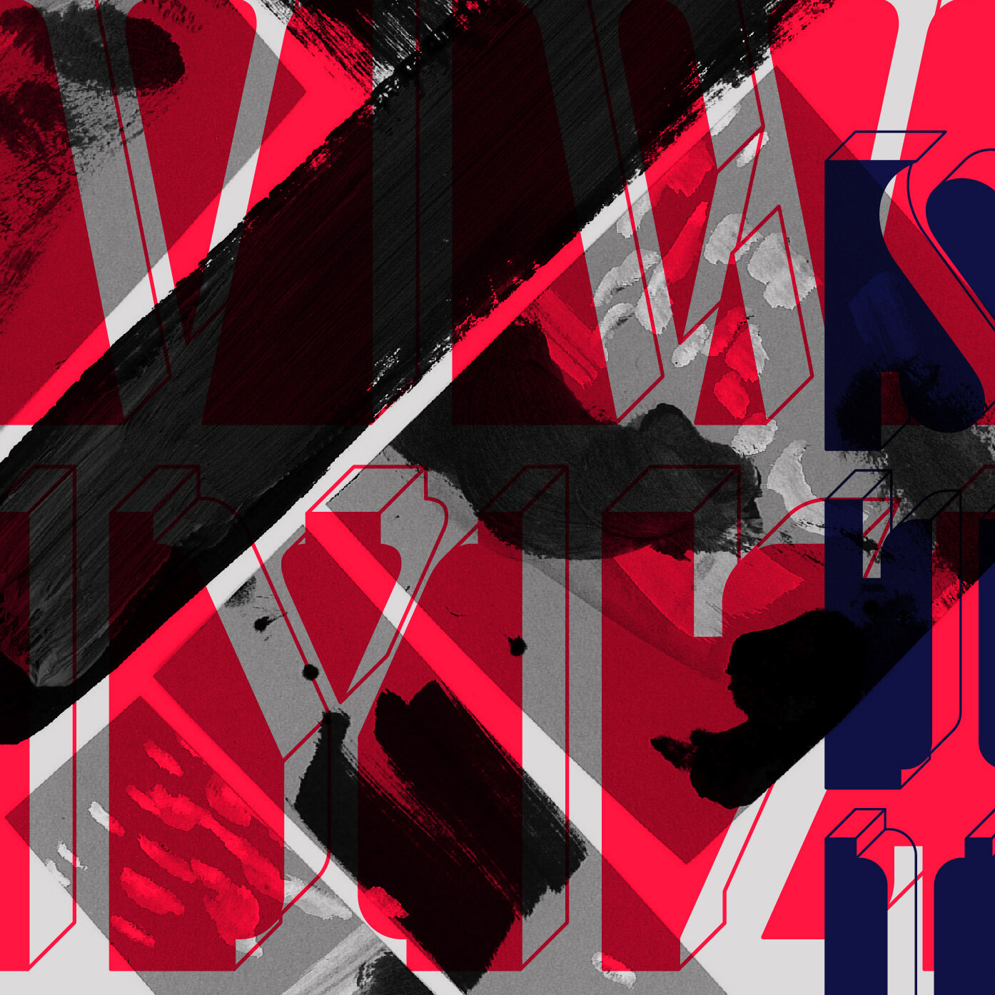

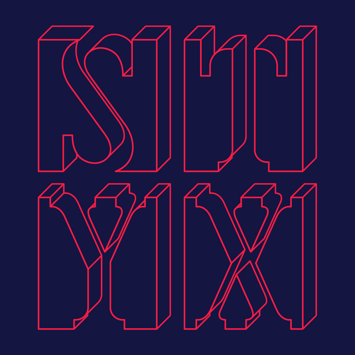
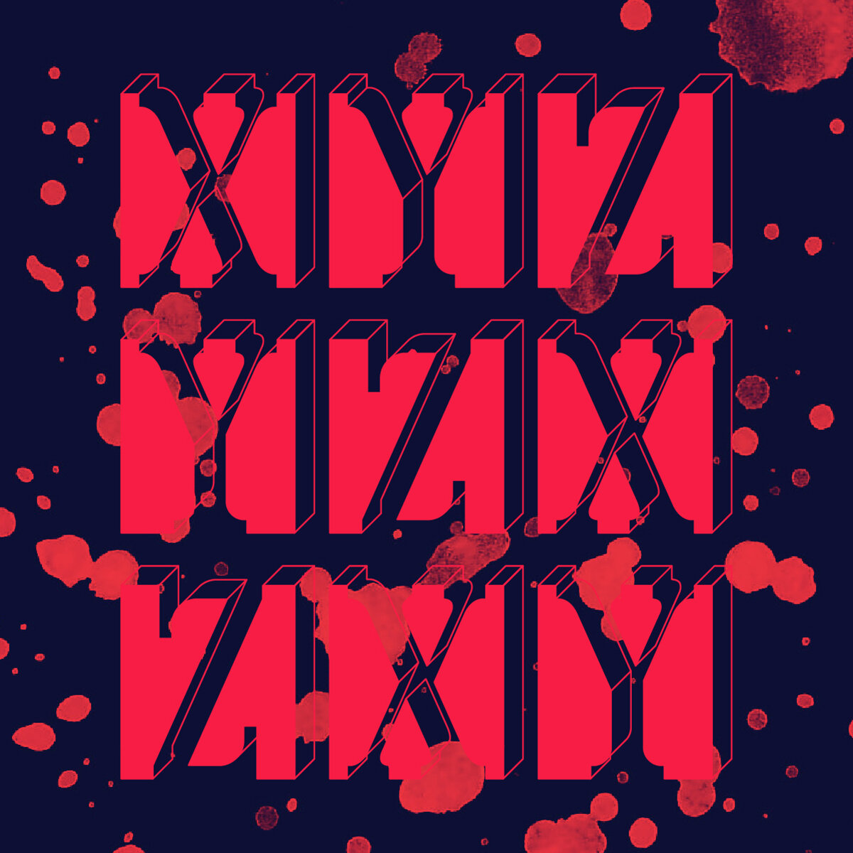
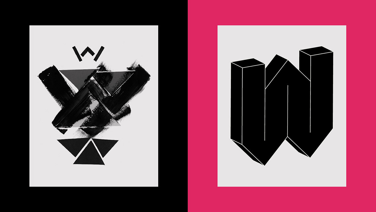
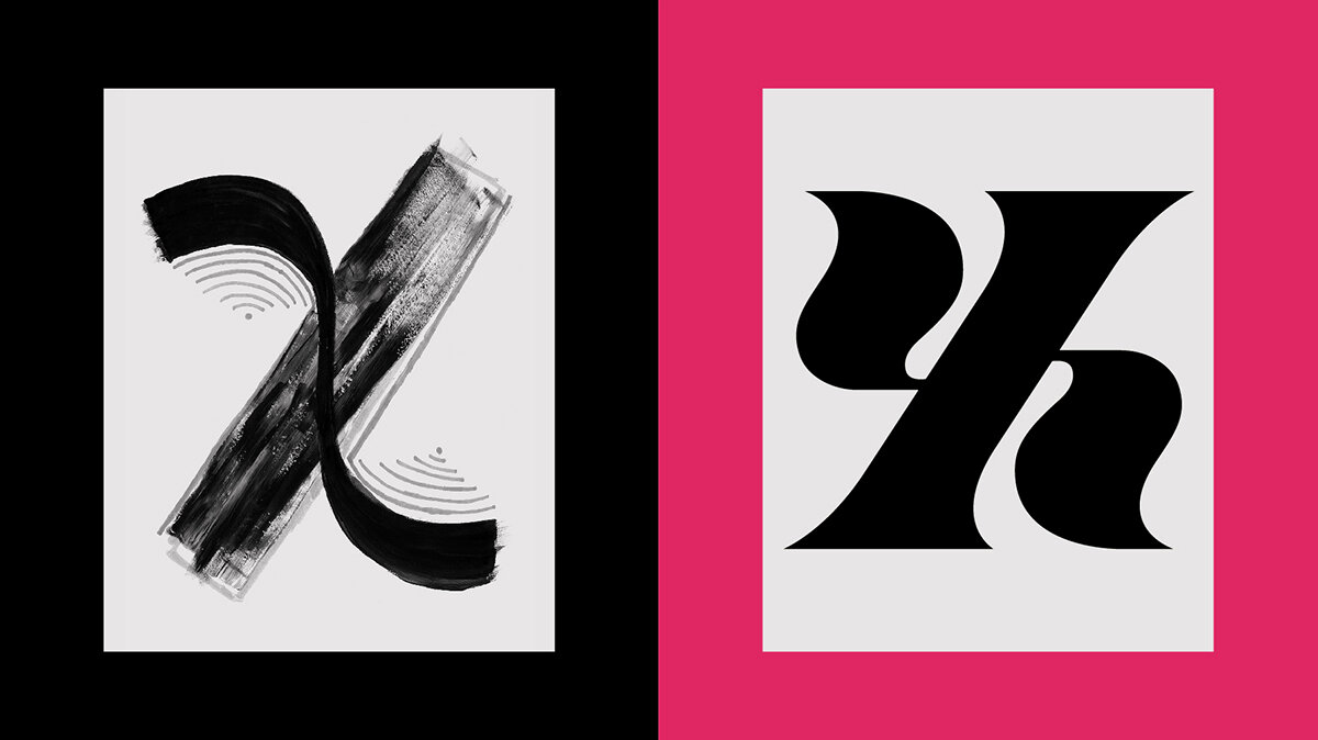
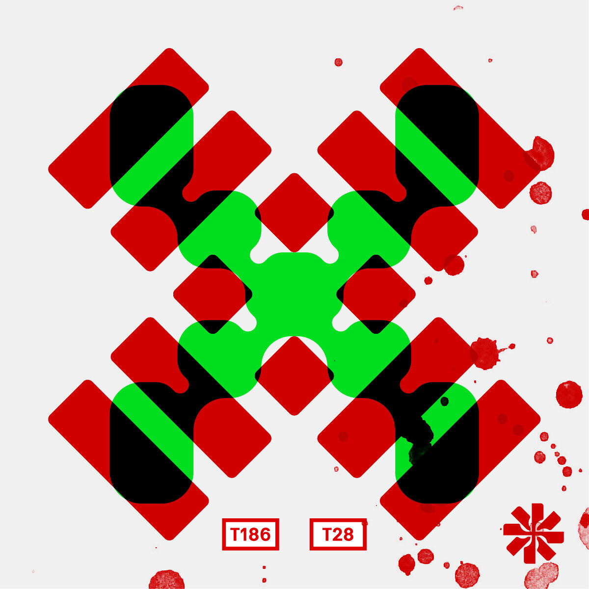
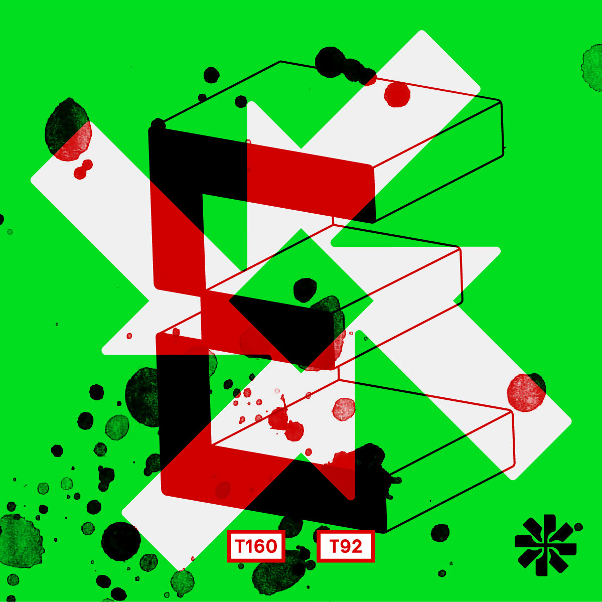
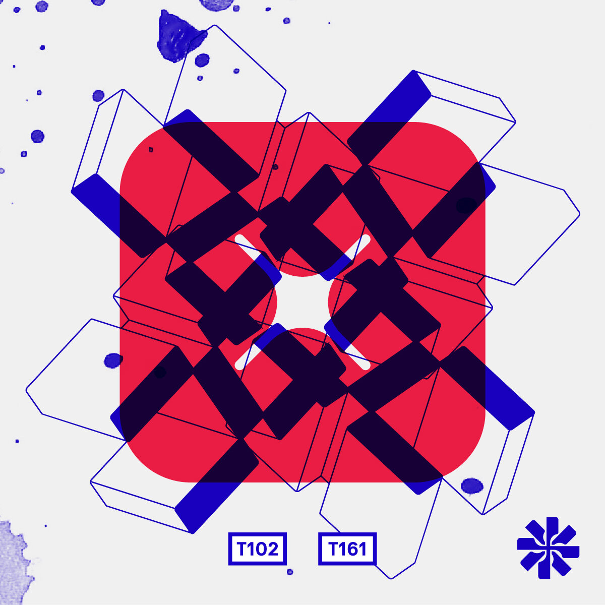
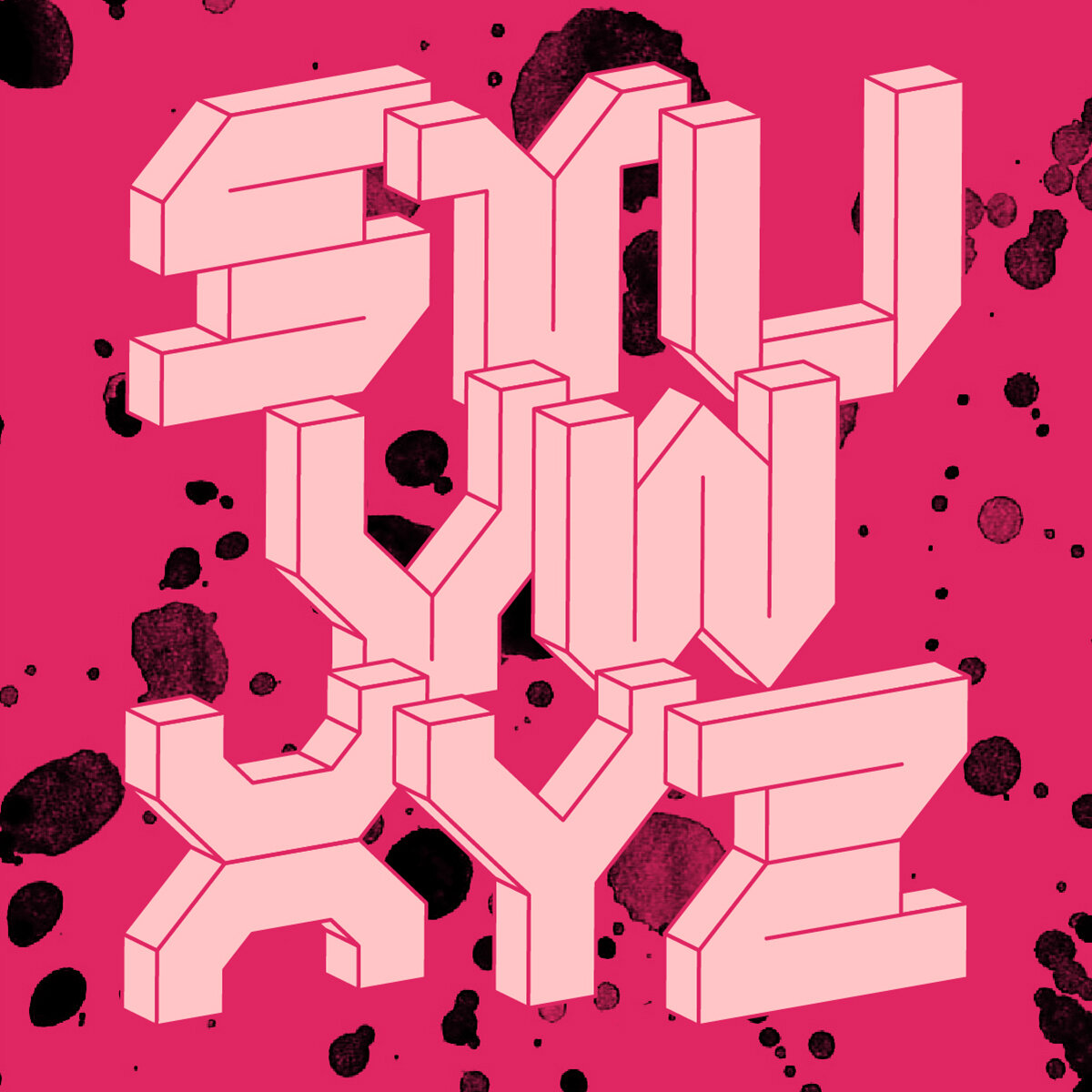
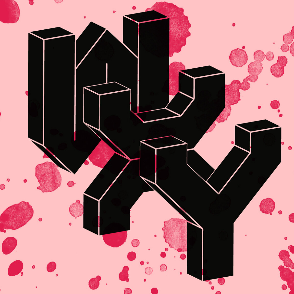
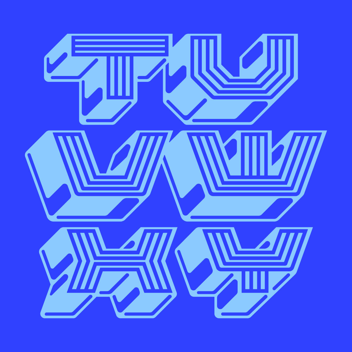
The workshop’s collaborative W had a few different iterations, including a series of tessellated triangles. This hyper geometric style was expanded it into 3D blocky letterforms consisting of 45 and 90 degree angles. For the X, the inspiration came from the unique duel-construction of the character, where half of it is a singular thick slab of paint and the other half is a gentle flourishing curve. The resulting mix is weird and wonderful.

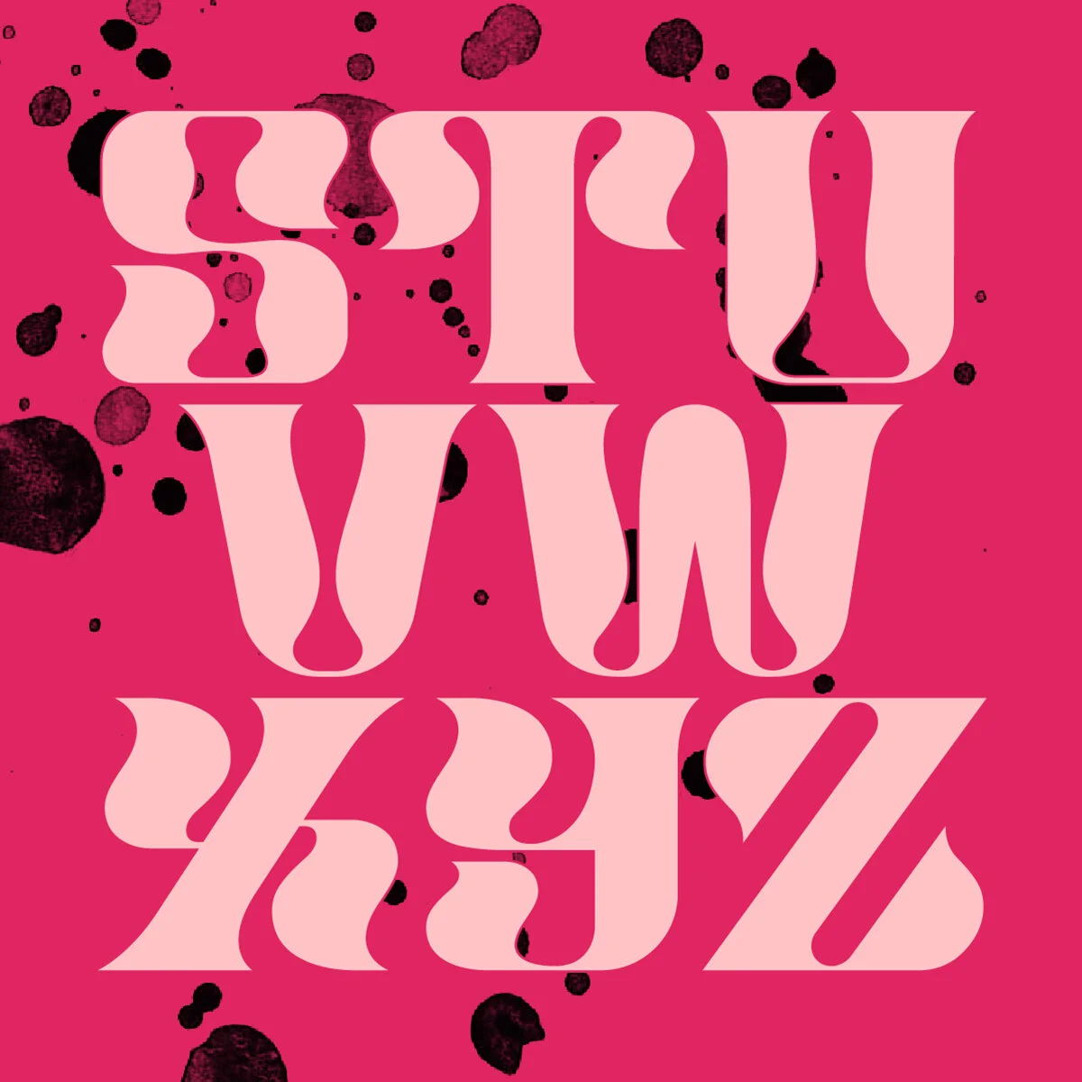

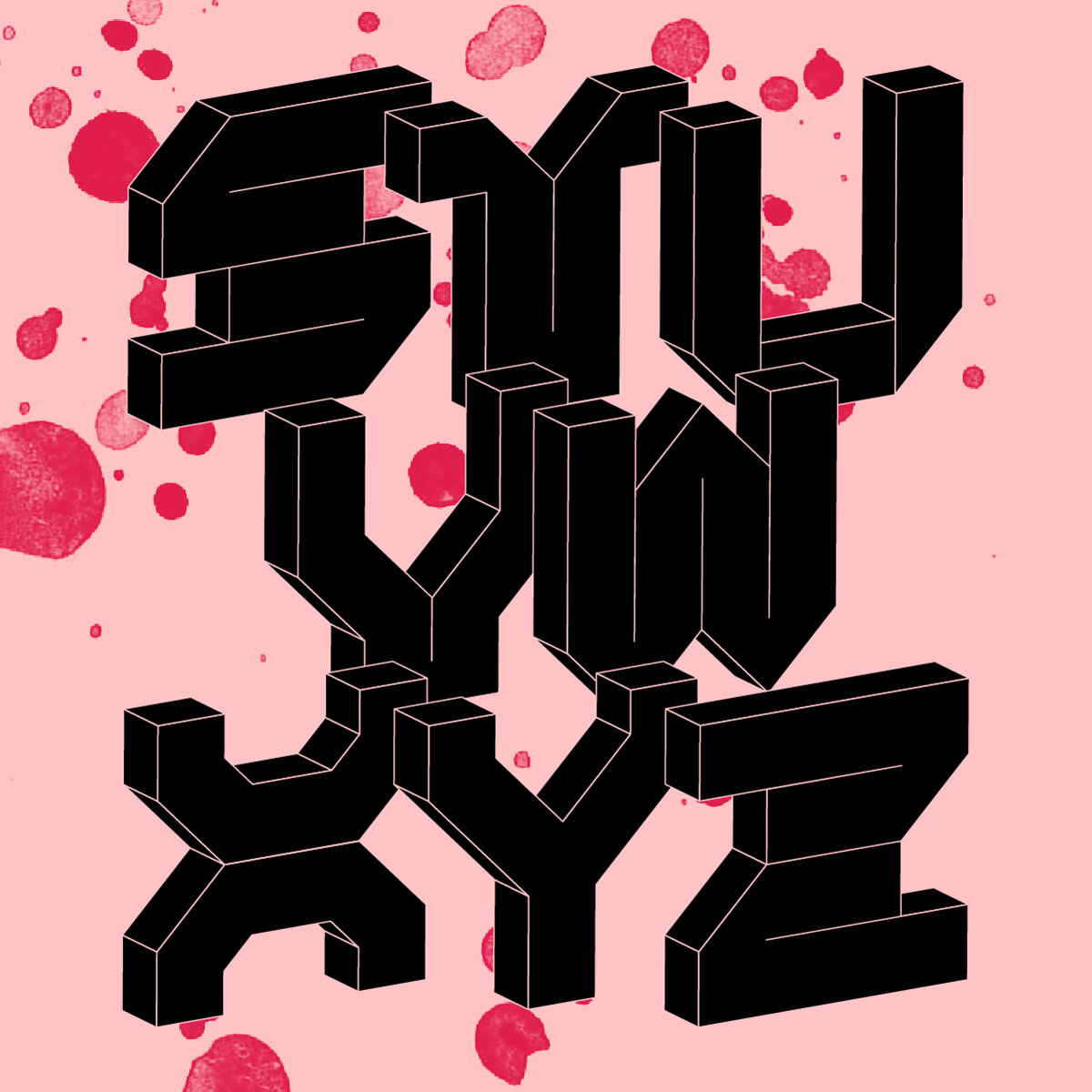

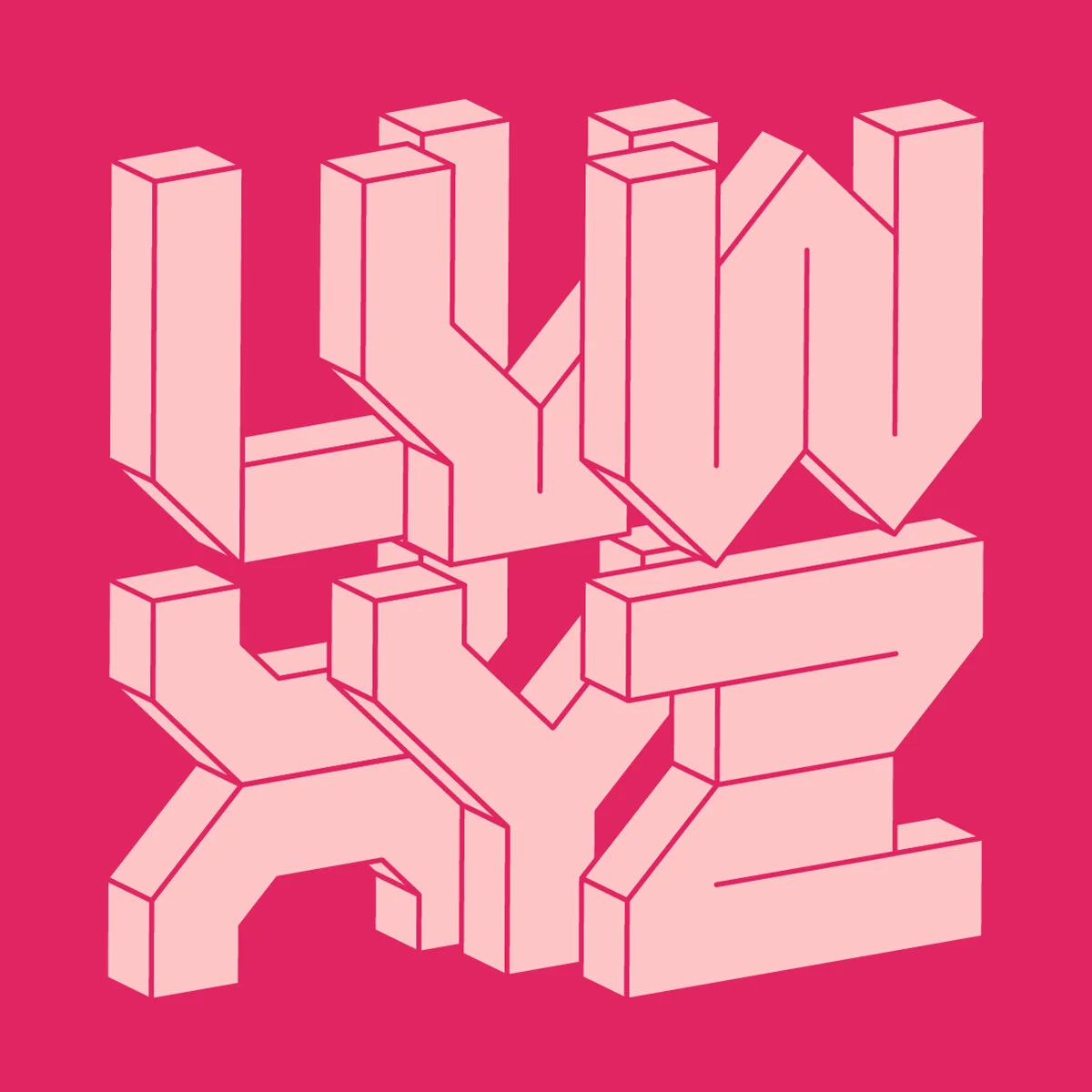

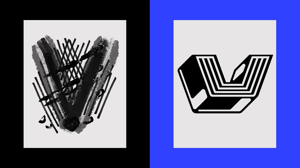
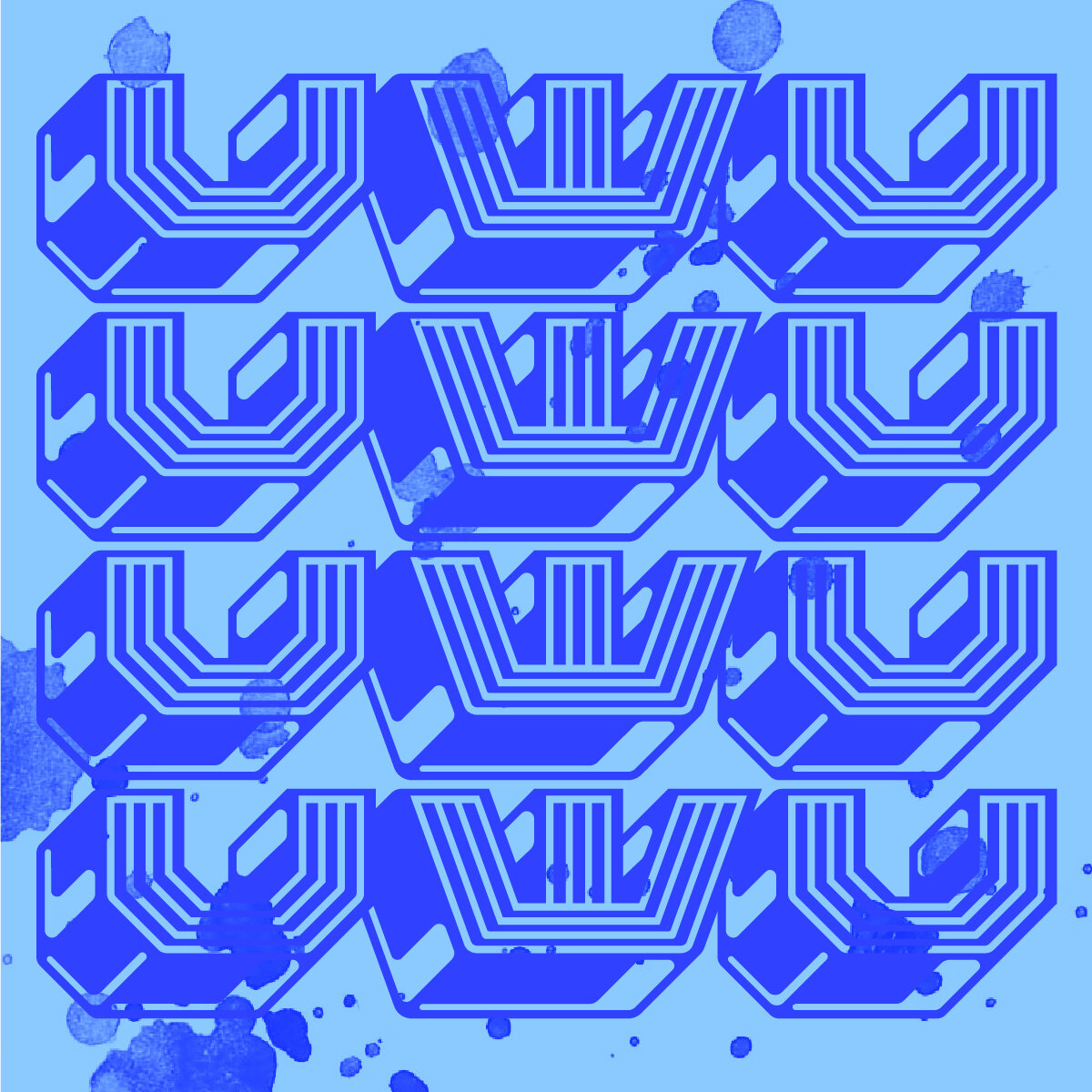
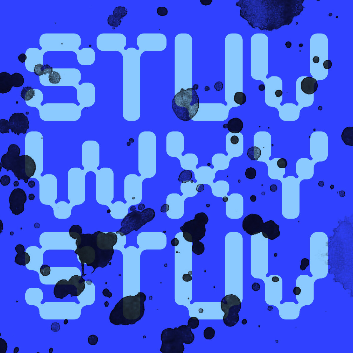
Based on the collaborative U which folds in on itself, these letterforms were created to notch and bend together; the result is something unintentionally Wim Crouwel inspired. Not organic, but not quite digital either. The typeface based on the “V” references the dozens of hatched overlapping lines that create the base letterform, with an added bit of dimension to pack the punch the painted V offers. The original V was also adorned with a few fingerprint smears which translated to the bands of light and dark brushing across the sides of each character.


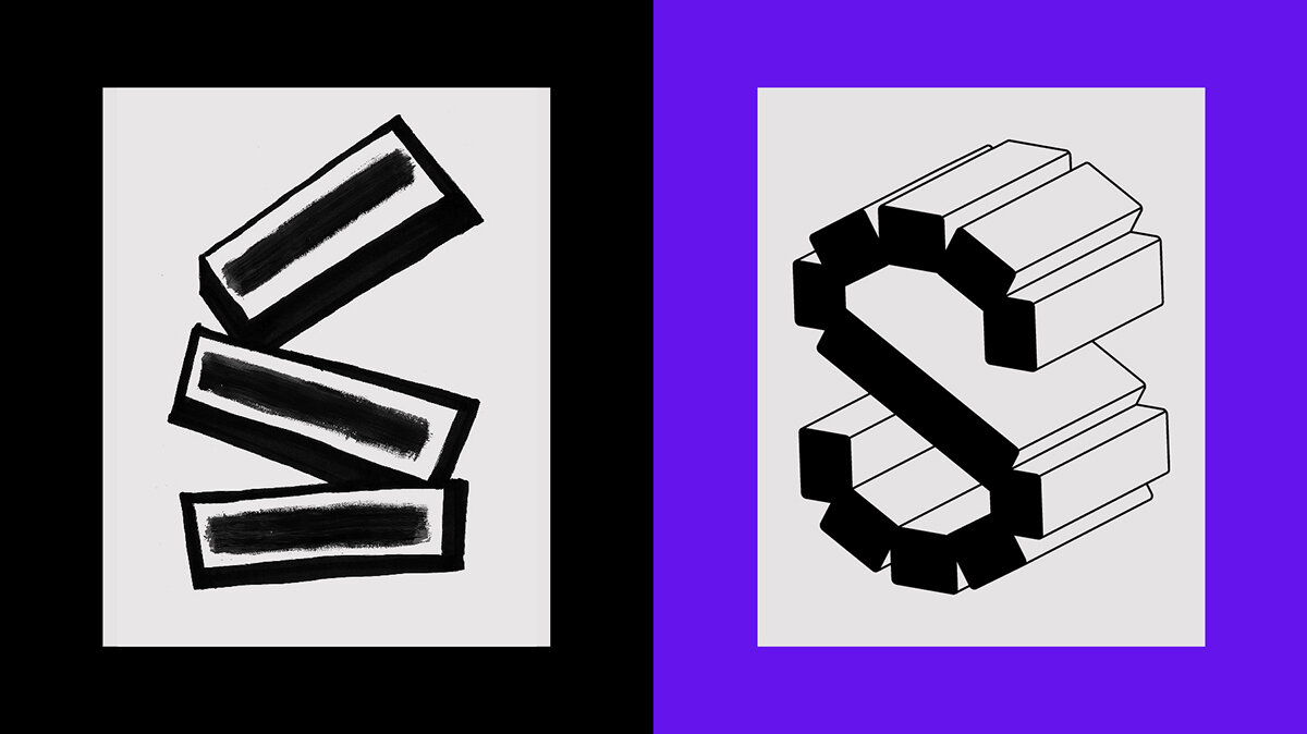
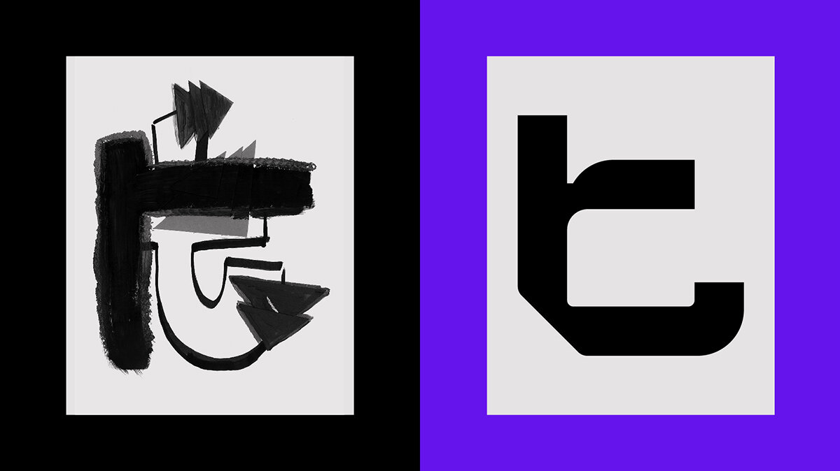
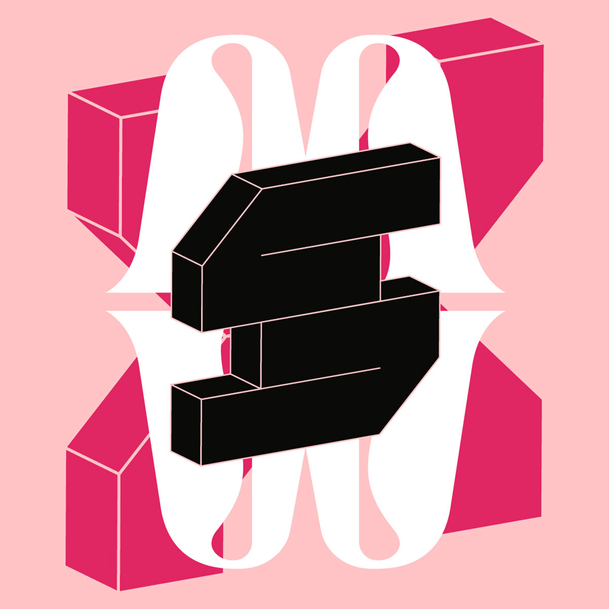
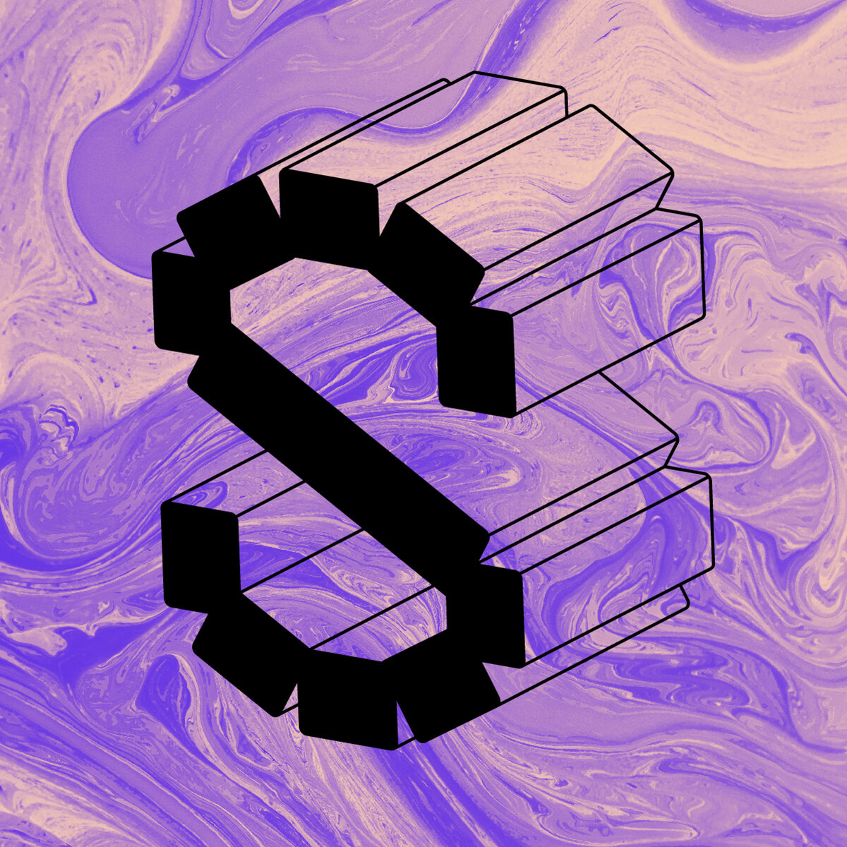
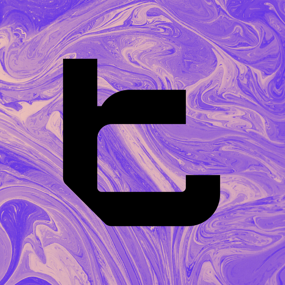
The elements that inspired this first typeface included the blocky construction of the “s” letterform and the implication of dimension through a small drop shadow. Both of these things were doubled down and what we’re left with is a dimensional typeface that lacks curves and finesse, the original intent of the character still there, but redefined. The second typeface draws on the duel nature of the lowercase “t” with one being a hard slab and the other being almost cartoonish. The typeface is bold yet elegant, with subtle curves and divots. Graceful but still authoritative.
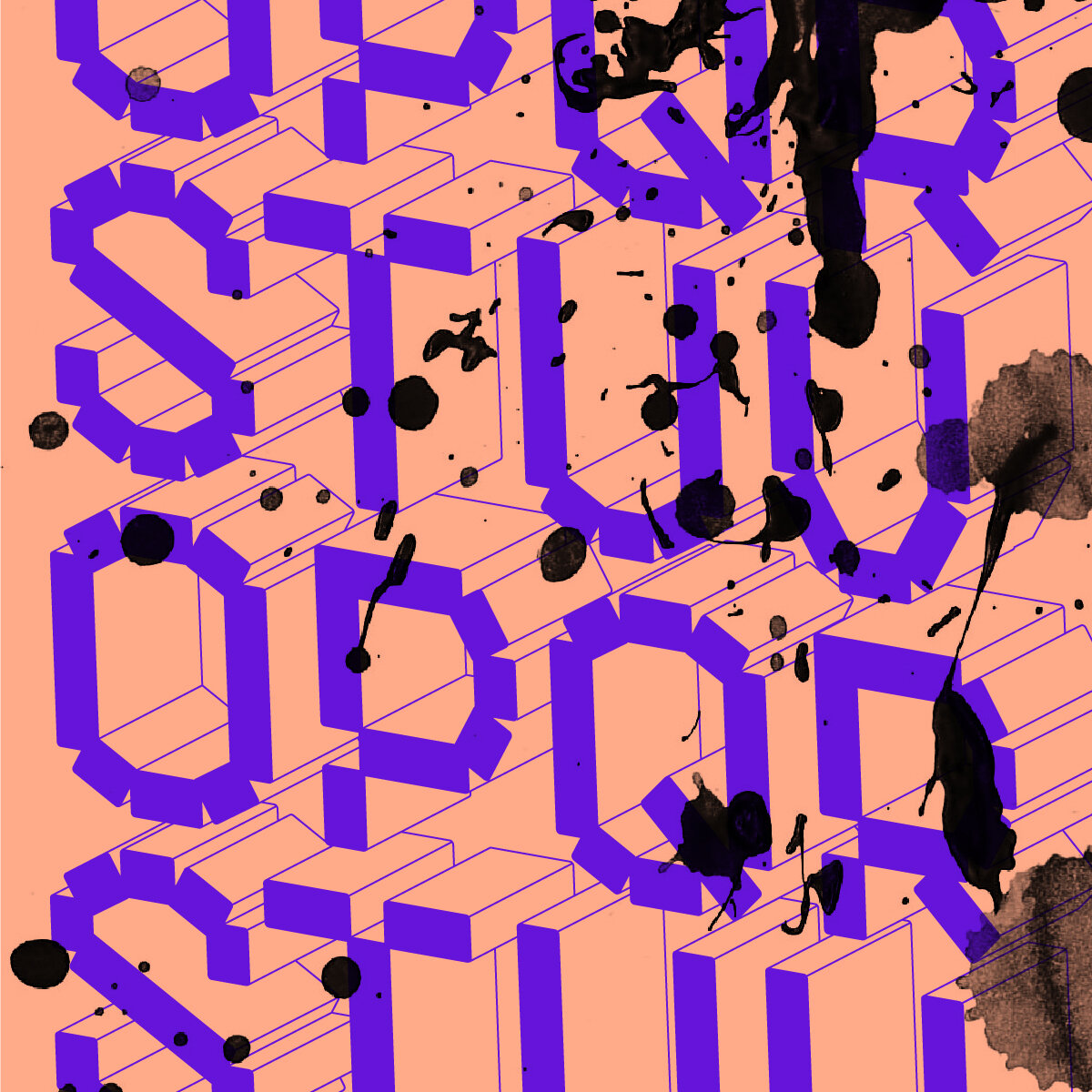

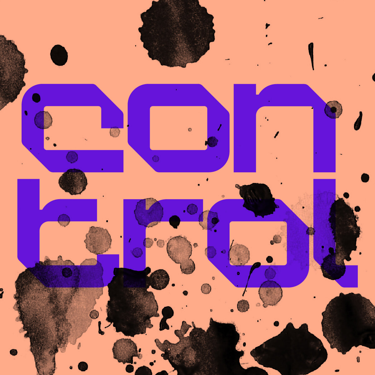
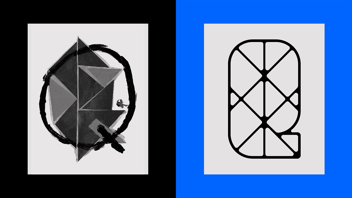

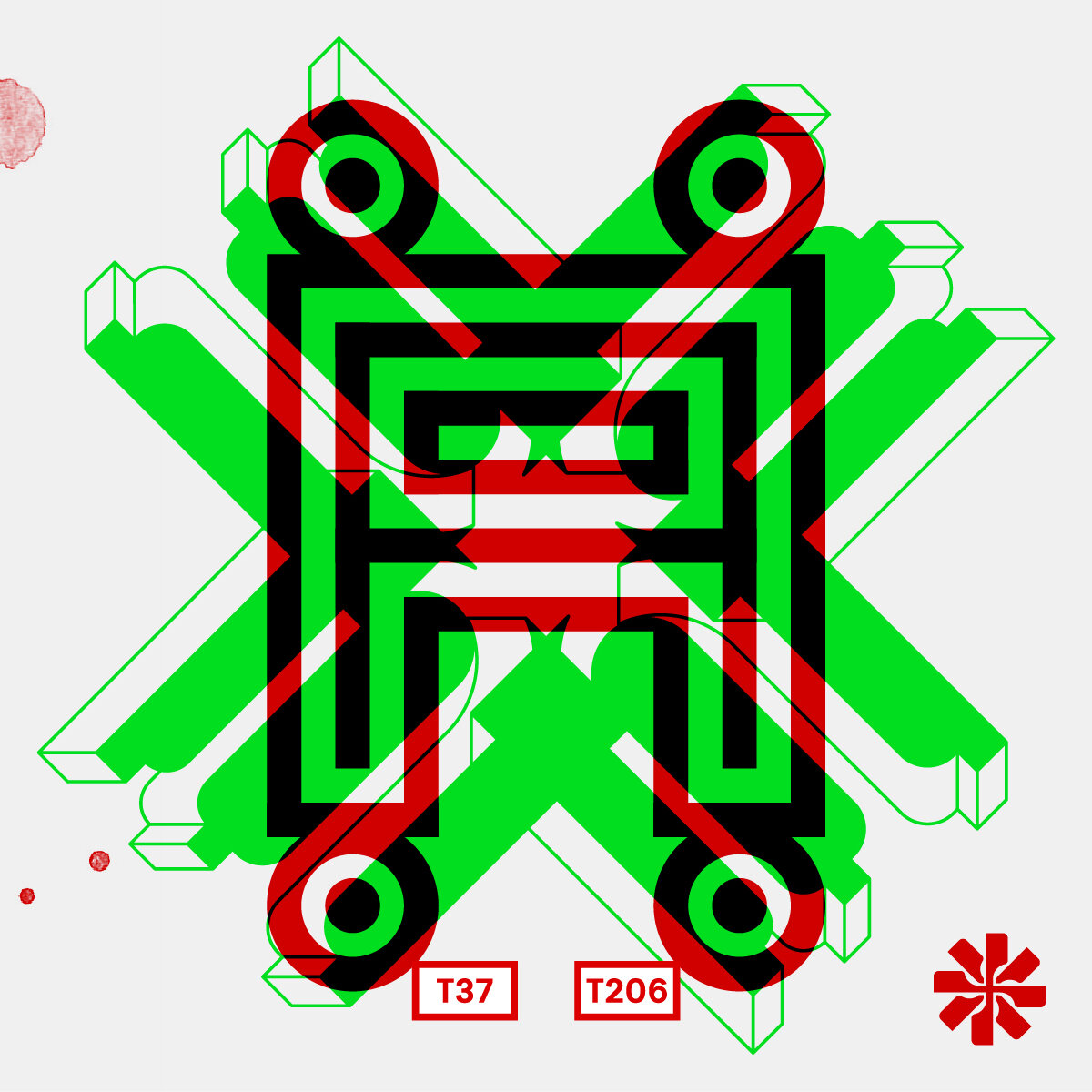
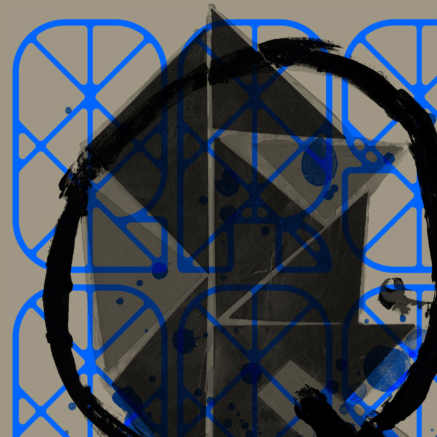
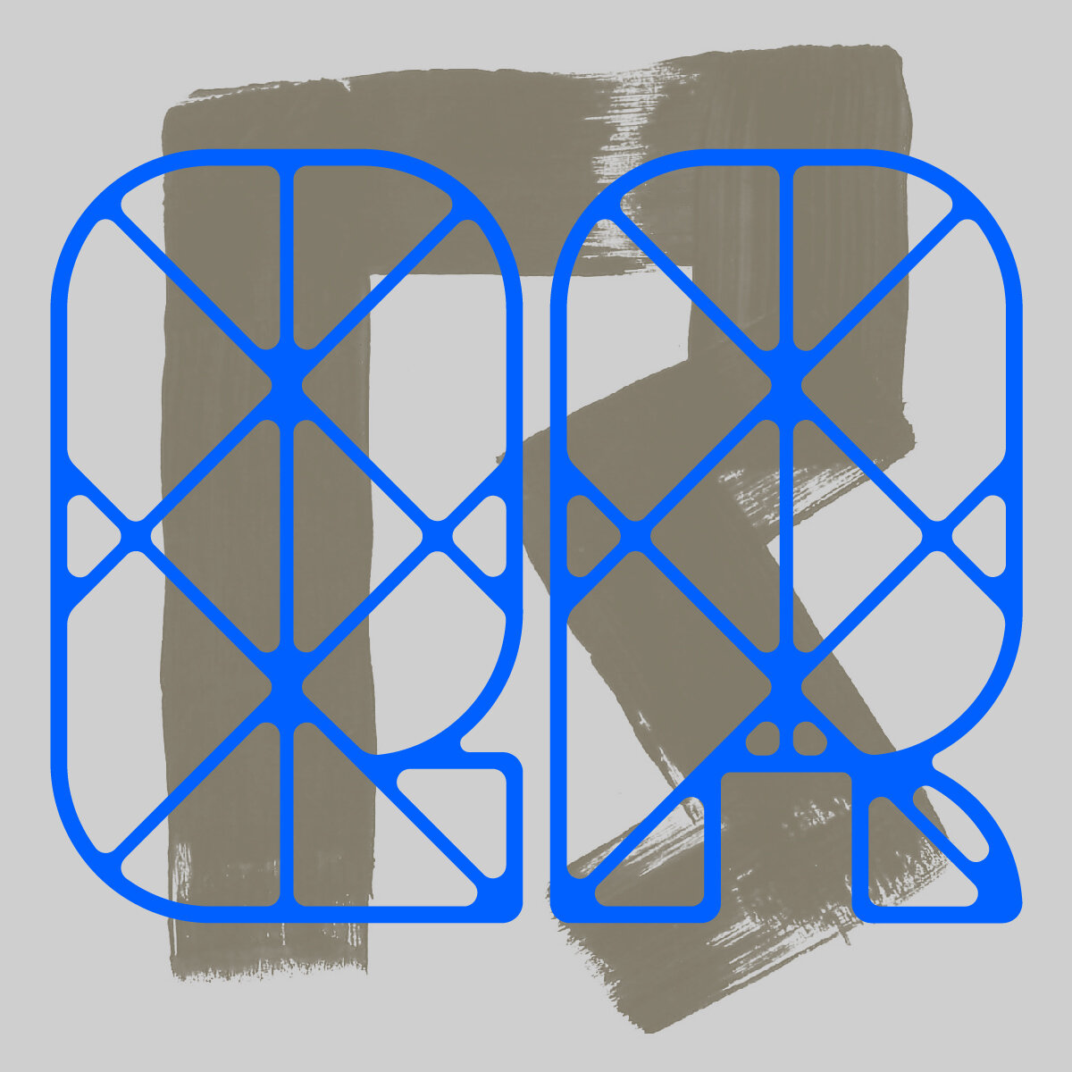
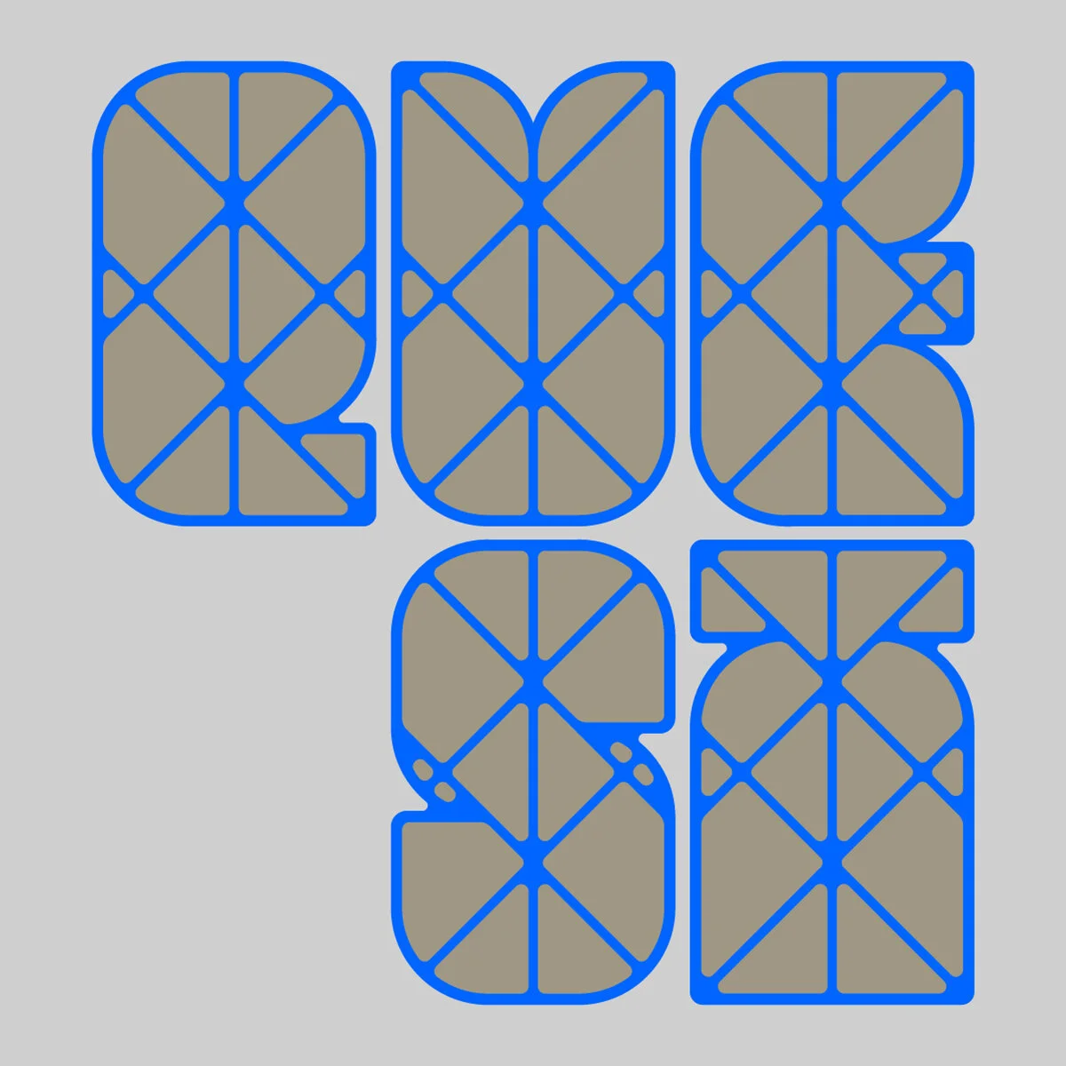
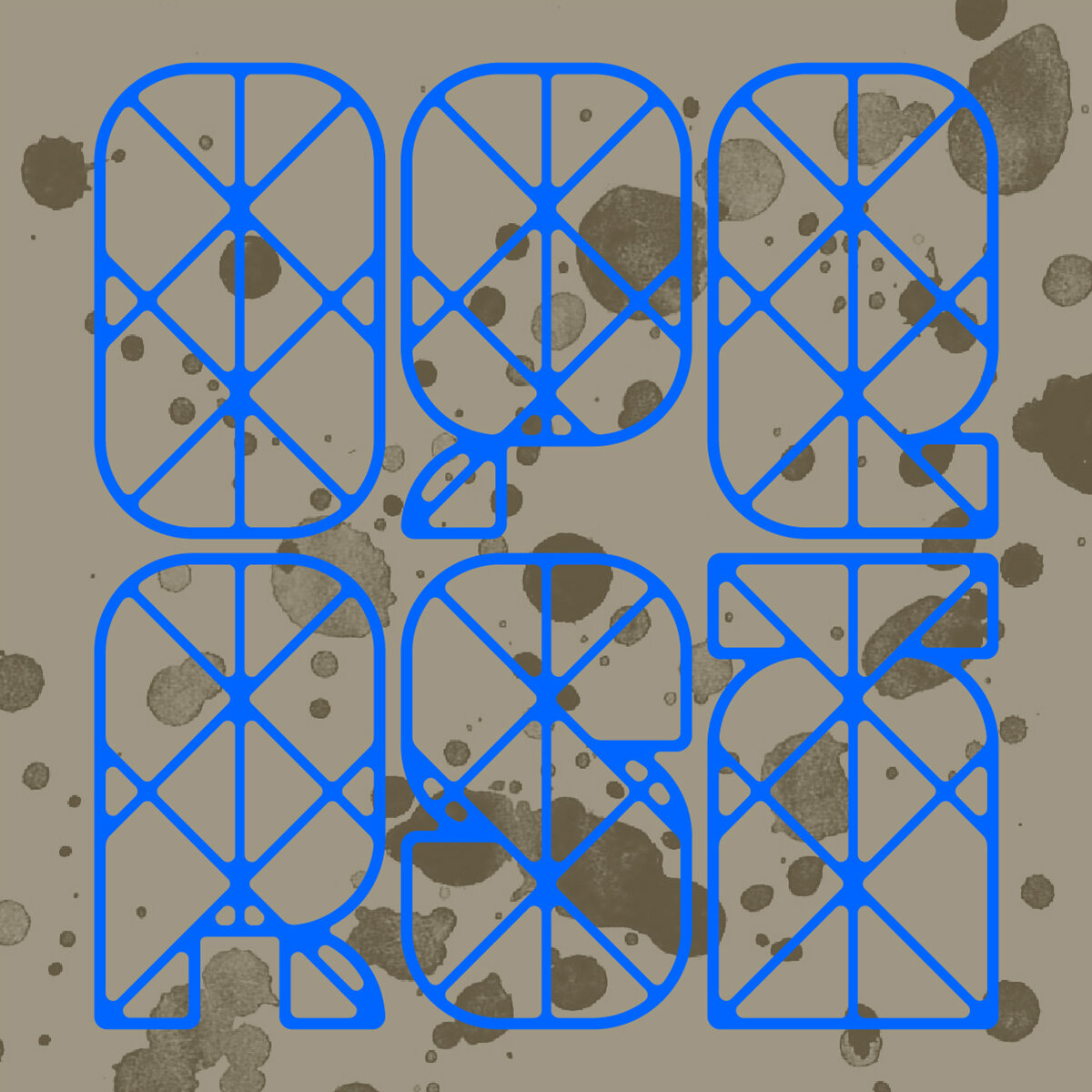
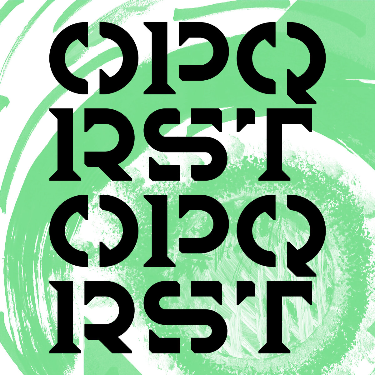
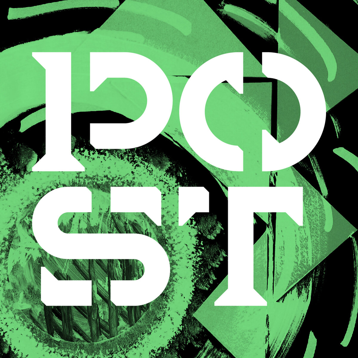
The first typeface, based on a Q constructed from scrap paper and a crude paint job, was created with an underlying grid based on the tessellation of the pasted-down triangles. From there, the grid is cropped within each character to create lemon-wedge letterforms. The next typeface was a bit more straightforward - a series of chunky brutalist characters with a repeating outlined shadow, referencing the repeating triangles tacked on to the side of the R.

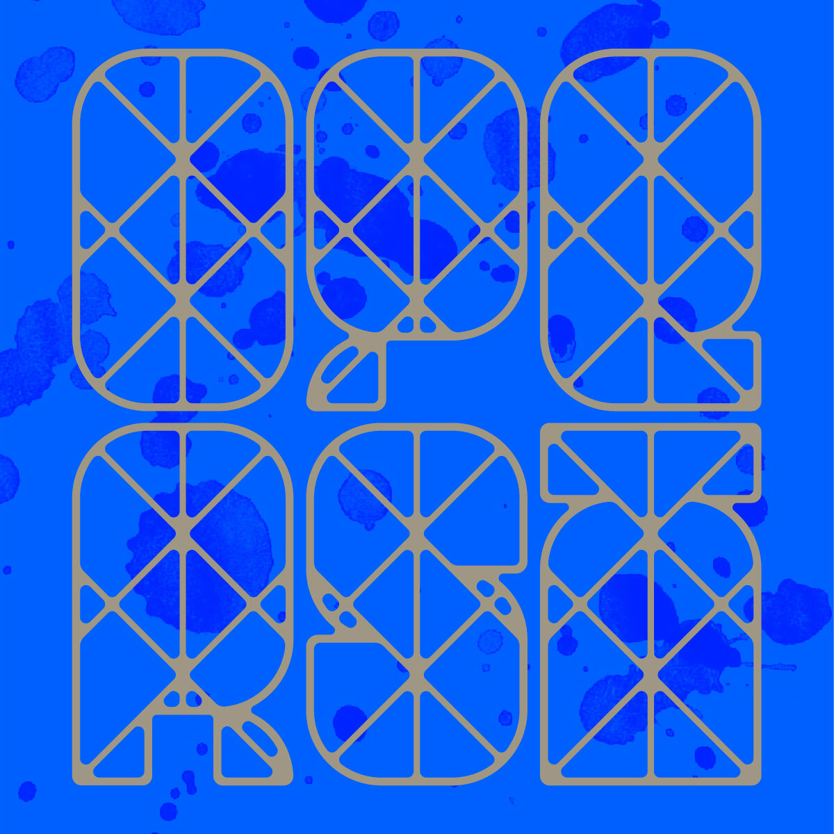


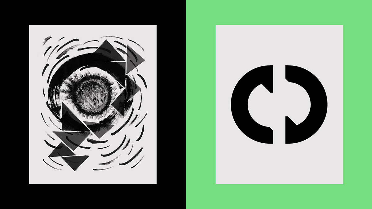
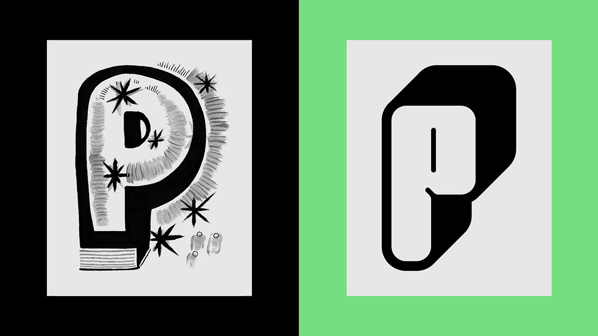
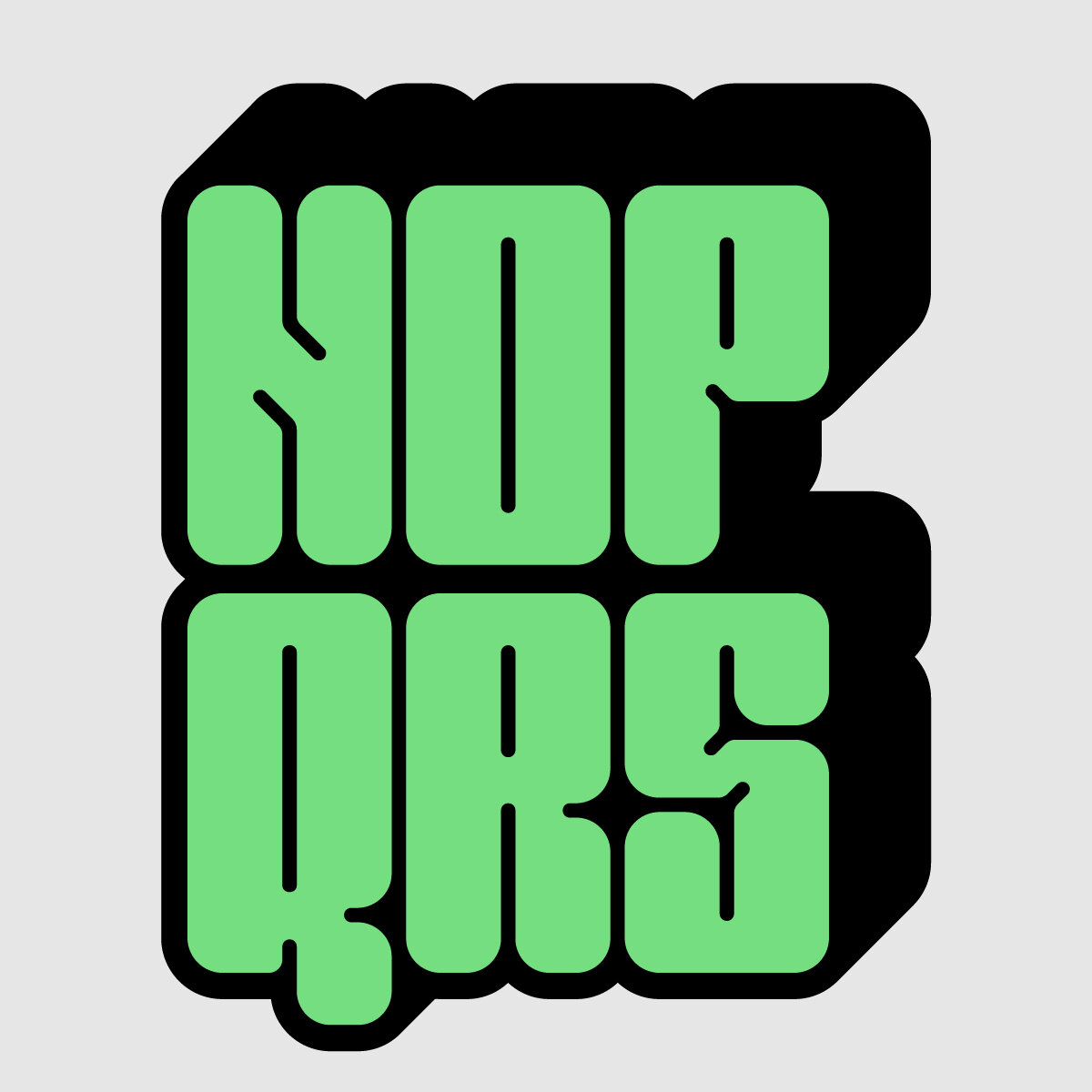
From the P we derive a dimensional and bubbly typeface that features pronounced ink traps, great for constructing some beefy wordmarks. In contrast to all the fun the P is having, the O is a touch more serious and utilitarian. There were a number of elements from the O to draw from, but the focus is on the juxtaposition of the smooth paint strokes and the harsh triangular cutouts that interrupt the beauty of the circle. This contrast is highlighted even more with the inclusion of stencil gaps, driving a wedge between the gentle curves and abrupt angles.


The Gestalt Type Lab
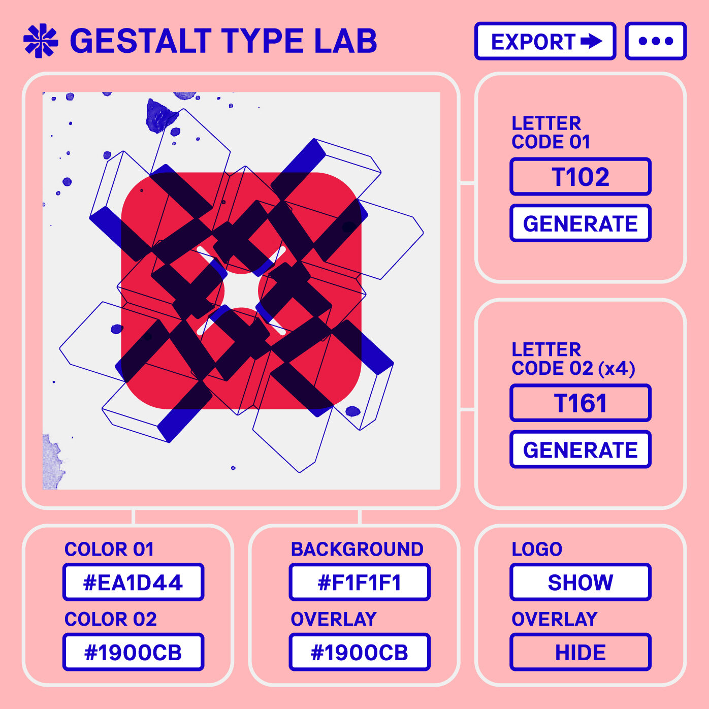
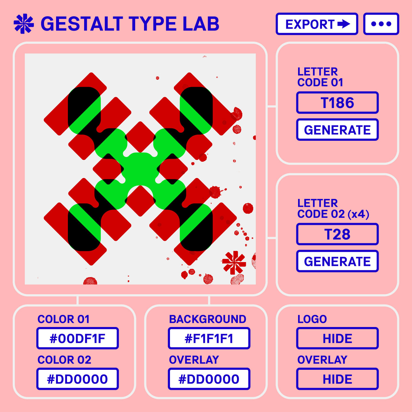
The true final piece to the Gestalt type project, and naturally it involves getting weird with type. When you have 676 characters to work with, there’s a lot of room for experimentation…
The Gestalt Type Lab is a RTG, or a “Random Type Generator,” and a digital playground for typography. With the Gestalt Type Lab, you’ll be able to autogenerate random compositions from the library of 676 characters, and add a personal touch with colors of your choosing. Or you can just sit for hours clicking the generate buttons and seeing how many random compositions you can make. The Type Lab RTG is currently in development, but expect to hear more soon!