
Letting Type Talk 01 & 02
Letting Type Talk is a series of posters/visual essays that provides insight on a very important aspect of design: innovative exploration of typography. Think of it as a Medium article in printed form. It is a love letter to a select few typographers from across the globe - those who have shaped the world of graphic design and visual culture through their contributions to the field. For some, this may even serve as an introduction to new ways of talking through type.
Each entry highlights one specific designer, displaying both their famous and lesser-known works, as well as a look into their unique methods of working with type. Each one also comes with a set of 4 postcards based on the work of the designer.
The first two entries include the work of Jurriaan Schrofer and Wim Crouwel - two Dutch typographers who favored grid-based type, strict Swiss layouts, and modular typography and organization of information.
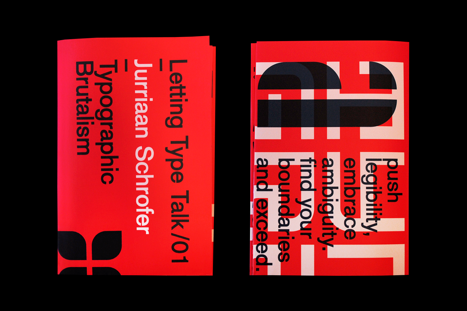


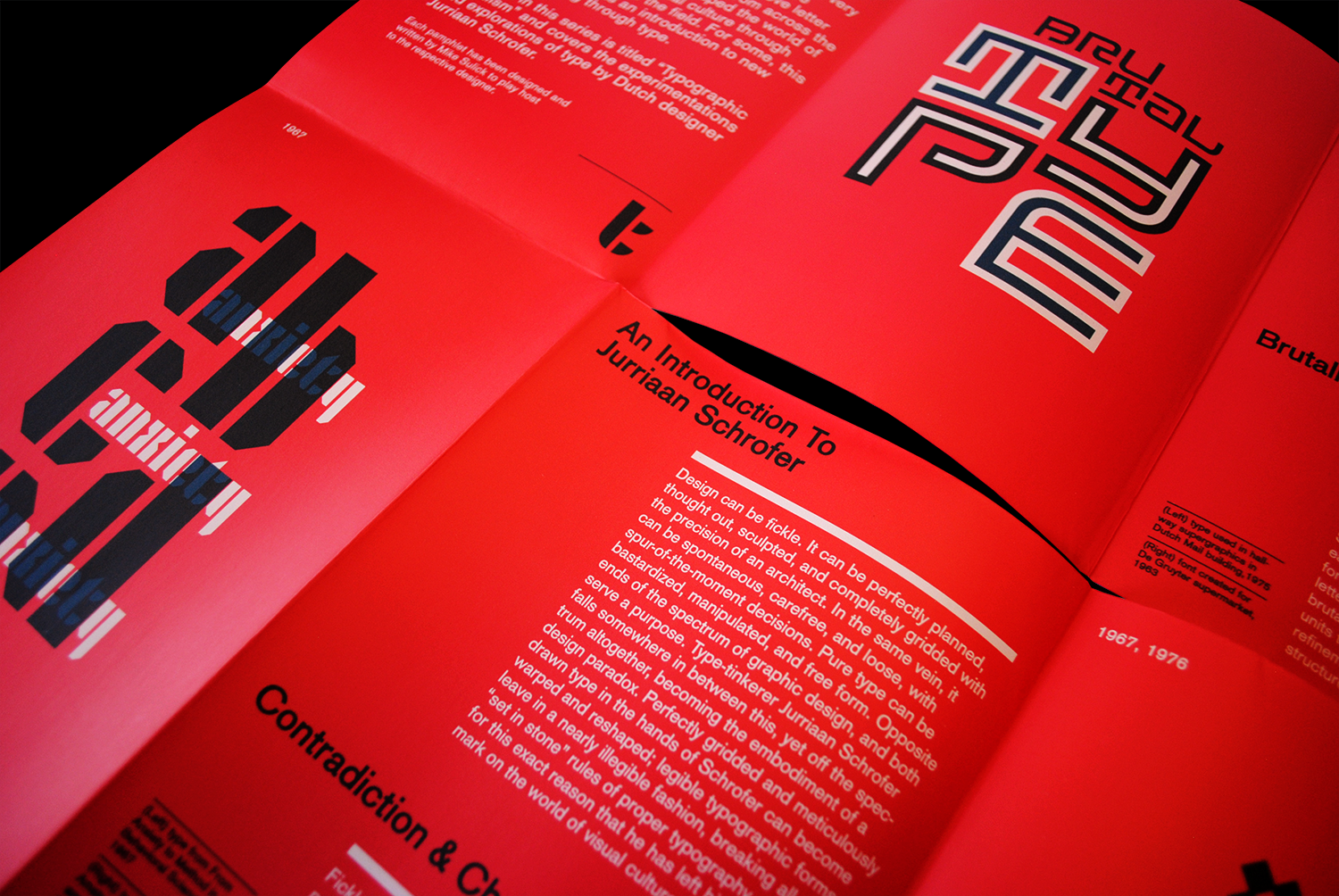
Letting Type Talk/01 - Jurriaan Schrofer
The first in this series is titled "Typographic Brutalism" and covers the experimentations and explorations of type by Dutch designer Jurriaan Schrofer.


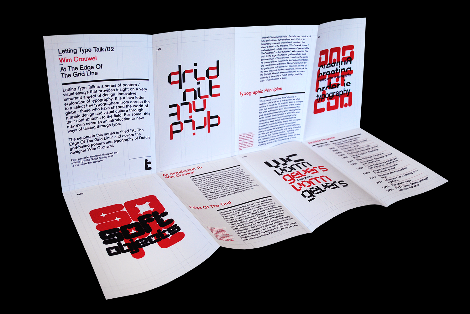
Letting Type Talk/02 - Wim Crouwel
The second in this series is titled "At The Edge Of The Grid Line" and covers the grid-based posters and typography of Dutch designer Wim Crouwel.